Category: 2: Informing Contexts

  • Typologies

    TASK

    Read Sean O’Hagan’s Guardian article on the New Topographics exhibition and publication and watch a You Tube video of Lewis Baltz talking about his work.

    Write down your own responses to the work of any of the practitioners O’Hagan mentions in his article, and describe your thoughts on typological approaches.

    Conclusions for my own work eg ‘Christmas 2014’ or Assignment 2 and Assignment 4 Safari?

    • I need to think very carefully about what I am trying to say about my surroundings and ‘suburbia’ – am I interested in dramatic perspectives, finding the sublime or beautiful, or about human interactions and ‘sense-making’?
    • How might I show this through for compiling typographies or other forms of narrative? What sorts of structured grids or conceptual juxtapositions might I make?
    • How might my approach differ if I am working in a different culture where there are sensitivities about stereotypes against a backdrop of colonial exploitation?

    “New Topographics: Photographs of a Man-Altered Landscape” 1975

    See overview of the exhibition, overview on New Topographics with video discussions, and links to each photographer:

    Robert Adams:  Minimalist plains landscape aesthetic with muted melancholy.

    Lewis Baltz: his photographs convey sadness, disappointment, and anger at how we have used the landscape..It becomes hard to distinguish construction from destruction

    Joe Deal: homes newly constructed against the desolate landscape of the American Southwest. I really like his later images in West to West with their square format and minimalist line.

    Frank Gohlke: Bold and dramatic skies or sky/foreground contrast. Pictures of grain elevators as sublime in machinery. I really like the drama in these images.

    Nicholas Nixon: His images are mostly high view images showing complexity of roadways and textured skyscrapers. Although they have a formal beauty, I do not find them as effective in terms of message or emotion as other images in the exhibition. I prefer his portraits eg the Browns sisters and Close Up.

    John Schott: His 20 images of motels are more human than most of the images in the exhibition. They are not homogenised or standardised; they have distinctive architectural features and are not owned by corporate chains. Cars are parked rather than being a threat.

    Stephen Shore: I like the colour and like in his shots of streets and parking lots. And the way he experiments with perspective and tries to see what happens when you try to take a photograph with no perspective structure.

    Henry Wessel, Jr: I like his treatment of light, and also the idea of the ‘flaneur’ who shoots images first, and thinks later in order to get something new and less studied.

    Bernd and Hilla Becher:  typologies of industrialisation. Although I find the idea of typologies interesting (see below) I find the subject matter less inspiring.

    There is a core message of the exhibition as a whole about ‘ecological citizenship’: we need to notice and appreciate what is around us – human colour and nature in the ‘semi-wilderness’. The everyday and apparently banale can also be beautiful. We must preserve and protect what is valuable in it . Not relegate ‘conservation’ and perceptions of beauty to an ever-shrinking small protected area of idealised wilderness. All our human environment is important.’

    Thoughts on typological approaches

    Typologising is an innate human instinct as we attempt to differentiate and order objects in the world around us to try and make sense of the chaos. In some contexts they have an obsessive attraction as for example in coin or stamp collecting. At the same time typologising can lead to stereotyping and closing off possibilities as we ignore differences and assume that because objects have certain characteristics in common, they are automatically the same in other respects as well.

    The actual term ‘typology’ was coined by Augustus Pitt Rivers who was interested in the evolution of different tools and mechanical implements used by man [sic]. Pitt Rivers collected different ‘types’ of one kind of tool across centuries and sorted them into series, which he believed demonstrated the tool’s logical progression – for example, stick, spear, musket.

    Typological approaches to photography are an extension of the process of photography itself – collecting images based on certain  criteria of selection and putting them together as narratives for the purpose of comparison and/or narrative.  They build on documentary recording in archaeology (artefacts) and anthropology (physical racial types) and natural sciences that became part of photographic practice in nineteenth century. Within photography its origins can be traced back to the questionable nineteenth-century experiments in eugenics and criminology of Sir Francis Galton (1822–1911) and Alphonse Bertillon (1853–1914), respectively. August Sander’s 1929 series of portraits entitled ‘Face of Our Time’   sought to record of social types, classes and the relationships between them in German society between the two World Wars.

    In relation to landscape photography the term ‘Typology’ was first used to describe the work of Bernd and Hilla Becher documenting dilapidated German industrial architecture in 1959. Each photograph was taken with the same large format camera, from the same angle, at approximately the same distance and then photographs were combined into grids. Key photographic typologists such as Thomas Struth (studies of cities), Thomas Ruff (giant passport photos), Thomas Demand (desolate empty cities and bleak interiors) and Gillian Wearing.

    Typologies are also used in commercial catalogues and becoming increasingly important in the context of date-driven websites etc. where it is important to make one website or one set of images stand out from the rest.

    Typologies are potentially extremely interesting as an area of enquiry and exploration in photography. On an aesthetic level they can propose different structural relationships and patterns and also highlight aspects of perception. On a conceptual and/or political level, they can lead the viewer to question assumptions and look deeper into presumed similarities and differences.

    Individual: selection and identity:

    • What objects qualify as ‘the same type’, by what criteria? Which criteria of similarity are to be emphasised?
    • What differences are identified? how and why are other objects different enough to not be of the same type? what particular differences are to be emphasised?

    System: juxtaposition, pattern, narrative

    • How are the objects to be presented together? Grid (dimensions?, circles? diamond etc?) ? Linear filmstrip? Sequential in time?
    • In what order? As a progression of difference? To emphasise contrast? By time of occurrence or capture?

    Resources:

    Greg Foster-Rice and John Rohrbach ‘Reframing the New Topographics’ 2013 University of Chicago Press

    Photographic Typologies: The Study of Types:

    David Campany’s ‘Almost the same thing: some thoughts on the collector-photographer’ in Dexter, E. & Weski, T. (eds.) (2003) Cruel and Tender: The Real in the Twentieth-Century Photograph. London: Tate Publishing

  • Postcard Views

    Task:

    1. Gather a selection of postcards (6-12) that you’ve either bought yourself or received from other people. If you don’t have any, then try to borrow some from other people,or see what you can find on an internet search. Write a brief evaluation (around 300 words) of the merits of the images you find. Importantly, consider whether, as Fay Godwin remarked, these images bear any relation to your own experience of the places depicted in the postcards.

    “I am wary of picturesque pictures. I get satiated with looking at postcards in local newsagents and at the picture books that are on sale, many of which don’t bear any relation to my own experience of the place… The problem for me about these picturesque pictures, which proliferate all over the place, is that they are a very soft warm blanket of sentiment, which covers everybody’s idea about the countryside… It idealises the country in a very unreal way.” (Fay Godwin)

    It is now quite some time since I received or sent postcards – most things these days are done by Facebook posts. I looked for postcards in East Anglia seaside towns like Aldeburgh but most were art postcards, no photographs. Even in Cambridge it is difficult to get ‘straight’ postcards. Most are tinted or artist drawings. I feel the traditional postcard is probably going out of fashion with technological change. On the Internet search for ‘postcards’ shows many sites where you can send off your own photos and get them produced as cards – this seems to be the growing trend. The other trend of for vintage postcards and art postcards.

    In the end I resorted to a simple search for Google images of some places I am familiar with on the Norfolk and Suffolk coast.

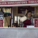
    Hunstanton postcards

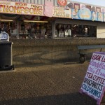
    I find these very tame and boring – the place itself is breezy with salt spray in your face, sounds of seagulls that eat your fish and chips chips, a very poignant out-of-season wrapped up feel on its fun fare and Seaworld, crashing waves against the sea defences and amazing light. It is one of the few places on the East Anglia coast that face West where you can see a sunset, and is also a place famous for seeing a sky full of geese flying to roost or migrating. But nothing of this was in the postcards. They mostly just showed:

    These images are not really ‘picturesque’ in Gilpin’s sense, more just promotion of seaside holidays. The pictures of castles are generally full frontal, with very little photographic artistry. Maybe imitating snapshots that holiday-makers themselves might take.

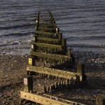
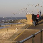
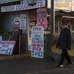
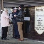
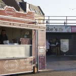
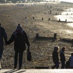
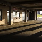
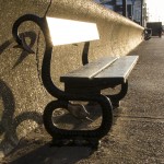
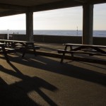
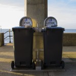
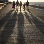
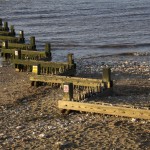
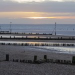
    Below are a selection of my own mixed ‘picturesque’ and social documentary images taken in early January out of season. I find these out of season images capture more of the spirit of the place – the light and long shadows, the way people enjoy themselves even when it is cold.

    Some other out of season images of Snettisham just down the coast. These are not picturesque – many are purposely underexposed – but do echo my memories of the place. This is possibly because of my memories of taking them – the act of taking images alters perception and memory itself.

    Aldeburgh in Suffolk

    This resort is better portrayed with rather more imagination – maybe because tourists there are rather more upmarket and it is a centre for art shops for the London weekend getaways with money – but still rather tame. Many of the street scenes use a very wide angle lens and leave out the traffic and parked cars – the streets are rarely that quiet.

    Cyclists walking in front of shop

    Fish and chip shop (very famous this one)

    Street view

    Some of what I consider to be the more interesting cards include:

    a  composite with different shaped and sized images of some of the major landmarks

    set of panoramas of different views from the seafront looking towards the town

    narrow panorama of the seafront houses

    narrow panorama of the tower

     the pier

    distant town view from the far beach.

    These cards do capture something of the light, the colour of the Dutch/Norfolk style houses as they look in the sunshine, the dramatic cloud forms (although the blue is too saturated) and the movement in the waves. These are more ‘picturesque’. What they fail to capture is the energy of the place and the people – all the children walking along the top of the sea wall, the different fashions people wear, the scrabble for parking in town (though plenty outside along the shoreline). They also fail to capture the drama of the windy cold days with people still enjoying a bracing walk on the shingle beach. And there is absolutely no social commentary – the parties of the rich with drunken and exclusive guests spilling out onto the streets from their holiday cottages.

    Below are some of my own more ‘picturesque images’ – I also have not so far dared to take pictures of drunken aristocracy. These for me capture more of the feel of the place – though many were taken with an old i-Phone and are not completely sharp.

    2. Write a brief response (around 200 words) to Graham Clarke’s comments above. Do you think it’s possible not to be a ‘tourist’ or ‘outsider’ as the maker of landscape images?

    “…the landscape photograph implies the act of looking as a privileged observer so that, in one sense, the photographer of landscapes is always the tourist, and invariably the outsider. Francis Frith’s images of Egypt, for example, for all their concern with foreign lands, retain the perspective of an Englishman looking out over the land. Above all, landscape photography insists on the land as spectacle and involves an element of pleasure.”

    Graham Clark (1997 p73)

    In its conventional sense as a noun, the land is inanimate space though it may have life in it – so the photographer is inevitably apart as an observer in the way they are not necessarily with documentary or street photography where the subjects of the photograph may participate in determining the meaning .If one takes ‘landscape’ as a verb and not a noun – an act of slicing parcels of space and thereby giving them some meaning – then also the photographer is always in some sense an observer and hence ‘outside’.

    But an observer is not necessarily superficial, privileged, a disinterested tourist or portraying land as spectacle for pleasure. Much depends on the intention of the photographer, their understanding of the complexities of the space they are ‘landscaping’ and the intended audience or market for the images. People may photograph the environment in which they live, or serve as a voice for other people living in the landscape – they are then less of an  outsider. Many photographers have also acted as advocates for preservation or restoration of landscapes devastated by commercial or other human exploitation – those images are far from pleasurable. Technically it is possible to select the content and composition, include even parts of the photographer’s body in the image, to increase the feeling of immersion and involvement. If the intended audience or market for the images is looking not for pleasure or commercial attraction, but to be informed of issues in the landscape/landscaping and the forces that shape it then the photographer often does in-depth research akin to documentary to select the images and meanings to communicate.


  • Psychogeography and Edgelands

    Initial reactions to ‘Wire’ and ‘Power’ – I found the descriptions evocative and also reminiscent of forbidden forays of my own early teenage life with my best friend or my dog into old bombed sites and semi-urban lanes on the outskirts of Manchester – with their potential threats of meeting with men in wait for teenage girls, gang knife fights between rival football teams and the odd murder.

    Many of the descriptions also resonate with areas along my daily walk in Cambridge that I have chosen for ‘Transitions’. And the book is definitely one source of inspiration to which I shall return many times as I progress with that project.

    But I agree with Marion Shoard:

    This book could perhaps have had more investigative rigour. The edgelands now need something beyond a merely subjective celebration of their identity. Far more than our towns and countryside, they are being subjected to ceaseless change. Wild space is being prettified at the expense of its character and creatures. Industrial ruins are being cleared away.

    We could be in the process of losing this landscape just as we are discovering its charms. Should we be trying to conserve it, as we conserve the best of rural environments? Or would any attempt to regulate this space destroy the wildness that makes it special?

    It is time for us to consider what relationship we want to see in the long term between our activity in the edgelands, their epic infrastructure, their unique wildlife and industrial archaeology and their peculiar place in our imagination. 

    Marion Shoard Guardian Review

    Robert Macfarlane Guardian review

  • Ingrid Pollard

    Website

    Through her practice, Guyanese-born artist Ingrid Pollard addresses her feelings towards the rural countryside as a non-white British subject, articulating her profound sense of being an outsider to these spaces. In some of her projects, Pollard hand tints black-and-white prints. This strategy has a dual purpose: firstly, it is a play on the idea of ‘colour’ in terms of race; and secondly, the use of this antiquated process immediately refers to nostalgic, romanticised ideals of the British landscape.

    In Miss Pollard’s Party (1993), Pollard parodies the tourist postcard, placing her own hand-tinted images on a template depicting ‘Wordsworth Heritage’.

    In Pastoral Interlude (1987) Pollard juxtaposes photographs of figures in the landscape (some of which are herself) with more subversive captions, such as: “It’s as if the Black experience is only lived within an urban environment. I thought I liked the Lake District; where I wandered lonely as a Black face in a sea of white. A visit to the countryside is always accompanied by a feeling of unease; dread.”

    Ingrid Pollard is unusual in that her practice addresses not only her sense of identity as a nonwhite British subject in the UK, but also her experience in relation to the countryside. What Pollard’s work also shows is that the concept of ‘environment’ in relation to the influence of a sense of place transcends geographical concerns alone. Whether a more deep-seated dichotomy exists between the interests of those from or living in the countryside and those in the towns is also a question that extends beyond UK borders.

    Listen to Ingrid Pollard talking about her work and landscape

    Source: Alexander p123

  • Edward Burtynsky

    Edward Burtynsky, OC (born February 22, 1955) is a Canadian photographer and artist known for his large-format photographs of industrial landscapes. Burtynsky’s most famous photographs are sweeping views of landscapes altered by industry: mine tailings, quarries, scrap piles. The grand, awe-inspiring beauty of his images is often in tension with the compromised environments they depict.

    Exploring the Residual Landscape

    Nature transformed through industry is a predominant theme in my work. I set course to intersect with a contemporary view of the great ages of man; from stone, to minerals, oil, transportation, silicon, and so on. To make these ideas visible I search for subjects that are rich in detail and scale yet open in their meaning. Recycling yards, mine tailings, quarries and refineries are all places that are outside of our normal experience, yet we partake of their output on a daily basis. These images are meant as metaphors to the dilemma of our modern existence; they search for a dialogue between attraction and repulsion, seduction and fear. We are drawn by desire – a chance at good living, yet we are consciously or unconsciously aware that the world is suffering for our success. Our dependence on nature to provide the materials for our consumption and our concern for the health of our planet sets us into an uneasy contradiction. For me, these images function as reflecting pools of our times.
    Ed Burtynsky website

    Oil  2009

    His series Oil (2009) resolves an epiphany he had in 1997, when he realised just how tightly connected all of our global activity was to petrol and its raw material – oil. The monograph is divided into three sections:
    • images of extraction and refinement;
    • the consumption of oil and motor culture;
    •  abandoned ‘oilfields run dry’ and motor vehicles of all descriptions resigned to huge scrap heaps.
    The images within Oil  evoke a terrifying sense of the sublime. It is within the third section that the images have their most potent effect, for instance seemingly endless rows of impotent, rusting fighter jets in Arizona, or a channel cutting through a canyon of stacked worn car tyres in California. Some of the most striking images are those made at the Chittagong ship breakers in Bangladesh. The proportions of the structures that the workers pick apart, almost by hand, are awesome, and just as affecting are the horrendous conditions in which they work. Although not overtly critical in any explicitly rhetorical sense (i.e. like Kennard’s montages), it is impossible to read Burtynsky’s position as anything but one of grave concern for our consumption of this valuable substance. Some images in Burtynsky’s Oil can be interpreted from different perspectives: great stacks of compressed oil drums or bits of car parts might speak of excess and consumption but, whilst they refer to manufacturing in a past tense, these are also the raw materials for current industries, ready to be melted down and turned into new things.

    China

    He has made several excursions to China to photograph that country’s industrial emergence, and construction of one of the world’s largest engineering projects, the Three Gorges Dam. Burtynsky discussing his work made in China

    Other work

    Wikipedia Burtynsky was born in St. Catharines, Ontario. His parents had immigrated to Canada in 1951 from Ukraine and his father found work on the production line at the local General Motors plant. Burtynsky recalls playing by theWelland Canal and watching ships pass through the locks. When he was 11, his father purchased a darkroom, including cameras and instruction manuals, from a widow whose late husband practiced amateur photography.With his father, Burtynsky learned how to make black-and-white photographic prints and together with his older sister established a small business taking portraits at the local Ukrainian center. In the early ’70s, Burtynsky found work in printing and he started night classes in photography, later enrolling at the Ryerson Polytechnical Institute. From the mid-1970s to early 1980s, Burtynsky formally studied graphic arts and photography. He obtained a diploma in graphic arts from Niagara College in Welland, Ontario, in 1976, and a BAA in Photographic Arts (Media Studies Program) from Ryerson Polytechnical Institute in Toronto, Ontario, in 1982. His early influences include Ansel Adams, Edward Weston, Eadweard Muybridge, and Carleton Watkins, whose prints he saw at the Metropolitan Museum of Art in the early 1980s. Another group whose body of work shares similar themes and photographic approaches to Burtynsky’s work are the photographers who were involved in the exhibition New Topographics.


    Photographic series

    • 1983 – 1985 Breaking Ground: Mines, Railcuts and Homesteads, Canada, USA
    • 1991 – 1992 Vermont Quarries, USA
    • 1997 – 1999 Urban Mines: Metal Recycling, Canada Tire Piles, USA
    • 1993 – Carrara Quarries, Italy
    • 1995 – 1996 Tailings, Canada
    • 1999 – 2010 Oil Canada, China, Azerbaijan, USA
    • 2000 – Makrana Quarries, India
    • 2000 – 2001 Shipbreaking, Bangladesh
    • 2004 – 2006 China
    • 2006 – Iberia Quarries, Portugal
    • 2007 – Australian Mines, Western Australia
    • 2009 – 2013 Water Canada, USA, Mexico, Europe, Asia, Iceland, India

    Video: Manufactured Landscapes

    In 2006, Burtynsky was the subject of the documentary film, Manufactured Landscapes, that was shown at the 2007 Sundance Film Festival in the World Cinema Documentary Competition.

    Video: Watermark

    Burtynsky and Jennifer Baichwal, who was his director on the 2006 documentary Manufactured Landscapes, are co-directors of the 2013 documentary film, Watermark. The film is part of his five-year project Water focusing on the way water is used and managed.  

    Technique

    Most of Burtynsky’s exhibited photography (pre 2007) was taken with a large format field camera on large 4×5-inch sheet film and developed into high-resolution, large-dimension prints of various sizes and editions ranging from 18 x 22 inches to 60 x 80 inches. He often positions himself at high-vantage points over the landscape using elevated platforms, the natural topography, and more currently helicopters and fixed-wing aircraft. Burtynsky describes the act of taking a photograph in terms of “The Contemplated Moment”, evoking and in contrast to, “The Decisive Moment” of Henri Cartier-Bresson. In 2007 he began using a high-resolution digital camera.

    The Long Now Foundation

    In July 2008 Burtynsky delivered a seminar for the Long Now Foundation entitled “The 10,000 year Gallery”. The foundation promotes very long-term thinking and is managing various projects including the Clock of the Long Now, which is a clock designed to run for 10,000 years. Burtynsky was invited by clock designer Danny Hillis to contribute to the Long Now project, and Burtynsky proposed a gallery to accompany the clock. In his seminar, he suggested that a gallery of photographs which captured the essence of their time, like the cave paintings at Lascaux, could be curated annually and then taken down and stored. He outlined his research into a carbon-transfer process for printing photographs that would use inert stone pigments suspended in a hardened gelatine colloid and printed onto thick watercolour paper. He believes that these photographs would persist over the 10,000 year time-frame when stored away from moisture. ——————————————

    Edward Burtynsky, OC (born February 22, 1955) is a Canadian photographer and artist known for his large-format photographs of industrial landscapes. Burtynsky’s most famous photographs are sweeping views of landscapes altered by industry: mine tailings, quarries, scrap piles. The grand, awe-inspiring beauty of his images is often in tension with the compromised environments they depict.

    Exploring the Residual Landscape

    Nature transformed through industry is a predominant theme in my work. I set course to intersect with a contemporary view of the great ages of man; from stone, to minerals, oil, transportation, silicon, and so on. To make these ideas visible I search for subjects that are rich in detail and scale yet open in their meaning. Recycling yards, mine tailings, quarries and refineries are all places that are outside of our normal experience, yet we partake of their output on a daily basis.

    These images are meant as metaphors to the dilemma of our modern existence; they search for a dialogue between attraction and repulsion, seduction and fear. We are drawn by desire – a chance at good living, yet we are consciously or unconsciously aware that the world is suffering for our success. Our dependence on nature to provide the materials for our consumption and our concern for the health of our planet sets us into an uneasy contradiction. For me, these images function as reflecting pools of our times.

    Ed Burtynsky website

    Oil  2009

    His series Oil (2009) resolves an epiphany he had in 1997, when he realised just how tightly connected all of our global activity was to petrol and its raw material – oil.

    The monograph is divided into three sections:

    • images of extraction and refinement;
    • the consumption of oil and motor culture;
    •  abandoned ‘oilfields run dry’ and motor vehicles of all descriptions resigned to huge scrap heaps.

    The images within Oil  evoke a terrifying sense of the sublime. It is within the third section that the images have their most potent effect, for instance seemingly endless rows of impotent, rusting fighter jets in Arizona, or a channel cutting through a canyon of stacked worn car tyres in California. Some of the most striking images are those made at the Chittagong ship breakers in Bangladesh. The proportions of the structures that the workers pick apart, almost by hand, are awesome, and just as affecting are the horrendous conditions in which they work. Although not overtly critical in any explicitly rhetorical sense (i.e. like Kennard’s montages), it is impossible to read Burtynsky’s position as anything but one of grave concern for our consumption of this valuable substance.

    Some images in Burtynsky’s Oil can be interpreted from different perspectives: great stacks of compressed oil drums or bits of car parts might speak of excess and consumption but, whilst they refer to manufacturing in a past tense, these are also the raw materials for current industries, ready to be melted down and turned into new things.

    China

    He has made several excursions to China to photograph that country’s industrial emergence, and construction of one of the world’s largest engineering projects, the Three Gorges Dam.

    Burtynsky discussing his work made in China

    Other work

    Wikipedia

    Burtynsky was born in St. Catharines, Ontario. His parents had immigrated to Canada in 1951 from Ukraine and his father found work on the production line at the local General Motors plant. Burtynsky recalls playing by theWelland Canal and watching ships pass through the locks. When he was 11, his father purchased a darkroom, including cameras and instruction manuals, from a widow whose late husband practiced amateur photography.With his father, Burtynsky learned how to make black-and-white photographic prints and together with his older sister established a small business taking portraits at the local Ukrainian center. In the early ’70s, Burtynsky found work in printing and he started night classes in photography, later enrolling at the Ryerson Polytechnical Institute.

    From the mid-1970s to early 1980s, Burtynsky formally studied graphic arts and photography. He obtained a diploma in graphic arts from Niagara College in Welland, Ontario, in 1976, and a BAA in Photographic Arts (Media Studies Program) from Ryerson Polytechnical Institute in Toronto, Ontario, in 1982.

    His early influences include Ansel Adams, Edward Weston, Eadweard Muybridge, and Carleton Watkins, whose prints he saw at the Metropolitan Museum of Art in the early 1980s. Another group whose body of work shares similar themes and photographic approaches to Burtynsky’s work are the photographers who were involved in the exhibition New Topographics.


    Photographic series

    • 1983 – 1985 Breaking Ground: Mines, Railcuts and Homesteads, Canada, USA
    • 1991 – 1992 Vermont Quarries, USA
    • 1997 – 1999 Urban Mines: Metal Recycling, Canada Tire Piles, USA
    • 1993 – Carrara Quarries, Italy
    • 1995 – 1996 Tailings, Canada
    • 1999 – 2010 Oil Canada, China, Azerbaijan, USA
    • 2000 – Makrana Quarries, India
    • 2000 – 2001 Shipbreaking, Bangladesh
    • 2004 – 2006 China
    • 2006 – Iberia Quarries, Portugal
    • 2007 – Australian Mines, Western Australia
    • 2009 – 2013 Water Canada, USA, Mexico, Europe, Asia, Iceland, India

    Video: Manufactured Landscapes

    In 2006, Burtynsky was the subject of the documentary film, Manufactured Landscapes, that was shown at the 2007 Sundance Film Festival in the World Cinema Documentary Competition.

    Video: Watermark

    Burtynsky and Jennifer Baichwal, who was his director on the 2006 documentary Manufactured Landscapes, are co-directors of the 2013 documentary film, Watermark. The film is part of his five-year project Water focusing on the way water is used and managed.

    Technique

    Most of Burtynsky’s exhibited photography (pre 2007) was taken with a large format field camera on large 4×5-inch sheet film and developed into high-resolution, large-dimension prints of various sizes and editions ranging from 18 x 22 inches to 60 x 80 inches. He often positions himself at high-vantage points over the landscape using elevated platforms, the natural topography, and more currently helicopters and fixed-wing aircraft. Burtynsky describes the act of taking a photograph in terms of “The Contemplated Moment”, evoking and in contrast to, “The Decisive Moment” of Henri Cartier-Bresson. In 2007 he began using a high-resolution digital camera.

    The Long Now Foundation

    In July 2008 Burtynsky delivered a seminar for the Long Now Foundation entitled “The 10,000 year Gallery”. The foundation promotes very long-term thinking and is managing various projects including the Clock of the Long Now, which is a clock designed to run for 10,000 years. Burtynsky was invited by clock designer Danny Hillis to contribute to the Long Now project, and Burtynsky proposed a gallery to accompany the clock. In his seminar, he suggested that a gallery of photographs which captured the essence of their time, like the cave paintings at Lascaux, could be curated annually and then taken down and stored. He outlined his research into a carbon-transfer process for printing photographs that would use inert stone pigments suspended in a hardened gelatine colloid and printed onto thick watercolour paper. He believes that these photographs would persist over the 10,000 year time-frame when stored away from moisture.
     

  • Richard Long

    Long, in particular, has sought to distance his practice from the epic scale of works by Smithson and Michael Heizer. Long branded these kinds of works negatively as ‘capitalist art’, because of the way they absorbed the land and because of the financial resources necessary for their production (Andrews, 1999, p. 215).

    Long espoused a less interventionist approach to making land art, as well as simpler, less obtrusive sculptures that have a minimal impact upon the landscape. In addition to the sculptures they produced and documented with photography, Fulton and Long have focused on the meditative process of walking, and conceive of the act of walking as an art form in itself. The outcomes of this activity may be a combination of photographs and notes of objects and events observed, and perhaps also a sculptural aspect using materials from the walk. River Avon Mud Circle (2011) is one such example of this approach.

    A talk by Clarrie Wallis, curator of Richard Long’s show Heaven and Earth, Tate Britain 2009:
    http://www.tate.org.uk/context-comment/audio/richard-long-curators-talk
    Sean O’Hagan’s preview of Heaven and Earth:
    http://www.guardian.co.uk/artanddesign/2009/may/10/art-richard-long

  • Tim Simmons

    From Out West

    website: http://www.timsimmons.co.uk

    Simmons creates his nocturnal landscapes using fluorescent lamps and a range of post-production techniques. His images might be described as ‘hyper real’; they have an aesthetic that somehow seems to transcend photo-realism. They look almost artificial, like video game graphics.

    Tim Simmons established a successful career within the field of motor photography. Simmons’s innovative lighting methods that brought him to the attention of advertising agencies, who wanted to place cars within his out-of-this-world landscapes.

    His recent projects are more tightly cropped ‘vignettes’ or almost meditative viewpoints. Simmons locates his practice within a fine art context and has installed his images in temporary open-air exhibitions across the world, some of which, ironically, have been presented on billboards.

    See: http://www.timsimmons.co.uk/showkase/ulp-billboards-2011/

  • James Morris

    In Wales, particularly South Wales, the idea of ‘post-industry’ is poignant in the light of the well-documented, widespread decline in industrial activity in recent decades.

    In A Landscape of Wales (2010), James Morris explores the diverse landscape of the country, including the Gothic-looking remains of slate quarries and other sublime-inspiring features. Most interestingly, Morris looks at how the tourism and heritage industries, which continue to play a major part in the Welsh economy, relate to the landscape. Morris provides an excellent example of the inextricable link between topography and industry, which have in turn shaped the identity of a place and its people.  (Alexander course text p105)

    See Google Images

    See more from this series at:
    http://www.jamesmorris.info   (Flash-based site)

  • John Davies

    [wpdevart_youtube]BW44iNga8Fk[/wpdevart_youtube]John Davies website

    See more of Davies’s work

    John Davies (born 1949 in Sedgefield, County Durham, England) is a British landscape photographer. He is known for completing long-term projects documenting Britain and its industrial and urban landscape. He juxtaposes elements of history, industry and social activity within a single composition to critically examine our social geography.

    The British Landscape is his best-known body of work

    Fuji City Mount Fuji, Japan is a meditation on the balance between nature and industry.

    The shift in subject matter also developed into a fascination with urban regeneration and work on this includes his Metropoli Project, City State, and Cities on the Edge, the latter of which he curated, in addition to contributing images of his own.

    Not judgemental – ask questions. People have different reactions to different images. Doesn’t include many people, but images are about what people have done in the environment.

    The caption to Davies’s Ffestiniog Railway image reads:
    “The Ffestiniog Railway was originally built to transport local slate, but in
    1964, following new connections to the national railway network, trains
    began serving the Trawsfynydd nuclear power station. Although the
    decommissioning of Trawsfynydd began in 1991, the railway continued
    to be used daily to transport 50-ton flasks of nuclear fuel and waste to
    the Sellafield reprocessing plant in Cumbria. Sellafield stopped taking
    waste from Trawsfynydd in 1997.”

    Technique

    He is known for producing large photographic prints of images produced from high vantage points, using traditional darkroom techniques. His work in the 1980s primarily used medium format cameras, and work from the 1990s alarge format camera, although in recent years he has begun using dSLR and digital medium format cameras in his work as well.

    The stylistic components reference – with irony – the picturesque:

    • Davies’s photographs are nearly always taken from high vantage points that hint towards a welltrodden, formalised ‘viewpoint’, looking out across views with foregrounds, middle distance and backgrounds (usually a rolling hill).
    • He continues to work with black-and-white film, linking his work to the classical aesthetics of Adams and Weston.

    Liz Wells (2011, pp.170–71) identifies a potential problem with Davies’s relation to the picturesque:
    “… his work operates as a visual archive of post-industrial Britain. But his personal style is so marked that content risks becoming subservient within a generalised vision of industrial legacy in ways that work against any sense of the specificity of each site. There is a risk that political commentary is diluted rather than distilled, as the industrial becomes a strand within a new picturesque.”

    Biography

    Davies was born in Sedgefield, County Durham, in 1949. He grew up in coal mining and farming communities, and this combination of open space and industry was to become a persistent motif in his creative work. His early life was spent living in industrial landscapes in County Durham and Nottinghamshire.

    He studied Photography, first attending Mansfield School of Art to complete a Foundation Course, then studying at Trent Polytechnic (now Nottingham Trent University), graduating in 1974. Following this, he began working on long-term projects, seeking commissions and arts funding to support his work. He has worked closely with Amber/Side Collective on a number of commissions. In 1981, Davies won a one-year Photography Fellowship at Sheffield Polytechnic, and he became Senior Research Fellow at the Art School of University of Wales Cardiff (UWIC) in 1995.

    He has also become involved in local politics, as his interest in the use of public space has been both personal and professional. He lives with his partner and their daughter Alix in Liverpool, England.

    Books by Davies

    • Aggie Weston’s no.13. Belper, Derbyshire: Stuart Mills, 1977 ASIN B0007C4X2C.
    • The Valleys project. Cardiff: Ffotogallery, 1985.
    • On the edge of White Peak. Derbyshire Museum Services, UK, 1985.
    • In the wake of King Cotton. Rochdale Art Gallery, UK, 1986.
    • Mist Mountain Water Wind. London: Traveling Light, 1986. ISBN 0-906333-18-0.
    • A Green & Pleasant Land. Manchester: Cornerhouse, 1987. ISBN 0-948797-10-X soft cover ISBN 0-948797-15-0.
    • Autoroute A26, Calais – Reims. Douchy, France: Mission Photogaphique Transmanche, 1989. ISBN 2-904538-16-X.
    • Phase 11 (eleven). London: The Photographers’ Gallery; London: Davenport, 1991. ISBN 0-907879-27-6.
    • Broadgate. London: Davenport, 1991.
    • Cross Currents. Cardiff: Ffotogallery; Manchester: Cornerhouse, 1992. ISBN 0-948797-32-0.
    • Linea di Confine della Provincia di Reggio Emillia Laboratorio di Fotografia 5. Arcadia Edizioni & Assessorato alla Cultra del Comune di Rubiera, Italy, 1992.
    • Skylines. Valencia University, Imp. Mari Montanana, Spain, 1993.
    • Through fire and water: River Taff. Oriel (The Arts Council of Wales’ Gallery, Cardiff); National Museum & Galleries of Wales, 1997. ISBN 0-946329-45-1.
    • Sguardigardesani. Milan, Italy: Charta, 1999. ISBN 88-8158-223-6.
    • Temps et Paysage. Tarabuste / Centre d’art et du Paysage, 2000. ISBN 2-84587-010-8.
    • Visa III, Littoral / Le retour de la nature. Filigranes, 2001. ISBN 2-914381-17-4.
    • Seine Valley. Le Point du Jour Editeur / Pole Image Haute-Normandie, France, 2002. ISBN 2-912132-21-5.
    • The British Landscape. Chris Boot, 2006. ISBN 0-9546894-7-X.
    • Cities on the Edge. Liverpool: Liverpool University, 2008. ISBN 978-1-84631-186-4.
    • Urban Landscapes / Krajobrazy Miejskie. Poznań, Poland: Centrum Kultury ‘Zamek’, 2008.
    • European Eyes on Japan / Japan Today volume 10. EU-Japan fest / European Eyes on Japan, 2008.