Natasha Myers is Associate Professor of Anthropology at York University.
She convened the Plant Studies Collaboratoryin 2010 to serve as a node for collaborative interdisciplinary research on plant-based ecologies and economies.
Her first book, Rendering LifeMolecular: Models, Modelers, and Excitable Matter (Duke 2015) is an ethnography of an interdisciplinary group of scientists who make living substance come to matter at the molecular scale. This book maps protein modeling techniques in the context of the ongoing molecularization of life in the biosciences. It explores how protein modelers’ multidimensional data forms are shifting the cusp of visibility, the contours of the biological imagination, and the nature of living substance. What, it asks, does life become in their hands?
Becoming Sensor in Sentient Worlds
I like to think of art practices as forms of dissensus that can rearrange our sensoria and sense making. I think about disrupting the intention of the camera, the logic of the grid in ecology, and producing data forms that cannot be arrayed along a chart or graph, that resist quantitative analysis. Becoming Sensor is about disrupting modes of attention and forms of knowing about the more-than-human that are so entrenched in settler common sense. It’s a kind of de-schooling, an unlearning, which can help us forget everything that we thought we knew about “nature.”
Plants also provoke rethinking the senses, sensing, and sense making. People tend to think plants can’t communicate because they have no eyes, ears, or mouths. We wanted to render our bodies available to sensing plant sentience, sensing what plants are up to, how they move and grow, and tune into their sensibilities and gestures.
Becoming Sensor is about disrupting modes of attention and forms of knowing about the more-than-human that are so entrenched in settler common sense. It’s a kind of de-schooling, an unlearning, which can help us forget everything that we thought we knew about “nature.”
EVANS, Meredith. 2020. “Becoming Sensor in the Planthroposcene: An Interview with Natasha Myers.
Art in the Planthroposcene: Refuse the aesthetics of ruin porn, which constrains our imaginaries about plants expressing their powers to sites of cultural decay and times of human extinction. Cultivate, instead, a taste for Planthroposcene porn: art that keeps people in the game by staging intimate relations among plants and people. MYERS, Natasha. October 2018 p.9.
Becoming Sensor aims to make strange the ways that the conventional ecological sciences have not only been deployed to colonize land, but also to colonize our imaginations; how they evacuate all other ways of knowing the living world, most especially those local and Indigenous knowledges that are attuned to the sentience of lands and bodies.
“Stephen Gill has learnt this: to haunt the places that haunt him. His photo-accumulations demonstrate a tender vision factored out of experience; alert, watchful, not overeager, wary of that mendacious conceit, ‘closure’. There is always flow, momentum, the sense of a man passing through a place that delights him. A sense of stepping down, immediate engagement, politic exchange. Then he remounts the bicycle and away. Loving retrievals, like a letter to a friend, never possession… What I like about Stephen Gill is that he has learnt to give us only as much as we need, the bones of the bones of the bones…”
Iain Sinclair
Stephen Gill (b. 1971, Bristol, UK) became interested in photography in his early childhood, thanks to his father and interest in insects and initial obsession with collecting bits of pond life to inspect under his microscope.
Photographs of single birds in everyday locations. The birds themselves are photographed very small, so the viewer has to search through the images of urban decay to find them.
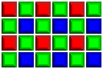
Every digital image consists of a fundamental small-scale descriptor: THE PIXEL, invented by combining the words “PICture ELement.” Each pixel contains a series of numbers which describe its color or intensity. The precision to which a pixel can specify color is called its bit or color depth. The more pixels your image contains, the more detail it has the ability to describe (although more pixels alone don’t necessarily result in more detail; more on this later).
PRINT SIZE: PIXELS PER INCH vs. DOTS PER INCH
Since a pixel is just a unit of information, it is useless for describing real-world prints — unless you also specify their size. The terms pixels per inch (PPI) and dots per inch (DPI) were both introduced to relate this theoretical pixel unit to real-world visual resolution. These terms are often inaccurately interchanged — misleading the user about a device’s maximum print resolution (particularly with inkjet printers).
“Pixels per inch” (PPI) is the more straightforward of the two terms. It describes just that: how many pixels an image contains per inch of distance (horizontally or vertically). PPI is also universal because it describes resolution in a way that doesn’t vary from device to device.
“Dots per inch” (DPI) may seem deceptively simple at first, but the complication arises because multiple dots are often needed to create a single pixel — and this varies from device to device. In other words, a given DPI does not always lead to the same resolution. Using multiple dots to create each pixel is a process called “dithering.”
Printers use dithering to create the appearance of more colors than they actually have. However, this trick comes at the expense of resolution, since dithering requires each pixel to be created from an even smaller pattern of dots. As a result, images will require more DPI than PPI in order to depict the same level of detail.
In the above example, note how the dithered version is able to create the appearance of 128 pixel colors — even though it has far fewer dot colors (only 24). However, this result is only possible because each dot in the dithered image is much smaller than the pixels.
The standard for prints done in a photo lab is about 300 PPI, but inkjet printers require several times this number of DPI (depending on the number of ink colors) for photographic quality. The required resolution also depends on the application; magazine and newspaper prints can get away with much less than 300 PPI.
However, the more you try to enlarge a given image, the lower its PPI will become…
MEGAPIXELS AND MAXIMUM PRINT SIZE
A “megapixel” is simply a million pixels. If you require a certain resolution of detail (PPI), then there is a maximum print size you can achieve for a given number of megapixels. The following chart gives the maximum print sizes for several common camera megapixels.
# of Megapixels
Maximum 3:2 Print Size
at 300 PPI:
at 200 PPI:
2
5.8″ x 3.8″
8.7″ x 5.8″
3
7.1″ x 4.7″
10.6″ x 7.1″
4
8.2″ x 5.4″
12.2″ x 8.2″
5
9.1″ x 6.1″
13.7″ x 9.1″
6
10.0″ x 6.7″
15.0″ x 10.0″
8
11.5″ x 7.7″
17.3″ x 11.5″
12
14.1″ x 9.4″
21.2″ x 14.1″
16
16.3″ x 10.9″
24.5″ x 16.3″
22
19.1″ x 12.8″
28.7″ x 19.1″
Note how a 2 megapixel camera cannot even make a standard 4×6 inch print at 300 PPI, whereas it requires a whopping 16 megapixels to make a 16×10 inch photo. This may be discouraging, but do not despair! Many will be happy with the sharpness provided by 200 PPI, although an even lower PPI may suffice if the viewing distance is large (see “Digital Photo Enlargement“). For example, most wall posters are often printed at less than 200 PPI, since it’s assumed that you won’t be inspecting them from 6 inches away.
CAMERA & IMAGE ASPECT RATIO
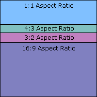
The print size calculations above assumed that the camera’s aspect ratio, or ratio of longest to shortest dimension, is the standard 3:2 used for 35 mm cameras. In fact, most compact cameras, monitors and TV screens have a 4:3 aspect ratio, while most digital SLR cameras are 3:2. Many other types exist though: some high end film equipment even use a 1:1 square image, and DVD movies are an elongated 16:9 ratio.
This means that if your camera uses a 4:3 aspect ratio, but you need a 4 x 6 inch (3:2) print, then some of your megapixels will be wasted (11%). This should be considered if your camera has a different ratio than the desired print dimensions.
Pixels themselves can also have their own aspect ratio, although this is less common. Certain video standards and earlier Nikon cameras have pixels with skewed dimensions.
SENSOR SIZE: NOT ALL PIXELS ARE CREATED EQUAL
Even if two cameras have the same number of pixels, it does not necessarily mean that the size of their pixels are also equal. The main distinguishing factor between a more expensive digital SLR and a compact camera is that the former has a much greater digital sensor area. This means that if both an SLR and a compact camera have the same number of pixels, the size of each pixel in the SLR camera will be much larger.
Compact Camera Sensor SLR Camera Sensor
Why does one care about how big the pixels are? A larger pixel has more light-gathering area, which means the light signal is stronger over a given interval of time.
This usually results in an improved signal to noise ratio (SNR), which createsa smoother and more detailed image. Furthermore, the dynamic range of the images (range of light to dark which the camera can capture without becoming either black or clipping highlights) also increases with larger pixels. This is because each pixel well can contain more photons before it fills up and becomes completely white.
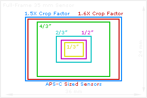
The diagram below illustrates the relative size of several standard sensor sizes on the market today. Most digital SLR’s have either a 1.5X or 1.6X crop factor (compared to 35 mm film), although some high-end models actually have a digital sensor which has the same area as 35 mm. Sensor size labels given in inches do not reflect the actual diagonal size, but instead reflect the approximate diameter of the “imaging circle” (not fully utilized). Nevertheless, this number is in the specifications of most compact cameras.
Why not just use the largest sensor possible? The main disadvantage of having a larger sensor is that they are much more expensive, so they are not always beneficial.
Does all this mean it is bad to squeeze more pixels into the same sensor area? This will usually produce more noise, but only when viewed at 100% on your computer monitor. In an actual print, the higher megapixel model’s noise will be much more finely spaced — even though it appears noisier on screen (see “Image Noise: Frequency and Magnitude“). This advantage usually offsets any increase in noise when going to a larger megapixel model (with a few exceptions).
NOTE: To be completed. I want to take a practical course on digital printing with the Camera Club and study this in depth.
If commercial print companies are used see image guidelines for each lab. Images need to be either JPEG or TIFF), with whatever colour profile is required by the printer (usually Adobe 1998 RGB or sRGB) at the specified resolution (usually 300 dpi) and at the exact dimensions required.
The Task
It’s not a requirement to submit prints for formal assessment, so you may choose to submit your work on the self-directed project in a different format, such as a book or a multi-media piece. However for the purposes of this exercise please imagine that you’re going to submit prints. 1. Search the internet for different companies offering inkjet and C-type printing. Compile three quotes for getting your work professionally printed, with a variety of different options such as C-type or inkjet, for portfolio review. (The pictures don’t need to be framed or mounted.) Prices will be available on the companies’ websites. This kind of information is useful to inform your project proposal. 2. Imagine you will order from one of these companies. Prepare one image file exactly as specified by the printers. Please note that you don’t actually need to have your work printed professionally in order to complete this exercise. 3. Write a brief entry in your learning log, reflecting on whether or not you feel that an inkjet can be treated as a ‘photograph’.
Different labs providing C-type printing use different machines and different brands of papers that will produce subtly different results and varying levels of quality. Some companies often offer postal services, such as sending test strips for you to assess, so you can instruct their technicians to make any adjustments to the exposure or colour balance before making the final print. They will then store the adjusted file for any future editions.
Inkjet printers use an array of different colours and tones of ink that are applied onto specially coated paper. Inkjet prints can be produced on inexpensive domestic printers to make prints up to A4 size, A3+ printers can be bought from eg Canon and Epson for slightly more. Costly ‘large format’ printers that can produce prints up to 1.6 metres wide and potentially many metres long (as long as the roll of paper that the printer can accommodate).
Inkjet prints have had a negative reputation compared to traditional C-type prints for two main reasons. Firstly, cheap inkjet prints are more prone to fading by exposure to daylight – but some manufacturers now claim that their products can last at least as long (around 40 years). Secondly, technically they are not ‘photographic’ [ie light-writing] prints but prints of photographic images. This means many serious collectors may not buy inkjet prints.
As well as making slightly larger sized prints, inkjet prints can offer greater black and white contrast and more vivid colour saturation. They also allow for printing on a wider range of paper types.
Many established photographers make and sell archival quality inkjet prints (calling them giclee, Iris or archival pigment prints) printed on fine art papers.
See:
Mari Mahr website has monochrome archival pigment prints alongside more traditional black and white photographic prints.
Most cheap inkjet printers can make useful ‘work prints’, soft proofs, and important learning log material (if you’re keeping a physical log). Investing in a high-end inkjet printer is only worthwhile if you intend to make quite a lot of prints regularly and put significant time into learning how to get the best performance from it. Ink cartridges are expensive, particularly quality professional inks, and if the photographic printer is not used frequently (i.e. weekly), the print heads can become clogged, leaving unsightly ‘banding’ on the image. Regular cleaning can prevent this, although it does waste ink. Some printers can be modified to accept what is known as a ‘continuous ink feed’ instead of cartridges, which will reduce ink costs considerably.
Papers vary in surface (i.e. gloss, semigloss/ lustre, matt), rag content, colour and texture. Different paper stocks vary in how they respond to the printer’s ink, and will absorb ink in different quantities. Different printer profiles need to be set in the printing software for different types of paper to avoid unwanted colour casts and get the right level of contrast.
Giclee, archival pigment or Iris prints
Giclée is the name given to inkjets by professional printers and artists, although this term is unregulated. The term ‘Giclée’, a neologism coined by French printmaker Jack Duganne, is derived from the French verb ‘gicler’, which literally translates as ‘to squirt’ or ‘to spray’ and describes the way that the printer nozzle applies the inks – or pigment inks – to the paper. Duganne chose the term as he was looking for a word which would not have the negative connotations then associated with the terms ‘inkjet’ which had happened due to fading occurring in early prints.
While the term ‘Giclée’ originally referred to fine art prints created on IRIS printers (large format colour inkjet printers which became prevalent in the 1980’s) the term ‘Giclée’ has since been used in a wider sense to describe any prints made using an inkjet process. These prints are also often known as ‘pigment prints’ because of the inks (which contains miniature particles of colour, or pigment, suspended in a neutral carrier liquid) that are laid down by a digital printer. We use both ‘Giclée print’ and ‘Pigment print’ to describe an archival grade inkjet print produced directly to fine art paper.
Anyone claiming to produce giclée prints should be using the best quality archival inks and equally high quality paper, with professional colour calibration of the print to the monitor.
For more video tutorials on Inkjet printing and up-to-date reviews of different printers see: See You Tube videos
Traditionally the photograph has been considered in terms of a print, and the high point of recognition for a photographer being an exhibition of their prints in a Fine Art Gallery. Galleries may present very different types of space in terms of lighting conditions, amounts and shape of space and general ‘feel’. But a tendency has been to galleries presenting white ‘neutral’ space. However the apparent ‘neutrality’ of this space needs to be questioned in terms of the implicit meanings this imposes on the image and the presumed ’empty mind’ of the viewer.
I would argue that a more interesting approach would be to acknowledge the importance of both context and the viewer’s life experience in giving meaning to the image, as valuable and integral parts of the art itself. This could mean displaying the same image in different conditions and explicitly promoting discussion of the ways that different life perspectives and everyday experiences of different viewers affect the meanings attributed. This could in turn lead photographers to discover ever more interesting perspectives and innovative approaches to their own work.
For the moment I do not have the equipment or skills to produce for gallery exhibition.
Look at some of the audio-visual slideshows on the websites listed above. Make some notes about particular works of interest, considering how they are edited, sequenced and how audio is used with images. Note down your own personal observations. (See Post Time-based audio-visual presentations)
Whether or not you intend to present your photographs for Assignment Five as an audiovisual piece, suppose for this exercise that you will. Familiarise yourself with any basic slideshow – or video-making software and compile an edit of your work, experimenting with transitions, text and music and/or sound effects. Save your work so that your tutor and/or an assessor can view this if necessary. Write a brief evaluation of your work, commenting on how appropriate and effective you think this medium is for presenting your photographs.
I was not able to complete this exercise because of RSI.
I have used automated slideshows on both this blog and the zemniimages website as a way of showing many photos in sequence on journeys. See:
These all need more work on sequencing to control the impacts as automated slideshows. This is not so straightforward on SmugMug and requires a lot of clicking to deselect and reselect many images – and hence gives RSI. I need to do one page for each set of images, and am planning this for the summer when I have less professional computer work to do.
I do a lot of simple video work in Lightroom and Adobe Premiere for work. The only one containing landscape photos is:
Maendeleo Yetu on You Tube (done quite quickly and still needs more editing)
I am planning at some point to develop the colour images of Baizakh village as audio-visual presentations in Adobe Premiere. I would like to do something more complex with the Storm over T’ian Shen images in Adobe After Effects. But I get RSI if I do too much video work. So this will have to wait until I have a lot less other work. I also need to find suitable music – or compose my own in Adobe audition. I will be updating my skills in both Audition and Premiere this year for work. I will be developing skills in After Effects for my Illustration level 2 course.
Reflections on: Thomas McEvilley’s summary of O’Doherty’s 1976 series of articles for ArtForum in his introduction to O’Doherty, B (1999) Inside the White Cube: The Ideology of the Gallery Space University of California Press
Traditionally the photograph has been considered in terms of a print, and the high point of recognition for a photographer being an exhibition of their prints in a Fine Art Gallery. Galleries may present very different types of space in terms of lighting conditions, amounts and shape of space and general ‘feel’. But a tendency has been to galleries presenting white ‘neutral’ space. However the apparent ‘neutrality’ of this space needs to be questioned in terms of the implicit meanings this imposes on the image and the presumed ’empty mind’ of the viewer.
I would argue that a more interesting approach would be to acknowledge the importance of both context and the viewer’s life experience in giving meaning to the image, as valuable and integral parts of the art itself. This could mean displaying the same image in different conditions and explicitly promoting discussion of the ways that different life perspectives and everyday experiences of different viewers affect the meanings attributed. This could in turn lead photographers to discover ever more interesting perspectives and innovative approaches to their own work.
For the moment I do not have the equipment or skills to produce for gallery exhibition.
Summary of the article
The main argument underlying the three articles is that the modernist gallery practice of placing artworks in a ‘White Cube’ places them in a sterile environment, depriving them of both connection to outside life and subjective meaning to the viewer, perpetuating the power of an art establishment elite.
The first of O’Doherty’s articles equates the physical space of the White Cube – windows sealed off and white walls with ceiling lights – to religious spaces and tombs designed to maintain particular social orders and power structures. ‘Art exists in a kind of eternity of display, and though there is lots of ‘period’ (late modern) there is no time. This eternity gives the gallery a limbolike status; one has to have died already to be there.’
‘The eternity suggested in our exhibition spaces is ostensibly that of artistic posterity, of underlying beauty, of the masterpiece. But in fact it is a specific sensibility, with specific limitations and conditions that is so glorified. By suggesting eternal ratification of a certain sensibility, the white cube suggests the eternal ratification of the claims of the caste or group sharing that sensibility. As a ritual place of meeting for members of that caste or group, it censors out the world of social variation, promoting a sense of the sole reality of its own point of view and, consequently, its endurance or eternal rightness. Seen thus, the endurance of a certain power structure is the end for which the sympathetic magic of the white cube is devised.’
The second part of the article looks at what this institutionalisation for the spectator ‘In return for the glimpse of ersatz eternity that the white cube affords us – and as a token of our solidarity with the special interests of a group – we give up our humanness and become the cardboard Spectator with the disembodied Eye…tireless and above the vicissitudes of chance and change’ and its underpinnings in modernist aesthetics of formalism and abstraction in the search for ‘transcendence’.
The final part of the article looks at the anti-formalist tradition that questioned and mocked the emptiness and meaninglessness of this white space.
My reflections
Both the original 1976 article and the 1999 book are now quite old, and have – as the end of the article suggests and also the anti-formalist tradition and critique of modernism – now become part of the ‘Canon’.
In relation to photography, the exclusive dominance of the ‘White Cube’ as an aesthetic guardian never really existed – despite the authority of organisations like the Royal Photographic Society. Photography by its nature is copiable, and the wide availability of cheaper cameras has always made it less exclusive. Local camera clubs and their exhibitions have been popular for a very long time – few being able to replicate the ‘ideal gallery conditions’. Technological advances with digital software and the Internet and possibilities for mass self-publishing have significantly increased the production and dissemination options.
There is nevertheless a continuing question of ‘quality’ and relationship of photography to the Fine Art world. There has been an expansion of private and public gallery spaces in large cities like London (eg but not only Photographer’s Gallery) where photography is displayed as ‘White Cube Fine Art’. Work of photographers is now commonly curated as Fine Art exhibitions in galleries like the Tate (See http://www.tate.org.uk/search?q=Photography), National Gallery (https://www.nationalgallery.org.uk/search?q=photographers), and National Portrait Gallery. This inevitably raises issues of the power of the curator and the degree to which they promote or challenge established aesthetic ideas.
In order to justify its display in a gallery such photography has to be ‘special’ – for example very large format images that can only be displayed in a gallery, abstraction or innovative use of traditional or digital techniques or drama in depiction of war and conflict. The gallery space and time is also inevitably a specific time that people set aside to visit a specific space – many after a long and expensive special journey. This means that certain norms of respect for the space and time of other visitors needs to be respected. Normally also the ’empty mind’ to absorb the ‘meaning of the works’ is seen as the ideal – together with reading of books etc on the photographer and work. This is true even of OCA Study visits.
One way possible with photography would be to present prints of the same photograph in very different conditions and spaces as part of the same exhibition, or linked displays. Making the question of context an integral part.
Another way to go beyond the ’empty mind’ approach (even in a White Cube gallery) would be not to replicate in photography the now somewhat cliche anti-formalist exhibitions, but to explicitly encourage the viewers to bring in and exchange ideas from their respective ‘outside worlds’. What does the same photograph, displayed in the same conditions mean to people with very different life experiences? That differential audience response – and even its day by day variation – is an integral part of the meaning. This would however need to go beyond the superficial recording of reactions in visitor’s books etc.
Embracing rather than avoiding this diversity of contextual and audience meaning could lead to exciting new directions for photographers themselves. With the many digital processing options, different contextual effects could be mixed and explored to replicate or challenge them. The very different viewer responses could lead to further processing experiments and/or new images. This also opens up the possibility of more imaginative galleries themselves.
We have also not yet seen the full effects of a move towards ‘virtual galleries’ that can (with virtual reality goggles) replicate the gallery experience – either a White Cube in one’s own home. Or infinite variations and user-generated interpretations.




 SLR Camera Sensor