Category: History

  • Photobooks: Inspiration

    Types of Photobook

    Surveys and catalogues
    • catalogues for exhibitions
    • ‘Survey’ publications draw together a collection of individual images or a group of practitioners working in a similar area. Some surveys seem more didactic or directed at the art market, such as 50 Photographers You Should Know (2008), Vitamin Ph: New Perspectives in Photography (2009), reGeneration: 50 Photographers of Tomorrow (2005) and reGeneration 2: Tomorrow’s Photographers Today (2010).
    Monographs and artists’ books Monographs are mass-produced (relatively speaking), but often they are the primary context for the photographic work. A monograph published to coincide with an exhibition of an artist’s work may  draw together several different bodies of work, but it will be devoted to one practitioner alone. An artist’s book may be produced in editions, but is generally more individual in terms of its design, the materials used and the printing technique or finish. Some may be printed, stencilled, stitched and embossed by the maker themselves. Others will be a collaboration with a professional bookbinder and a graphic designer. Early photobooks Many of these were topographic images for travel and tourism.
    • Francis Frith photographs from travels to Middle and Far East
    • John Thomson photographs from travels to Middle and Far East
    • Maxime Du Camp (1822–94)
    • Auguste Salzmann (1824–72)
    • Josiah Dwight Whitney (1819–96) published The Yosemite Book in 1868.
    Some developed more innovative design
    • Soviet and Fascist propaganda books with novel design features, such as fold-out pages that extend the dimensions of an image

    Inspiration

    I have a large collection, but not had time to look through or properly review apart from getting some layout ideas.

    Colour

    • Martin Parr: documentary photographer. Some of his works have been mass produced and re-printed (e.g. The Last Resort, 1986 and 1998); others have been limited editions or even more exclusive artist’s books such as Cherry Blossom Time in Tokyo, 2001. See: www.martinparr.com/books/. Layout in Last Resort has one, or very occasionally two, large images per spread, with white margin around and no border. This focuses attention on the content of the socially complex saturated colour images. There is a short introductory text at the beginning.
    • Paul Seawright : Invisible Cities a very large hardback book of colour images. Some images are full bleed crossing the whole spread, sometimes with some space to one side or top/bottom. Other spreads have only one half page image generally placed full bleed to one corner with the rest of the spread as white space. There is a text introduction to African cities at the beginning.
    • Urbex ‘Beauty in Decay’ this has beautiful limited palette images . The book is divided into chapters with some introductory text. But the book is mostly large images with  whitespace. Some images and spreads are on black background. A few text passages are on beige background. Some have black or white boders and vignettes to increase contrast.

    Black and white

    • Daido Moriyama  Tales of Tono – small portrait format book of very high contrast black and white images. Full bleed in landscape across a double spread on black background. This makes the abstract flashes of white shapes in the often barely readable images standout. Text is reserved for a narrative section at the end. I like the moodiness of this book and all the images demand close attention in themselves, as well as producing an overall edgy impression as a apparently random narrative.
    • Algirdas Seskus ‘Love Lyrics’ Lithuanian 149 contrasty documentary Black and White images in landscape format. No text except the number of each photo and date. One or two large images per spread. No border with generous white margin.
    • Arunas Baltenas  Vilnius  2007 images from 1987. Small misty sepia images one per spread with no border and lots of white space. Delicate handwritten titles and date. One page introduction in English and Lithuanian at the beginning. No other text. I find the delicate nostalgia of this book really beautiful.
    • Henri Cartier Bresson in India  Thames and Hudson. 1987 with forward by Bengali film director Satyajit Ray. One large black and white photo per page with short caption. Black border on white paper. Occasionally one large and one small. The images themselves are quite low contrast. The black border makes the eye focus inwards.
    At the Brighton Photography Biennial I saw a lot of interesting innovative designs, but did not have time to note all the details.
    • David Galjaard Concresco. A book about Albania. Has a brown opening cover with short explanatory text. Then  double page spreads with small white text insert pages. For this and other work see his website: http://www.davidgaljaard.nl
    • Dara McGrath ‘Deconstructing the Maze’  This has two coloured photographs on one side and page of text on the other. The strength here is in the photos. For this and other work see his website http://www.daramcgrath.com/index.html
    • Xavier Ribas  ‘Concrete Geographies’.  Photos of concrete blocks in Barcelona. See his website: http://www.xavierribas.com. This has inside views and links to vimeos of other books like Sanctuary – no text, one photo per spread. Sometimes a cross-over image. But the onscreen resolution is not good enough to really see the images.
    • Alessandro Rota A Neocolonialist’s diary.  Small paisley pattern cover. Coloured photos of sheets in Lusaka. Dark night streets. Lights. See his website . And vimeo of the book. https://vimeo.com/28099164
    • Irene Siragusa ‘Six weeks in Dublin’.   Lots of photos of spattered blood. Small juxtaposed rectangular images. website
    Unknown author/title glimpsed over other peoples’ shoulders:
    • Book with glued images folded.
    • Aids (author???).  Small and simple brown cover. Photos of slits one on a page opposite a blank page.

     Sources and overviews

    • The Photobook: A History, Volumes I,  ll and III Gerry Badger and Martin Parr
    • The Chinese Photobook: Martin Parr and Wassink Lundgren from the Photographer’s Gallery exhibition
    • Japanese Photobooks of the 1960s and ’70s Ryuichi Kaneko and Ivan Vartanian
    • Channels on YouTube and Vimeo with videos of certain books;
    • Tate video about William Klein which shows his assistant with one of Klein’s early maquettes:
    •  José Navarro discussing OCA students’ photobooks
    OCA Student links Joe Wright

    Assignment 5: Perspectives on Kyrgyztstan

    ————————————-

    Photobooks offer a tactile one-to-one viewing experience for the reader were they control the place and time.  Photographer/designer can give detailed narrative guidance through the images by linear sequencing and juxtaposition in page layout. At the same time, the reader is freer to override this design and establish their own viewing experience.

    !! Rough notes and links. !! To be significantly updated for assessment with detailed

    Photobook Key Inspiration

    https://illustration.zemniimages.info/martin-parr
    https://illustration.zemniimages.info/alec-soth

    !! Sketchbook analysis of page design and layout of key sources of inspiration. bearing in mind copyright issues.

    Photobook History

    Early photobooks

    Many of these were topographic images for travel and tourism.

    • Francis Frith photographs from travels to Middle and Far East
    • John Thomson photographs from travels to Middle and Far East
    • Maxime Du Camp (1822–94)
    • Auguste Salzmann (1824–72)
    • Josiah Dwight Whitney (1819–96) published The Yosemite Book in 1868.

    Some developed more innovative design

    • Soviet and Fascist propaganda books with novel design features, such as fold-out pages that extend the dimensions of an image
    • Japanese Photobooks
    Colour
    • Martin Parr: documentary photographer. Some of his works have been mass produced and re-printed (e.g. The Last Resort, 1986 and 1998); others have been limited editions or even more exclusive artist’s books such as Cherry Blossom Time in Tokyo, 2001. See: www.martinparr.com/books/. Layout in Last Resort has one, or very occasionally two, large images per spread, with white margin around and no border. This focuses attention on the content of the socially complex saturated colour images. There is a short introductory text at the beginning.
    • Paul Seawright : Invisible Cities a very large hardback book of colour images. Some images are full bleed crossing the whole spread, sometimes with some space to one side or top/bottom. Other spreads have only one half page image generally placed full bleed to one corner with the rest of the spread as white space. There is a text introduction to African cities at the beginning.
    • Urbex ‘Beauty in Decay’ this has beautiful limited palette images . The book is divided into chapters with some introductory text. But the book is mostly large images with  whitespace. Some images and spreads are on black background. A few text passages are on beige background. Some have black or white boders and vignettes to increase contrast.
    https://illustration.zemniimages.info/martin-parr
    https://illustration.zemniimages.info/urbex
    Black and white
    • Daido Moriyama  Tales of Tono – small portrait format book of very high contrast black and white images. Full bleed in landscape across a double spread on black background. This makes the abstract flashes of white shapes in the often barely readable images standout. Text is reserved for a narrative section at the end. I like the moodiness of this book and all the images demand close attention in themselves, as well as producing an overall edgy impression as a apparently random narrative.
    • Algirdas Seskus ‘Love Lyrics’ Lithuanian 149 contrasty documentary Black and White images in landscape format. No text except the number of each photo and date. One or two large images per spread. No border with generous white margin.
    • Arunas Baltenas  Vilnius  2007 images from 1987. Small misty sepia images one per spread with no border and lots of white space. Delicate handwritten titles and date. One page introduction in English and Lithuanian at the beginning. No other text. I find the delicate nostalgia of this book really beautiful.
    • Henri Cartier Bresson in India  Thames and Hudson. 1987 with forward by Bengali film director Satyajit Ray. One large black and white photo per page with short caption. Black border on white paper. Occasionally one large and one small. The images themselves are quite low contrast. The black border makes the eye focus inwards.

    !! Insert annotated sketchbook pages of Flatpans of these and other selected photobooks.

    Contemporary Photobooks

    At the Brighton Photography Biennial 2016 I saw a lot of interesting innovative designs:

    • David Galjaard Concresco. A book about Albania. Has a brown opening cover with short explanatory text. Then  double page spreads with small white text insert pages. For this and other work see his website: http://www.davidgaljaard.nl
    • Dara McGrath ‘Deconstructing the Maze’  This has two coloured photographs on one side and page of text on the other. The strength here is in the photos. For this and other work see his website http://www.daramcgrath.com/index.html
    • Xavier Ribas  ‘Concrete Geographies’.  Photos of concrete blocks in Barcelona. See his website: http://www.xavierribas.com. This has inside views and links to vimeos of other books like Sanctuary – no text, one photo per spread. Sometimes a cross-over image. But the onscreen resolution is not good enough to really see the images.
    • Alessandro Rota A Neocolonialist’s diary.  Small paisley pattern cover. Coloured photos of sheets in Lusaka. Dark night streets. Lights. See his website . And vimeo of the book. https://vimeo.com/28099164
    • Irene Siragusa ‘Six weeks in Dublin’.   Lots of photos of spattered blood. Small juxtaposed rectangular images. website

    Unknown author/title glimpsed over other peoples’ shoulders:

    • Book with glued images folded.
    • Aids (author???).  Small and simple brown cover. Photos of slits one on a page opposite a blank page.

    !! Insert annotated sketchbook pages of Flatpans of these and other selected photobooks.

    Photobook How To

    https://photography.zemniimages.info/photobooks-publishing/

    https://www.youtube.com/watch?v=FJCLNKoZ8gE

    https://youtu.be/OxlgFLIfOSE

     Sources and overviews

    To do a proper annotated bibliography of a selection of the many photobooks I have in my library. Linked to the annotated sketchbook analysis.

    • The Photobook: A History, Volumes I,  ll and III Gerry Badger and Martin Parr
    • The Chinese Photobook: Martin Parr and Wassink Lundgren from the Photographer’s Gallery exhibition
    • Japanese Photobooks of the 1960s and ’70s Ryuichi Kaneko and Ivan Vartanian
    • Channels on YouTube and Vimeo with videos of certain books;
    • Tate video about William Klein which shows his assistant with one of Klein’s early maquettes:
    •  José Navarro discussing OCA students’ photobooks
  • Beginnings of Photography

    (edited from Wikipedia various)

    The word “photography” was created from the Greek roots φωτός (phōtos), genitive of φῶς (phōs), “light” and γραφή (graphé) “representation by means of lines” or “drawing”, together meaning “drawing with light”.

    Wikipedia links:  History of photography History of the camera

    Several people may have coined the same new term from these roots independently. Hercules Florence, a French painter and inventor living in Campinas, Brazil, used the French form of the word, photographie, in private notes which a Brazilian photography historian believes were written in 1834. Johann von Maedler, a Berlin astronomer, is credited in a 1932 German history of photography as having used it in an article published on 25 February 1839 in the German newspaper Vossische Zeitung. Both of these claims are now widely reported but apparently neither has ever been independently confirmed as beyond reasonable doubt.

    Credit has traditionally been given to Sir John Herschel both for coining the word and for introducing it to the public. His uses of it in private correspondence prior to 25 February 1839 and at his Royal Society lecture on the subject in London on 14 March 1839 have long been amply documented and accepted as settled facts.

    Precursor technologies

    Photography is the result of combining several technical discoveries.

    Pinhole camera or camera obscura: The camera obscura literally means “dark chamber” in Latin. It is a box with a hole in it which allows light to go through and create an image onto the piece of paper. The discovery of the camera obscura that provides an image of a scene dates back to ancient China.  Chinese philosopher Mo Di and Greek mathematicians Aristotle and Euclid described a pinhole camera in the 5th and 4th centuries BCE. In the 6th century CE, Byzantine mathematician Anthemius of Tralles used a type of camera obscura in his experiments, Ibn al-Haytham (Alhazen) (965–1040) studied the camera obscura and pinhole camera. Renaissance painters used the camera obscura which, in fact, gives the optical rendering in color that dominates Western Art. Leonardo da Vinci mentions natural cameras obscura that are formed by dark caves on the edge of a sunlit valley. A hole in the cave wall will act as a pinhole camera and project a laterally reversed, upside down image on a piece of paper.

    Methods of reproducing and fixing the image: Silver Nitrate and Silver Chloride: Albertus Magnus (1193–1280) discovered silver nitrate,[12] and Georg Fabricius (1516–71) discovered silver chloride. Techniques described in the Book of Optics are capable of producing primitive photographs using medieval materials. Daniele Barbaro described a diaphragm in 1566. Wilhelm Homberg described how light darkened some chemicals (photochemical effect) in 1694. The fiction book Giphantie, published in 1760, by French author Tiphaigne de la Roche, described what can be interpreted as photography.

    The first success of reproducing images without a camera occurred when Thomas Wedgwood, from the famous family of potters, obtained copies of paintings on leather using silver salts. Since he had no way of permanently fixing those reproductions (stabilizing the image by washing out the non-exposed silver salts), they would turn completely black in the light and thus had to be kept in a dark room for viewing.

    First camera photography (1820s)

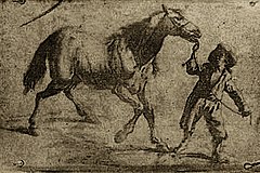
    Photography as a usable process dates to the 1820s with the discovery of chemical photography. The first permanent photoetching was an image produced in 1822 by the French inventor Nicéphore Niépce, but it was destroyed in a later attempt to make prints from it. Niépce was successful again in 1825. He made the View from the Window at Le Gras, the earliest surviving photograph from nature (i.e., of the image of a real-world scene, as formed in a camera obscura by alens), in 1826 or 1827.

    Earliest known surviving heliographic engraving, 1825, printed from a metal plate made by Joseph Nicéphore Niépce with his “heliographic process”. The plate was exposed under an ordinary engraving and copied it by photographic means. This was a step towards the first permanent photograph from nature taken with a camera obscura, in 1826.

    Because Niépce’s camera photographs required an extremely long exposure (at least eight hours and probably several days), he sought to greatly improve his bitumen process or replace it with one that was more practical. Working in partnership with Louis Daguerre, he discovered a somewhat more sensitive process that produced visually superior results, but it still required a few hours of exposure in the camera. Niépce died in 1833 and Daguerre then redirected the experiments toward the light-sensitive silver halides, which Niépce had abandoned many years earlier because of his inability to make the images he captured with them light-fast and permanent. Daguerre’s efforts culminated in what would later be named the daguerreotype process, the essential elements of which were in place in 1837. The required exposure time was measured in minutes instead of hours. Daguerre took the earliest confirmed photograph of a person in 1838 while capturing a view of a Paris street: unlike the other pedestrian and horse-drawn traffic on the busy boulevard, which appears deserted, one man having his boots polished stood sufficiently still throughout the approximately ten-minute-long exposure to be visible. Eventually, France agreed to pay Daguerre a pension for his process in exchange for the right to present his invention to the world as the gift of France, which occurred on 19 August 1839.

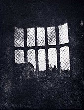
    A latticed window inLacock Abbey, England, photographed by William Fox Talbot in 1835. Shown here in positive form, this may be the oldest extant photographic negative made in a camera.

    Meanwhile, in Brazil, Hercules Florence had already created his own process in 1832, naming it Photographie, and an English inventor, William Fox Talbot, had created another method of making a reasonably light-fast silver process image but had kept his work secret. After reading about Daguerre’s invention in January 1839, Talbot published his method and set about improving on it. At first, like other pre-daguerreotype processes, Talbot’s paper-based photography typically required hours-long exposures in the camera, but in 1840 he created the calotype process, with exposures comparable to the daguerreotype. In both its original and calotype forms, Talbot’s process, unlike Daguerre’s, created a translucent negative which could be used to print multiple positive copies, the basis of most chemical photography up to the present day. Daguerreotypes could only be replicated by rephotographing them with a camera.[21] Talbot’s famous tiny paper negative of the Oriel window in Lacock Abbey, one of a number of camera photographs he made in the summer of 1835, may be the oldest camera negative in existence.[22][23]

    John Herschel made many contributions to the new field. He invented the cyanotype process, later familiar as the “blueprint”. He was the first to use the terms “photography”, “negative” and “positive”. He had discovered in 1819 that sodium thiosulphate was a solvent of silver halides, and in 1839 he informed Talbot (and, indirectly, Daguerre) that it could be used to “fix” silver-halide-based photographs and make them completely light-fast. He made the first glass negative in late 1839.

    In the March 1851 issue of The Chemist, Frederick Scott Archer published his wet plate collodion process. It became the most widely used photographic medium until the gelatin dry plate, introduced in the 1870s, eventually replaced it. There are three subsets to the collodion process; the Ambrotype (a positive image on glass), the Ferrotype or Tintype (a positive image on metal) and the glass negative, which was used to make positive prints on albumen or salted paper.

    Many advances in photographic glass plates and printing were made during the rest of the 19th century. In 1884, George Eastman invented an early type of film to replace photographic plates, leading to the technology used by film cameras today.

    In 1891, Gabriel Lippmann introduced a process for making natural-color photographs based on the optical phenomenon of the interference of light waves. His scientifically elegant and important but ultimately impractical invention earned him the Nobel Prize for Physics in 1908.

  • Colour Photography

    Wikipedia to be properly edited with links
    Main article: Color photography

    Color photography was possible long before Kodachrome, as this 1903 portrait by Sarah Angelina Aclanddemonstrates, but in its earliest years the need for special equipment, long exposures and complicated printing processes made it extremely rare.

    A photographic darkroom withsafelight

    Color photography was explored beginning in the mid-19th century. Early experiments in color required extremely long exposures (hours or days for camera images) and could not “fix” the photograph to prevent the color from quickly fading when exposed to white light.

    The first permanent color photograph was taken in 1861 using the three-color-separation principle first published by physicist James Clerk Maxwell in 1855. Maxwell’s idea was to take three separate black-and-white photographs through red, green and blue filters. This provides the photographer with the three basic channels required to recreate a color image.

    Transparent prints of the images could be projected through similar color filters and superimposed on the projection screen, an additive method of color reproduction. A color print on paper could be produced by superimposing carbon prints of the three images made in their complementary colors, a subtractive method of color reproduction pioneered by Louis Ducos du Hauronin the late 1860s.

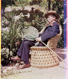
    Russian photographer Sergei Mikhailovich Prokudin-Gorskii made extensive use of this color separation technique, employing a special camera which successively exposed the three color-filtered images on different parts of an oblong plate. Because his exposures were not simultaneous, unsteady subjects exhibited color “fringes” or, if rapidly moving through the scene, appeared as brightly colored ghosts in the resulting projected or printed images.

    Implementation of color photography was hindered by the limited sensitivity of early photographic materials, which were mostly sensitive to blue, only slightly sensitive to green, and virtually insensitive to red. The discovery of dye sensitization by photochemist Hermann Vogel in 1873 suddenly made it possible to add sensitivity to green, yellow and even red. Improved color sensitizers and ongoing improvements in the overall sensitivity of emulsions steadily reduced the once-prohibitive long exposure times required for color, bringing it ever closer to commercial viability.

    Autochrome, the first commercially successful color process, was introduced by the Lumière brothers in 1907. Autochrome plates incorporated a mosaic color filter layer made of dyed grains of potato starch, which allowed the three color components to be recorded as adjacent microscopic image fragments. After an Autochrome plate was reversal processed to produce a positive transparency, the starch grains served to illuminate each fragment with the correct color and the tiny colored points blended together in the eye, synthesizing the color of the subject by the additive method. Autochrome plates were one of several varieties of additive color screen plates and films marketed between the 1890s and the 1950s.

    Kodachrome, the first modern “integral tripack” (or “monopack”) color film, was introduced by Kodak in 1935. It captured the three color components in a multilayer emulsion. One layer was sensitized to record the red-dominated part of the spectrum, another layer recorded only the green part and a third recorded only the blue. Without special film processing, the result would simply be three superimposed black-and-white images, but complementary cyan, magenta, and yellow dye images were created in those layers by adding color couplers during a complex processing procedure.

    Agfa’s similarly structured Agfacolor Neu was introduced in 1936. Unlike Kodachrome, the color couplers in Agfacolor Neu were incorporated into the emulsion layers during manufacture, which greatly simplified the processing. Currently available color films still employ a multilayer emulsion and the same principles, most closely resembling Agfa’s product.

    Instant color film, used in a special camera which yielded a unique finished color print only a minute or two after the exposure, was introduced by Polaroid in 1963.

    Color photography may form images as positive transparencies, which can be used in a slide projector, or as color negatives intended for use in creating positive color enlargements on specially coated paper. The latter is now the most common form of film (non-digital) color photography owing to the introduction of automated photo printing equipment.