Tag: colour

  • Digital Printing


    THE PIXEL: A FUNDAMENTAL UNIT OF DIGITAL IMAGES

    Every digital image consists of a fundamental small-scale descriptor: THE PIXEL, invented by combining the words “PICture ELement.” Each pixel contains a series of numbers which describe its color or intensity. The precision to which a pixel can specify color is called its bit or color depth. The more pixels your image contains, the more detail it has the ability to describe (although more pixels alone don’t necessarily result in more detail; more on this later).

    PRINT SIZE: PIXELS PER INCH vs. DOTS PER INCH

    Since a pixel is just a unit of information, it is useless for describing real-world prints — unless you also specify their size. The terms pixels per inch (PPI) and dots per inch (DPI) were both introduced to relate this theoretical pixel unit to real-world visual resolution. These terms are often inaccurately interchanged — misleading the user about a device’s maximum print resolution (particularly with inkjet printers).

    “Pixels per inch” (PPI) is the more straightforward of the two terms. It describes just that: how many pixels an image contains per inch of distance (horizontally or vertically). PPI is also universal because it describes resolution in a way that doesn’t vary from device to device.

    “Dots per inch” (DPI) may seem deceptively simple at first, but the complication arises because multiple dots are often needed to create a single pixel — and this varies from device to device. In other words, a given DPI does not always lead to the same resolution. Using multiple dots to create each pixel is a process called “dithering.”

    Printers use dithering to create the appearance of more colors than they actually have. However, this trick comes at the expense of resolution, since dithering requires each pixel to be created from an even smaller pattern of dots. As a result, images will require more DPI than PPI in order to depict the same level of detail.

    In the above example, note how the dithered version is able to create the appearance of 128 pixel colors — even though it has far fewer dot colors (only 24). However, this result is only possible because each dot in the dithered image is much smaller than the pixels.

    The standard for prints done in a photo lab is about 300 PPI, but inkjet printers require several times this number of DPI (depending on the number of ink colors) for photographic quality. The required resolution also depends on the application; magazine and newspaper prints can get away with much less than 300 PPI.

    However, the more you try to enlarge a given image, the lower its PPI will become…

    MEGAPIXELS AND MAXIMUM PRINT SIZE

    A “megapixel” is simply a million pixels. If you require a certain resolution of detail (PPI), then there is a maximum print size you can achieve for a given number of megapixels. The following chart gives the maximum print sizes for several common camera megapixels.

    # of Megapixels Maximum 3:2 Print Size
    at 300 PPI: at 200 PPI:
    2 5.8″ x 3.8″ 8.7″ x 5.8″
    3 7.1″ x 4.7″ 10.6″ x 7.1″
    4 8.2″ x 5.4″ 12.2″ x 8.2″
    5 9.1″ x 6.1″ 13.7″ x 9.1″
    6 10.0″ x 6.7″ 15.0″ x 10.0″
    8 11.5″ x 7.7″ 17.3″ x 11.5″
    12 14.1″ x 9.4″ 21.2″ x 14.1″
    16 16.3″ x 10.9″ 24.5″ x 16.3″
    22 19.1″ x 12.8″ 28.7″ x 19.1″

    Note how a 2 megapixel camera cannot even make a standard 4×6 inch print at 300 PPI, whereas it requires a whopping 16 megapixels to make a 16×10 inch photo. This may be discouraging, but do not despair! Many will be happy with the sharpness provided by 200 PPI, although an even lower PPI may suffice if the viewing distance is large (see “Digital Photo Enlargement“). For example, most wall posters are often printed at less than 200 PPI, since it’s assumed that you won’t be inspecting them from 6 inches away.

    CAMERA & IMAGE ASPECT RATIO
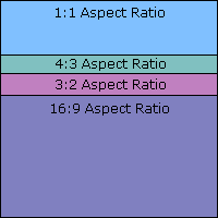
    The print size calculations above assumed that the camera’s aspect ratio, or ratio of longest to shortest dimension, is the standard 3:2 used for 35 mm cameras. In fact, most compact cameras, monitors and TV screens have a 4:3 aspect ratio, while most digital SLR cameras are 3:2. Many other types exist though: some high end film equipment even use a 1:1 square image, and DVD movies are an elongated 16:9 ratio.

    This means that if your camera uses a 4:3 aspect ratio, but you need a 4 x 6 inch (3:2) print, then some of your megapixels will be wasted (11%). This should be considered if your camera has a different ratio than the desired print dimensions.

    Pixels themselves can also have their own aspect ratio, although this is less common. Certain video standards and earlier Nikon cameras have pixels with skewed dimensions.

    SENSOR SIZE: NOT ALL PIXELS ARE CREATED EQUAL

    Even if two cameras have the same number of pixels, it does not necessarily mean that the size of their pixels are also equal. The main distinguishing factor between a more expensive digital SLR and a compact camera is that the former has a much greater digital sensor area. This means that if both an SLR and a compact camera have the same number of pixels, the size of each pixel in the SLR camera will be much larger.

    Compact Camera Sensor
    SLR Camera Sensor

    Why does one care about how big the pixels are? A larger pixel has more light-gathering area, which means the light signal is stronger over a given interval of time.

    This usually results in an improved signal to noise ratio (SNR), which createsa smoother and more detailed image. Furthermore, the dynamic range of the images (range of light to dark which the camera can capture without becoming either black or clipping highlights) also increases with larger pixels. This is because each pixel well can contain more photons before it fills up and becomes completely white.

    The diagram below illustrates the relative size of several standard sensor sizes on the market today. Most digital SLR’s have either a 1.5X or 1.6X crop factor (compared to 35 mm film), although some high-end models actually have a digital sensor which has the same area as 35 mm. Sensor size labels given in inches do not reflect the actual diagonal size, but instead reflect the approximate diameter of the “imaging circle” (not fully utilized). Nevertheless, this number is in the specifications of most compact cameras.
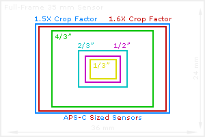
    Why not just use the largest sensor possible? The main disadvantage of having a larger sensor is that they are much more expensive, so they are not always beneficial.

    Other factors are beyond the scope of this tutorial, however more can be read on the following points:larger sensors requiresmaller apertures in order to achieve the same depth of field, however they are alsoless susceptible to diffraction at a given aperture.

    Does all this mean it is bad to squeeze more pixels into the same sensor area? This will usually produce more noise, but only when viewed at 100% on your computer monitor. In an actual print, the higher megapixel model’s noise will be much more finely spaced — even though it appears noisier on screen (see “Image Noise: Frequency and Magnitude“). This advantage usually offsets any increase in noise when going to a larger megapixel model (with a few exceptions).

  • The Contemporary Abyss

    TASK: Read Simon Morley ‘Staring into the Contemporary Abyss’. Choose any body of work you feel explores the sublime. It may be a photographic project, a work of literature, cinema, or any other medium. Write at least 300 words describing how you believe the work you have selected relates to the sublime. Use Morley’s text to support your argument.

    Hiroshi Sugimoto

    Japanese photographer Hiroshi Sugimoto focuses in much of his work explicitly or implicitly on the transience of life,  the conflict between life and death and the known and unknown. He questions our attitudes to death in ‘Chamber of Horrors’ using photos of (now removed) waxworks of torture and execution from Madame Tussaud’s. His images of an ancient ‘installation’ of hundreds of Bodhisattvas in a Kyoto temple mirrors interestingly Gursky’s images of North Korean armies – are they also all the same? or individual souls?

    Works like  ‘Seascapes’ and ‘Revolution’ give a sense of void – of being on a borderline or edge where we can no longer codify experience – as a fundamental prerequisite for a deeper sense of reality, serving to mediate between being and nothingness, and communicating through a condition of absence a heightened awareness of the self. He is particularly interested in boundaries between science and religion ‘In all this, I somehow feel we are nearing an era when religion and art will once again cast doubts upon science, or else an era when things better seen through to a scientific conclusion will bow to religious judgement.’ ‘There remains… a great divide between comprehending (i.e.explaining) the world and being able to explain what we ourselves are. And even then, what we can explain of the world is far less than what we cannot ― though people tend be more attracted by the unexplained.’ 

    Other works like ‘architecture’ use photography as an expression of ‘time exposed’, or photographs serving as a time capsule for a series of events in time.  He pushes his old large-format camera’s focal length out to twice-infinity―with no stops on the bellows rail, the view through the lens was an utter blur. This gives a very eerie effect,  completely melting away many of the buildings in the process.

    In Joe – a photograph of an outdoor sculpture, he looks at relationships between 2 and 3 dimensions, effects of light on memory. The sculpture has to be experienced by walking around and through it… Joe is different according to the time of the day, the season, and the viewer’s position. Using a photographic technique involving areas of extremely soft light and blurred darkness, he sculpts views that seem like aspects of visual memory.

    Other works like Lightning Fields observe the effects of scientific processes like electrical discharges on photographic dry plates. He describes these as a desire to re-create the major discoveries of these scientific pioneers in the darkroom and verify them with my own eyes. But the effects are extremely beautiful – art produced by science.

    Simon Morley main points

    Romantic artists: irrational and frightening

    Abstract expressionists:  Barnett Newman ( ‘The Sublime is Now’) and Mark Rothko.  an art possessing  depth and profundity beyond classical  ideas about beauty and aesthetics.

    Pop and Conceptual Art and radical philosophers in France trying to understand aspects of human experience that seemed to lie beyond the controlling structures imposed by the status quo, to keep open a pathway leading to some kind of possibility of emancipation.

    Morley’s  book  The Sublime: Documents of Contemporary Art distinguishes five different ways in which the word is now broadly used:

    • the unpresentable
    • transcendence,
    • terror,
    • the uncanny and
    • altered states of consciousness.

    There are also two main contexts for such discussions: nature and technology. Linking all these: a desire to define a moment when social and psychological codes and structures no longer bind us, where we reach a sort of borderline at which rational thought comes to an end and we suddenly encounter something wholly and perturbingly other.

    At the sublime’s core are experiences of self-transcendence that take us away from the forms of understanding provided by a secular, scientific and rationalist world view.  covert or camouflaged devices for talking about the kinds of things that were once addressed by religious discourses and nevertheless seem to remain pertinent within an otherwise religiously sceptical and secularised world.

    ” a transformative experience understood as occurring within the here and now. What we make of this experience, what value we give it, can take us in two very different directions, however. One re-envisages the self as existing in the light of some unnameable revelation arising in a gap between, on the one hand, a dull and alienating reality, and on the other an unmediated awareness of life. In contrast, there is a far more pessimistic conclusion that can be drawn, one that ends up as a resigned sense of inadequacy, in which we are made aware of our emotional, cognitive, social and political failure when faced with all that so blatantly exceeds us.”

    Ultimately, the concept of the sublime must pose more questions than it answers

    Olafur Eliasson’s The Weather Project 2003

    Anish Kapoor’s huge maroon trumpet Marsyas 2002.  made of stretched PVC, managed to convey a more affirmative experience of the sublime – a kind of post-religious state of emotional transcendence in which, exactly because of the lack of ordered structures or codes, we feel a powerful sense of exaltation and release rather than fear. His work also serves to link discussions of the sublime to non- Western concepts. In an interview given several years ago, he declared that through the experience of void that is central to his art he sought to convey ‘a potential space, not a non-space’.

    Miroslaw Balka’s dark container How It Is 2009, a huge steel structure with a vast dark chamber. ‘negative sublime’, destabilising and unnerving entering into a structureless and unsettling zone of inky blankness  (at least when there are no mobile phone lights being turned on) but simultaneously aware of merely experiencing an artwork in a museum.

    Douglas Gordon,site-specific work Pretty much every word written, spoken, heard, overheard from1989…2010. nameless and imageless emotions,  Wordsworth’s ‘blank abyss’.

    Korean artist Lee Ufan and Japanese photographer Hiroshi Sugimoto, a sense of void – of being on a borderline or edge where we can no longer codify experience – is considered a fundamental prerequisite for a deeper sense of reality, serving to mediate between being and nothingness, and communicating through a condition of absence a heightened awareness of the self.

    James Turrell, who uses light to dematerialise an environment and to propel the spectator into a state of sensory confusion that isn’t so much unsettling as ecstatic. Turrell, who is influenced by Quaker Christianity’s idea of divine light as well as by oriental concepts, declares that his work is involved in the ‘plumbing of visual space through the conscious act of moving, feeling out through the eyes’, and adds that the experience is ‘analogous to a physical journey of self as a flight of the soul through the planes’.

    Gerhard Richter paintings looking like blurred photographs ‘ new sense of the sublime as something that gets squeezed out as an intangible and ambiguous supplement in the gap between these two different but related media’. large abstracts ‘seem merely to engage with the sublime in the more traditional and easily consoling sense of something that strives for the exalted effect’.

    Luc Tuymans : thwarted transcendence in  deliberately drab paintings derived from photographs. Many of Tuymans’s works  refer to Nazism, in which sublime effects were exploited in order to inspire a nation to commit barbaric acts. Albert Speer’s Cathedrals of Light, constructed for the Nuremberg rallies, were frightening instances of the sublime in the hands of authoritarian politics

    Andreas Gursky. series of large-scale photographs of intricately orchestrated mass public displays of the North Koreans – any discussion of the concept of the sublime should take into account its political implications.

    French artist Philippe Parreno and his collaborators, dive into the depths of virtual reality by exploring how contemporary subjectivity is distorted and augmented through plugging into the digital. The artists copyrighted a digital animation character in order to ‘set her free’ to ‘live’ in ways not constrained by the strict regulations imposed by the usual conventions of cyberspace. Perhaps it is indeed to this new world, beyond the limits of the physical body and of time and space, that the sublime experience is now migrating.

  • Justin Partyka

    website

    Summer Days in the Stour Valley

    Wander the path of a winding river and it will take you deeply into the experience of landscape. Through the summer days I walked the footpaths, fields, meadows and farm tracks of this bucolic river valley. The Stour Valley remains a timeless landscape that continues to be rooted to its past. In places it has remained relatively unchanged for centuries by escaping the impact of industrial agriculture. Of course, this is “Constable Country:” the heart of English landscape art. People come to this part of East Anglia to literally step into the scenes of Constable’s paintings, but I set out to find my own way of seeing the Stour Valley. I discovered it can be a place of wonderful afternoon light and this inspired the photographs I made. These photographs largely reject the celebrated grand vistas of the Stour Valley and instead offer an alternative way of looking at this landscape. They bring attention to the particular, the peculiar, and the poetic – highlighting the hidden places and scenes that are so often overlooked. But as I worked, the spirit of Constable was always there, lingering behind me in the fields.

    [These photographs were made during the summer months of 2012-2013.]

    Some Country

    “When we walk, we naturally go to the fields and woods….”
    (Henry David Thoreau, ‘Walking,’ 1862)

    Some Country continues my commitment to photographing rural East Anglia. Following the decade long work photographing the agrarian farmers of the region (Field Work), this new ongoing series explores the contemporary rural agricultural landscape of Norfolk and Suffolk. Moving beyond the farmer’s connection to the landscape, Some Country is reveals my own connection to rural East Anglia and includes photographs from the same fields and farm tracks that I explored during childhood. Once again, these photographs show my fascination with how man shapes the landscape, but they are also photographs about memory, personal experience, and how a prolonged connection to the landscape around us, makes us and shapes us.

    Some Trees

    As I have wandered the East Anglian landscape making the photographs for Some Country occasionally I have encountered trees that are so particular in their diginity and presence in the landscape that they suggest something beyond the country and become themselves the subject of a photograph.

    Fieldwork

    Gallery

    One of England’s most rural and agricultural regions, East Anglia is a place with a long history of people working the land. Here the Romans grew their wheat and barley, and a culture of family owned agrarian farms developed and flourished, continuing an agricultural tradition with a lineage extending back to the region’s peasant farmers of the early Middle Ages. But during the last 50 years things have changed. Most of the small farms are now gone.

    These photographs are from the East Anglian counties of Norfolk and Suffolk. They tell the story of those that remain – the stoical small-time farmers who continue to work the fields because it is all they know. They are the forgotten people of the flatlands, whose identity is intimately shaped by the landscape that surrounds them. Theirs is a way of life that is deeply rooted in the past. Traditional methods and knowledge are still very much depended upon. How best to plough, sow, hoe, and harvest a field to reap the best from it. The detailed histories and biographies of the local landscape. Farmers who have come and gone, from what direction the fox will come to steal a chicken, and who planted a particular oak tree and when. The old ways continue to work, so there is no need to change.

    For ten years Justin Partyka has been photographing throughout the East Anglian counties of Norfolk and Suffolk, exploring a world of rabbit catchers, reed cutters, and the region’s small-scale agrarian farmers. He calls them “the forgotten people of the flatlands,” who have an intimate relationship with the landscape that surrounds them. It is a way of life that is deeply rooted to the past and its traditional methods and knowledge. These photographs tell the story of these farmers and the fields they work, and clearly illustrate Partyka’s dedicated immersion into their world. His painterly use of colour and the unique qualities of the East Anglian light beautifully captures this timeless way of rural life.

    Field Work: Photographs from East Anglia is published in a limited edition of 100 signed and numbered books. Each book comes with a specially embossed slipcase and a 10 x 12

    Black Fen

    Black fen they call it round here. Black — for the peaty soil; black — for the mood of the area, for its history and for its future.
    — Mary Chamberlain, Fenwomen, 1975

    Black Fen is an ongoing series of photographs exploring the mysterious flatlands of the Fens. To drive across this landscape feels like crossing a great sea. The road undulates from the ever-shifting land, tossing the car like a small boat. Occasionally an unpaved drove branches off providing access to a house, farm buildings or fields deep in the middle of the fen. The presence of water is constant. A complex network of dykes and drains criss-crosses the fields, the murky waters rising and falling as the fenland locks and pumping stations work to prevent the water from taking back the land. All around is an abundance of crops which fight for space with an encroaching wildness of weeds and bushes that grow thick and fast out of the fertile earth. Once a place of swamps and marshes, this landscape exists because of the pioneering work of Cornelius Vermuyden and his fellow Dutch engineers, who in 1626 began draining the fens with the support of King Charles I. Today covering an area of almost 1,500 square miles in Eastern England, the Fens are one of the world’s largest areas of reclaimed land.

    Fen Women

    Fenwomen by Mary Chamberlain is a classic work of oral history. It was the first book by the feminist publisher Virago Press in 1975. Fenwomen is a unique documentary of women’s lives in the village of Isleham in the Cambridgeshire Fens. It tells the story of “women as labourers and labourers’ wives, whose daily toil for the survival of themselves and their families had never been acknowledged, much less lauded.”

    This new edition of the book by Full Circle Editions features 23 new photographs by Justin Partyka specially commissioned for this publication. Taken in and around Isleham during 2010, these photographs present a portrait of the village over thirty years since the oral history was originally collected. Much has changed in the village, but as these photographs reveal, Isleham’s strong sense of place is still intimately shaped by the mysterious flat fenlands that surround it.

    Saskatchewan

    Covering an area of 251, 700 square miles, the province of Saskatchewan is almost three times the size of Great Britain, yet it has a population of only 1, 010, 146. For such a big place, the rest of the world seems to know very little about Saskatchewan, if anything at all. Even in Canada, the majority of Canadians asked about Saskatchewan have never been there and have no desire to go. Those that have driven through the province say that, “there is nothing there, just endless wheat fields.”
    Saskatchewan is the place you pass through to get somewhere else. But hidden amongst the wheat fields is a rich and diverse, deeply traditional prairie culture. It is an eclectic mix of Hutterite colonies, Indian reservations, stock car racing, and cowboys; towns and cities which rise out of the landscape with their seductive names like Moose Jaw, Big Beaver, and Buffalo Gap, along with the main industry of grain farming.
    In 2005 Saskatchewan celebrated its centennial year. But as the pioneering spirit of the province’s founders is remembered, rural life is experiencing a major decline. The many abandoned farms which scar the landscape are a testimony to this. Although Saskatchewan is still predominately agricultural, today seventy percent of the population live in towns and cities. Many years of poor grain prices, along with the dominance of corporate agribusiness are destroying the cultural landscape of the province, where 20,000 small farms have closed since 1986 alone. As DeNeen Brown highlights in a story in the Washington Post (Oct 25, 2003): ‘Towns throughout Canada’s prairies are dying slow deaths. All along the highways of Saskatchewan abandoned buildings lean against the prairie wind, which blows through the cracked windows of houses deserted by the families who traded them for a few thousand dollars or for the cars they drove away.’

    However, the people that remain and call Saskatchewan home express a deep passion for and understanding of prairie life: an acceptance of the endless space and the loneliness it brings, but also the importance of community in a world of rural isolation. And underlying it all is a deep sense of place–an intimate relationship with the inescapable open landscape which surrounds everything and everyone.

    [This project has developed into a collaboration with the Saskatchewan writer Ken Mitchell, taking the form of an image and word performance and a future book. In 2015 – 2016 Justin will be returning to Saskatchewan to make new photographs.]

  • Helen Sear

    Creative Wales award.

    Not just the eye. Uses the hand to pain in parts. Sculptural and 3D form. Liberate from computer screen. Different types of paper. Or use CAD.

    Body in the landscape, or landscape in the body

    What does it mean to be both human and animal?

    Wants to concentrate on unremarkable landscape – portrait of a field over a year. Landscape as a living being. And walk to a particular part of forest that changes through being cut down and exposes a particular view suddenly.

    Inside the view

    Beyond the view

    Pond 2011  installation at Crescent Arts Scarborough, UK, March 2011. video of frozen winter pond and trees. Occasional birds. Sheep in silhouette on the horizon.

  • Colour Photography

    Wikipedia to be properly edited with links
    Main article: Color photography

    Color photography was possible long before Kodachrome, as this 1903 portrait by Sarah Angelina Aclanddemonstrates, but in its earliest years the need for special equipment, long exposures and complicated printing processes made it extremely rare.

    A photographic darkroom withsafelight

    Color photography was explored beginning in the mid-19th century. Early experiments in color required extremely long exposures (hours or days for camera images) and could not “fix” the photograph to prevent the color from quickly fading when exposed to white light.

    The first permanent color photograph was taken in 1861 using the three-color-separation principle first published by physicist James Clerk Maxwell in 1855. Maxwell’s idea was to take three separate black-and-white photographs through red, green and blue filters. This provides the photographer with the three basic channels required to recreate a color image.

    Transparent prints of the images could be projected through similar color filters and superimposed on the projection screen, an additive method of color reproduction. A color print on paper could be produced by superimposing carbon prints of the three images made in their complementary colors, a subtractive method of color reproduction pioneered by Louis Ducos du Hauronin the late 1860s.

    Russian photographer Sergei Mikhailovich Prokudin-Gorskii made extensive use of this color separation technique, employing a special camera which successively exposed the three color-filtered images on different parts of an oblong plate. Because his exposures were not simultaneous, unsteady subjects exhibited color “fringes” or, if rapidly moving through the scene, appeared as brightly colored ghosts in the resulting projected or printed images.

    Implementation of color photography was hindered by the limited sensitivity of early photographic materials, which were mostly sensitive to blue, only slightly sensitive to green, and virtually insensitive to red. The discovery of dye sensitization by photochemist Hermann Vogel in 1873 suddenly made it possible to add sensitivity to green, yellow and even red. Improved color sensitizers and ongoing improvements in the overall sensitivity of emulsions steadily reduced the once-prohibitive long exposure times required for color, bringing it ever closer to commercial viability.

    Autochrome, the first commercially successful color process, was introduced by the Lumière brothers in 1907. Autochrome plates incorporated a mosaic color filter layer made of dyed grains of potato starch, which allowed the three color components to be recorded as adjacent microscopic image fragments. After an Autochrome plate was reversal processed to produce a positive transparency, the starch grains served to illuminate each fragment with the correct color and the tiny colored points blended together in the eye, synthesizing the color of the subject by the additive method. Autochrome plates were one of several varieties of additive color screen plates and films marketed between the 1890s and the 1950s.

    Kodachrome, the first modern “integral tripack” (or “monopack”) color film, was introduced by Kodak in 1935. It captured the three color components in a multilayer emulsion. One layer was sensitized to record the red-dominated part of the spectrum, another layer recorded only the green part and a third recorded only the blue. Without special film processing, the result would simply be three superimposed black-and-white images, but complementary cyan, magenta, and yellow dye images were created in those layers by adding color couplers during a complex processing procedure.

    Agfa’s similarly structured Agfacolor Neu was introduced in 1936. Unlike Kodachrome, the color couplers in Agfacolor Neu were incorporated into the emulsion layers during manufacture, which greatly simplified the processing. Currently available color films still employ a multilayer emulsion and the same principles, most closely resembling Agfa’s product.

    Instant color film, used in a special camera which yielded a unique finished color print only a minute or two after the exposure, was introduced by Polaroid in 1963.

    Color photography may form images as positive transparencies, which can be used in a slide projector, or as color negatives intended for use in creating positive color enlargements on specially coated paper. The latter is now the most common form of film (non-digital) color photography owing to the introduction of automated photo printing equipment.

  • Shirley Baker

    Images on Mary  Evans Picture Library

    Google Images

    Shirley Baker, (1932-2014), was one of the rare female photographers who chronicled life in the north of England from the 1950s onwards. Her street photography was in the ‘flaneuse’ tradition of Henri Cartier-Bresson and Robert Frank, whom she named as influences. Unposed snapshots of people going about their business were juxtaposed with telling graffiti. She had a great eye for composition that has been under-appreciated next to her compassionate documentation and concern for social injustice, with a particular focus on women and children.

    From the 60s, Baker taught photography at Salford College of Art and would always carry her camera modestly stowed in her handbag. In free periods, she began a body of work, spanning 15 years, of the social housing in the area that was being demolished as people lived in semi-derelict slums. Shirley’s work in Salford and Manchester (shot mainly between 1960 and 1973) captured a time of rapid social and economic change in the lives of working class people in Manchester and Salford.”It was a time of much change: people were turfed out of their homes and some squatted in old buildings, trying to hang on to the traditional life they knew.”

    Slum clearances, started in the 1930s, resumed in earnest in the 1950s, and in the twenty years between 1955 and 1975, around 1.3 million homes were demolished nationwide. When Shirley Baker began photographing the streets of her native Salford, it seemed that no-one was interested in recording the human story of these soon-to-be demolished communities. Old ladies sitting on doorsteps in a row of condemned houses, men with handcarts searching for refuse to be recycled, children playing inventively among rubble and abandoned cars. That she chose to preserve these moments on film, now seems like the only perceptive response to a vanishing environment. It was not until 1989 that her first book, Street Photographs: Manchester and Salford, was published and Baker began to be more widely appreciated.

    In addition to her work in Manchester and Salford, she spent a considerable amount of time capturing Camden Market at the height of punk. Her work was often humorous and she added over the years to collections such as owners who look like their dogs and people falling asleep in public.

    Remembering the work of Shirley Baker Phil Coomes  BBC

    Life

    (from Guardian Obituary)

    Born in Salford, to Alec, a furniture maker, and Josephine, a housewife, Shirley had an identical twin, Barbara, who would also become an artist. They both went as boarders to Penrhos College, in Colwyn Bay, from where during the second world war they were evacuated to Chatsworth House, in Derbyshire. Their parents were unfazed by their daughters pursuing the arts professionally after they left school.

    Baker married Tony Levy, a GP, in 1957, and the couple eventually settled in Wilmslow, Cheshire, where their daughter, Nan, was born in 1963. Baker never displayed any of her photographs around their home, although she did like to take pictures of the family. This perhaps summed up the private, almost secretive, nature of her work.

    When Baker studied  photography at Manchester College of Technology, there was only one other woman on the course. On finishing, Baker’s plan was to work in-house at a company, recording processes and producing promotional images. She started at Courtaulds fabric manufacturers before freelancing for other businesses and doing some journalism, including for the Guardian. Baker encountered difficulties getting a press card, so was unable to pursue photojournalism seriously, and believed she was only given the assignments deemed unsuitable for men. From the 60s, Baker taught photography at Salford College of Art.

    Baker kept photographing in later life and completed an MA in critical history and the theory of photography at the University of Derby in 1995. She joined the Mary Evans Picture Library in 2008, and in 2012 had solo shows in Oldham and Salford, with another planned for 2015 at the Photoraphers’ Gallery in London. She was always pleased when people who featured in her work came along to exhibitions. At the opening of the Lowry Gallery in 2000, the Queen not only viewed Baker’s photographs but met some of Baker’s subjects, too.


  • Martin Parr

    Martin Parr (born 1952) trained in photography at Manchester Polytechnic. Described in the past as Margaret Thatcher’s favourite  photographer, Parr caused a stir when he tried to join Magnum Photos. The issue was one of integrity. Photographers within Magnum’s ranks guarded their territory jealously and felt that the work that Parr offered was voyeuristic, titillating and meaningless. Parr was eventually accepted at Magnum in 1994 and went on to become one of the leading authorities on photography in the UK. Parr has an ability to turn the snapshot into art. There is however something of the satirical about this work – many of the images raise a smile. Parr worked mainly in colour and his approach was to over-light with fill-in flash, causing a frozen moment in time to be even more false yet far more real.  His work is quirky and opportunistic. He makes no bones about the latter; invited to an event, he takes the opportunity to produce images that will lead to further projects. His approach is direct. He doesn’t ask permission and if someone sees that he is photographing them he will continue on the basis that it’s his job to photograph them, record their reaction, etc. The characteristic Parr style is still there 30 years on. Listen to Martin Parr talking about his images and practice:   Parr has produced a wide range of work.
    • Last Resort: Photographs of New Brighton (1986). One of his first major colour pieces.This style was to become synonymous with Parr and his ability to create from the ordinary. The little girl could be the focus of the image but the boy is also interesting. The car and the lighthouse are both essential to the composition.
    • A recent project in the suburbs of Paris depicts ordinary life within a diverse, mainly immigrant, community.
    • St Moritz series shows the rich at play in a way that only people who work there would normally get to see.
    • Luxury – a recent Martin Parr project where he looks at the rich and their pastimes.
    The Parrworld (2008) show exhibited some of Parr’s extensive collection of kitsch souvenirs and other disparate paraphernalia: a watches with pictures of Bin Laden and Saddam Hussein, bubblegum pop pin-up wallpaper. He compares photography to collecting: the world is out there for the having. Parr has edited three volumes of his collections of postcards:
    • Boring Postcards (1999)
    • Boring Postcards USA (2000)
    • Langweilige Postkarten (2001).
    The subjects within Boring Postcards are what we judge to be mundane or prosaic, such as motorways, service stations, tower blocks, school and other modernist municipal buildings – structures that we take for granted and might even consider to be ‘eyesores’. They weren’t necessarily photographed for their beauty in any traditional sense, but because of their novelty value as photographic subjects. [Many of the images in the UK edition are attributed to the Frith photographic company.] They are in fact often quite unusual and remarkably intriguing.

     Exercise: Getting the Parr ‘feel’

    For this exercise, photograph people engaged in a fun or social activity outdoors. For example, you could go to a seaside resort and photograph people having a good time. Or photograph people at an outdoor party or function. Try to capture the Martin Parr ‘feel’. Use your camera flash or a flash gun to balance the daylight. You need to take light readings from the ambient light and then set the flash gun to produce a small amount of flash – not enough to turn the scene into night – running the camera at a slower speed than the flash would normally synch at. Getting the flash /ambient light balance right is the key to the technical side of the whole look. This is the camera’s reaction under normal circumstances. A slower shutter speed than the recommended flash setting may help a lot. This will work very differently for a range of cameras and you may need individual support and advice for this relative to your personal camera equipment. Produce a set of eight colour images. Ensure that the colour is bright and reflects the nature of Martin Parr’s work. How does this lighting effect change the nature of your images? Make some notes in your learning log. ————————————————–

    Martin Parr  is a British documentary photographer, photojournalist and photobook collector. He is known for his photographic projects that take an intimate, satirical and anthropological look at aspects of modern life, in particular documenting the social classes of England, and more broadly the wealth of the Western world.

    Martin Parr (born 1952) trained in photography at Manchester Polytechnic. Described in the past as Margaret Thatcher’s favourite  photographer, Parr caused a stir when he tried to join Magnum Photos because many Magnum photographers felt that Parr’s work was voyeuristic, titillating and meaningless. Parr was eventually accepted at Magnum in 1994 and went on to become one of the leading authorities on photography in the UK.

    He has a characteristic photography style and approach. Parr works mainly in colour, using fill-in flash to over-light the scene, causing a frozen moment in time to be even more false yet far more ‘real’. His approach is direct and opportunistic. He doesn’t ask permission and if someone sees that he is photographing them he will continue on the basis that it’s his job to photograph them, record their reaction, etc.  His work is quirky and opportunistic. He makes no bones about the latter; invited to an event, he takes the opportunity to produce images that will lead to further projects.

    See Tate Modern overview and links to Parr’s work.
    Tate video overview of his approach to British documentary photography
    Listen to Martin Parr talking about his images and practice:

    !! Insert sketchlog pages of analysis of his images and annotated flatpans of his photobooks.

    Martin Parr  is a British documentary photographer, photojournalist and photobook collector. He is known for his photographic projects that take an intimate, satirical and anthropological look at aspects of modern life, in particular documenting the social classes of England, and more broadly the wealth of the Western world.

    Martin Parr (born 1952) trained in photography at Manchester Polytechnic. Described in the past as Margaret Thatcher’s favourite  photographer, Parr caused a stir when he tried to join Magnum Photos because many Magnum photographers felt that Parr’s work was voyeuristic, titillating and meaningless. Parr was eventually accepted at Magnum in 1994 and went on to become one of the leading authorities on photography in the UK.

    He has a characteristic photography style and approach. Parr works mainly in colour, using fill-in flash to over-light the scene, causing a frozen moment in time to be even more false yet far more ‘real’. His approach is direct and opportunistic. He doesn’t ask permission and if someone sees that he is photographing them he will continue on the basis that it’s his job to photograph them, record their reaction, etc.  His work is quirky and opportunistic. He makes no bones about the latter; invited to an event, he takes the opportunity to produce images that will lead to further projects.

    See Tate Modern overview and links to Parr’s work.
    Tate video overview of his approach to British documentary photography
    Listen to Martin Parr talking about his images and practice:

    Technique: Getting the Parr ‘feel’

    • Use your camera flash or a flash gun to balance the daylight. You need to take light readings from the ambient light and then set the flash gun to produce a small amount of flash – not enough to turn the scene into night – running the camera at a slower speed than the flash would normally synch at.
    • Getting the flash /ambient light balance right is the key to the technical side of the whole look.
    • This is the camera’s reaction under normal circumstances. A slower shutter speed than the recommended flash setting may help a lot.
    • This will work very differently for a range of cameras and you may need individual support and advice for this relative to your personal camera equipment.
    • Ensure that the colour is bright and reflects the nature of Martin Parr’s work. How does this lighting effect change the nature of your images?
    https://www.youtube.com/watch?v=uEtnCCXpZv4

    Photobooks

    !! To significantly update with notes to the videos and flatpan analysis in my sketchlog of photobooks I own: The Last Resport and Think of England

    Parr has had around 40 solo photobooks published including: 

    • The Last Resort (1983–1985)
    • The Cost of Living (1987–1989)
    •  Small World (1987–1994)
    •  Common Sense (1995–1999).
    • Think of England (1999)
    • The Human Condition

    Other projects:

    • Rural communities (1975–1982)A recent project in the suburbs of Paris depicts ordinary life within a diverse, mainly immigrant, community.
    • St Moritz series shows the rich at play in a way that only people who work there would normally get to see.
    • Luxury – a recent Martin Parr project where he looks at the rich and their pastimes.

    Martin Parr as collector and curator

    Parr has edited three volumes of his collections of postcards:

    • Boring Postcards (1999)
    • Boring Postcards USA (2000)
    • Langweilige Postkarten (2001).

    The subjects within Boring Postcards are what we judge to be mundane or prosaic, such as motorways, service stations, tower blocks, school and other modernist municipal buildings – structures that we take for granted and might even consider to be ‘eyesores’. They weren’t necessarily photographed for their beauty in any traditional sense, but because of their novelty value as photographic subjects. [Many of the images in the UK edition are attributed to the Frith photographic company.] They are in fact often quite unusual and remarkably intriguing.

    The Parrworld (2008) show exhibited some of Parr’s extensive collection of kitsch souvenirs and other disparate paraphernalia: a watches with pictures of Bin Laden and Saddam Hussein, bubblegum pop pin-up wallpaper. He compares photography to collecting: the world is out there for the having.

    !! Photobook collections and his discussions of these.

  • Mathua Mateka Rough Notes

    Website   much too flashy. One very large image that takes ages to load, even on my fast connection, never mind slow ones in Africa. Rolling slideshows etc down right hand side lead to very slow loading large images. Seems to be trying to use the most jazzy tools for photo galleries. But very confusing and doesn’t really work.

    Entry screen is Maasai ?girl with nipple half exposed. Is this a tongue-in cheek parody of African exoticism or just cheesy??

    Confusing icons like the power button to get to the main menu.

    Landscape not very original.

    Instagram showcase  some possibly interesting ‘over-the-top digitally-manipulated colour’ images for advertising.

    I am a city-changer

    General impression he is rather full of himself.

    Artist Statement

    I – Mutua Matheka – am an artist born and bred in Machakos and fine-tuned by Nairobi. I draw, sketch, mold stuff, destroy stuff & occasionally create stuff… I have been drawing and sketching since my mother placed crayons in my hands at just 3 years of age. The art has since then morphed from Drawing, Illustration, Graphic art, Architectural Visualization to Photography, my latest obsession. When I’m not meeting a deadline or sharpening crayons, I love to get my adrenaline pounding by riding motorbikes, mountain climbing, and (if I got a chance) para-troop and ski.

    I am a graduate Architect from Jomo Kenyatta University of Agriculture & Technology (J.K.U.A.T), now fully applying my architectural eye to capture Architecture, cityscapes & landscapes. I love photography and I hope you can see that love by looking through my images.

    I credit my creativity to The Creator who is the number one creative in my books, and my mom for the 3yr old crayon awakening. Also, I’m happily married to a beautiful woman who also doubles as a personal model.

    Together with David ‘Blackman’ Muthami and the UN Habitat, we are using my photography of urban spaces in Africa to showcase a beautiful Nairobi and eventually Africa. Through the ‘I’m a City Changer‘ campaign, we seek to change mindsets of people in cities especially in Africa about their cities. Take a look at the ‘I’m A City Changer‘ page on my website to see the images that people all over the world are sharing to show why they love their cities. To this effect we held the first photography showcase for ‘I’m a City Chager’ in Nairobi that attracted lots of media attention.

    I’ve been featured in Nokia’s ‘Teddy Bears & Talking drums’, a documentary (view here), ADA (African Digital Art), Afri-Love (Afri-love.com), BBC News Africa’s In Pictures, Nation Newspaper feature, Kiss 100′s Breakfast show with Caroline Mutoko, Zuqka magazine (Nation newspaper). I have won the pioneer BAKE AWARD for best Photography Blog in Kenya, as well as being nominated for the International CSS DESIGN Award based in the United States, putting both Kenya and Africa on the Map in photography. My photos have been used by BBC MEDIA, KUVAA IN NETHERLANDS, African Digital Art, NTV’s PM LIVE, among other avenues showcasing excellence.

    I’ve also had the privilege of working with: Image 360 designs, Iseme, Kamau & Maema Advocates, Symbion Architects, Reata Apartments, Radio Jambo, Kiota Guest house, Exotic Golf Safaris, UP Magazine, Kobo Safaris, and artists like: Blackman, Daddy Owen, Bupe, Anto Neosoul, Neema, Ruth Wamuyu, Kevo Juice, Five.Oh.One, Dj MO, Monique, Ma3 band, Sara Mitaru, among many other amazing people.

    You can connect with me through any of the avenues listed below:

    To contact me on any general thing please email [info at mutuamatheka.co.ke]

    For information about my prints or to purchase any of my images kindly email [sales at mutuamatheka.co.ke]

  • Emeka Okerere Rough Notes

    Nigeria  website

    Much more voyeuristic and less engaged than eg Michael Tsegaye. Performance photography,

    Artist’s statement

    Emeka Okereke born in 1980 is a Nigerian photographer who lives and works between Africa and Europe, moving from one to the other on a frequent basis. He came in contact with photography in 2001. He is a member of Depth of Field (DOF) collective, a group made up of six Nigerian photographers.

    Presently, his works oscillate between diverse mediums. He uses photography, poetry, video and collaborative projects to address issues pertinent to his convictions. His works deal mainly with the questions of co-existence (beyond the limitations of predefined spaces), otherness and self-discovery. Often times they are subtle references to the socio-political issues of our times.

    Another aspect of his practise lies in project organising which artistic interventions to promote exchanges cutting across indigenous and international platforms.

    To this effect he organized the first ever photographic exchange projects between a school in France and one in Nigeria involving the Fine Art School of Paris and Yaba College of Arts and Technology Lagos. He is the Founder and Artistic Director of “Invisible Borders Trans-African Photography Project” an annual photographic project which assembles up to ten artists from Africa towards a roadtrip across Africa. There has been three editions of the project since 2009. Through Emeka Okereke Photography & Projects, he co-ordinates projects based on exchanges. The most recent of these projects include: Crossing Compasses, Lagos-Berlin Photo Exchange (May – June 2012) and Converging Visions: Nigeria – Netherlands Photo Exchange (June – September 2012)

    In 2003, he won the Best Young Photographer award from the AFAA “Afrique en Création” in the 5thedition of the Bamako Photo Festival of photography. He has a Bachelors/Masters degree from the National Fine Art School of Paris and has exhibited in biennales and art festivals in different cities of the world, notably Lagos, Bamako, Cape Town, London, Berlin, Bayreuth, Frankfurt, Nurnberg, Brussels, Johannesburg, New York, Washington, Barcelona, Seville, Madrid, Paris, etc. He has also won several awards both in Nigeria and Internationally.

    Invisible borders: Trans-African Photography Project

    In 2009, I founded a project which every year unites up to ten African artists – photographers, writers, film makers and art historians on a road trip across Africa in a bid to reflect on exchanges across geographical borders. The core concept of this project is deeply rooted in the philosophy of movement and the ardent need to transcend inflicted limitations, by creating a crossbreed of realities which in turn offers the possibility of an extension of oneself beyond predefinitions.

    There has been four editions of the road trip project with journeys to Mali, Senegal, Ethiopia and Gabon – always departing from Lagos Nigeria.  I have taken part and coordinated all  four editions, travelling across over 15 countries in the process.

    During the trips, my works consisted of images, writings and films which looks at the intricate interactions between people and their spaces as experienced in the Africa of today – that friction between people and space in the quest for existence and co-existence. Furthermore, these works testify to an Africa at the brink of a turning point, that point where the new is struggling its way out of the old…and we are the signs as well as symptoms.

    Sao Tome

    It is a small Island with only 180,000 inhabitants. Everything man-made seems to be engulfed by the freshness of nature. There are more trees and forests than people and due to this, the people have a unique relationship with nature. Food is abundant because the land and plants are far from barren. All year round the trees produce all kinds of fruits. It is an Island of immense greens. Where only the thought of the concept of selling “bio” foods at acutely exorbitant prices becomes immediately ridiculous.

    In the way of material acquisition, we do not see much. The cityscape is plagued with old dilapidated building of obviously Portuguese architecture. One could tell that much has not been done in terms of an independent advancement since its independence from Portugal in 1975.

    The buildings are chipping away with every passage of time, with no scheme towards preservation talk more of restoration – they just stand there obtrusively like phantoms of a colonial past, creating a picture of people meandering through “beautiful” shacks and rubbles. But all of this is perfectly cocooned every inch of the way, by the freshness and liveliness of the many plants.

    Rituals Lagos 2001-2003

    This project was one of the first body of works produced at the earlier stages of my carrer. It explores the relationship between body and light. These works won the Afrique en Creation Price at the 2003 Bamako festival of Photography.


  • Michael Tsegaye Rough Notes

    Michael Tsegaye, Ethiopia,  portfolio website

    Born in 1975, Michael Tsegaye lives and works in Addis Ababa, Ethiopia. He received his diploma in painting from Addis Ababa University’s School of Fine Arts and Design in 2002, but soon gave up painting after he developed an allergy to oil paint. He subsequently found his real passion in photography and has made of it not only a profession, but a way of expressing a very particular voice.

    “As a photographer I try as much as possible to escape being pigeonholed. I place myself among my peers (photographers and painters) across the world. While the spirit of my culture — its traditions in music, poetry and literature — informs my photography, my goal is that of any artist: to understand my life and standpoint in the 21st century, and express these through art.”

    Future memories chronicles the urbanization of various neighborhoods in Addis Ababa.

    Chasms of the soul  images are of gravestones in Ethiopia. When a person dies, his or her relatives place a photograph onto the tombstone and also inscribe a short history of the deceased. Thinking about the family’s photographs, and the idea of memorials and loss, I am struck by the personal sense of damage that these images—and the air that falls about them—evoke. As a result of time, those buried continue to experience a second death: the gradual deterioration of their entombed identity.

    Ethiopia at work 10 years ago it was said that it took a full day for the average farmer to walk to the closest road. This prevented farmers from communicating with neighbours or engaging in independent small-scale market activity with each other. But in the Wollo region of Ethiopia, I came across a new market that was created by the building of a road that was still under construction. (2008)

    Working Girls ll Commercial sex workers who live in Sebategna, a busy neighborhood in Addis Abeba close to the central bus station and Merkato (the largest open-air market in Africa). (2009) Black and White chiaroscuro.

    North Road  Impressions of northern Ethiopia along the road that leads from Addis Abeba to Wello, Tigrai, Gonder, and Gojjam. (2008) Full saturated colour.

    Ankober (2007) Misty atmospheric Black and White

    Arenguade (2011) Semi-abstract patchwork images of Ethiopian fields taken from a plane. Colour.

    Afar (2011) Erta Ale active volcano in Eastern Ethiopia Danakil depression. Black and white textures and rock formations.