Author: lindamayoux

  • Journeys

    ‘Going North’

    ‘Going North’ montage

    For this assignment I wanted to explore a journey that was likely to be ‘unpicturesque’ – one that was characteristic of many journeys on busy roads through rather boring countryside. I travel a lot for my work – currently in Africa and so have photographed many ‘journeys’ – and am planning to review these in a review of ideas about ‘safari’ for Assignment 4. But for this assignment, based on the discussions in the course materials and my work on ‘Christmas 2014’, I wanted to focus closer to home and try something a bit different.  I have become interested in some of the ideas from ‘New Topographics’Lewis Baltz‘s aim to look for things that were most unremarkable, presenting them in as unremarkable a way as possible to ‘appear objective’ and not show a point of view. Also to show how we use and construct the landscape to make our busy lives more convenient. I am also interested in the different effects of different ways of making the image – should they be sharp and studied with a political message as in Nadav Kander‘s work on China and Paul Graham‘s Great North Road, or deliberately blurred and out of focus to convey a subjective mood as in Robert Frank’s Americans and Chris Coekin‘s work, or even more uncontrolled as in mobile phone images.

    I started by experimenting a bit with my mobile phone on train  journeys. Building on some earlier images of train journeys in London (see Docklands Journey). I used my iPhone to take images of the train journey home from London to Cambridge as we went past open fields, suburban allotments and warehouses and included some images of the passengers (See London to Cambridge) On this iPhone it is not possible using the normal camera to control shutter speed – the focus is on the actual image. These gave me very much a feeling of movement and going through the suburban landscape. I also like some of the reflections in the windows. But an aesthetic I need to think about a lot more – what actually creates an effect/mood and what is just snapshot and what exactly am I trying to convey – the passage of time, isolation of commuters, ordinariness of countryside, specific landmarks of human intervention or maybe something new and less cliche?

    I also experimented with walking – the idea of a disturbing inward journey. On a walk along the River Holme I photographed light and human made objects and litter along the way. (See HolmeWalk  images) I was interested in how some of these things became quite disturbing – footprints in mud, hanging ropes like dead birds, electricity boxes like nestboxes. Plastic tubes like underground snakes. I photographed in colour and then converted to high contrast black and white in Lightroom, but without any further Black and White manipulation because I wanted the images to have an element of accident, not too contrived. I am planning to use these images in my Book Design course to illustrate the poem ‘Jabberwocky’ as a scary fable. This type of approach is also something I want to explore further – inspired by some of the images of Japanese photographers like Daido Moriyama and Hiroshi Sugimoto.

    For the actual assignment on this course, I chose a two and a half hour journey up the A1 from Cambridge to Barnsley to take my assessment materials to OCA. I had experimented with shutter speed and lenses on my various journeys in Africa. In order to maintain the more ‘objective’ and random element and also not to spend all my time fiddling with camera settings to free me to focus on the image itself, I decided to take two series each using a different lens and format,  but within each series using the same approach and then decide which series is most interesting and select the images:

    1) Going North – my 28mm wide angle fixed lens in order to give me the widest choice of composition, including some dramatic distortion, in landscape format. Using shutter speed priority on a fast shutter speed of 1600.

    2) Going South – my 100mm telephoto in portrait format to give a much flatter image and using a slower shutter speed.

    I looked at the route on Google Street View in advance. But as the road is extremely long and the interest in my images would be from traffic and events along the route rather than ‘views’ I did not pursue this area of exploration far. I used a standard map during the journey itself.

    I was interested in using photography as a way of exploring and discovering the road, rather than shooting to a predetermined formula (following photographers like Kander and Baltz). I took over 1000 images going up and 500 coming back because it was very difficult to predict any ‘decisive moment’ so I shot images at frequent intervals whenever I saw anything potentially interesting and/or characteristic of a particular stretch of road. I found the wide angle fast shutter speed images much more interesting – partly but not only because of the interestingly dreadful heavy rain for most of the journey and the feeling of potential risk that this added. Though it was difficult to actually shoot near collisions without provoking them! The dramatic gloomy sky was also a constant until very nearly at the end of the journey, framing things like water towers and pylons. The images themselves are mostly very sharp and some are quite like those of Paul Graham, rather than Coekin.

    The big challenge was then what to make of all the images and ways in which the photographic process had made me constantly aware of new things. I started by thinking of selecting 12 images as a montage for 12 stages of the journey (See the different pages of square thumbnails in Going North on Zemniimages website). But I was not sure if that would be cheating. If I was to select 12 images I still needed to think exactly what I was trying to say – choosing deadpan images that showed the sameness of much of the countryside? or the dramatic cloud breaks? or the awful traffic?

    In the end as I reread the material for this part of the course, I decided to experiment with typological ideas. I had started to notice the many different signs – particularly industrial estates trying to sound rural like ‘Honeypot Lane’, ‘historic market towns’ and the variety of traffic signs. I could have taken this typological approach to start with, but then the images could have become too studied and I would have stopped the feeling of journey as exploration. In the end, looking through what I found to be some of the most interesting images I noted that they were often based on colour. So I thought of doing a post-selection of red vehicles – an after-the-event  I-Spy red cars  game used to keep children happy on a boring journey.

    I think the images are best displayed as a montage of square images so that they can be seen all at once. For a slideshow I would have selected rather different images that told a clearer narrative or anti-narrative. I could have cropped and processed the images in a more considered montage with aesthetic dynamic diagonals and abstract colour patterns. But I think that would have negated the rather random nature of the images and my ambivalent feeling about the journey. On the one hand it was pretty long, tiring and at many stretches boring. The greys and plastics of much of the ‘architecture’ and the feeling of so many people busily going somewhere but nowhere special? a bit depressing for my picturesque sensitivities. At the same time I had found the photographic process added a frisson of interest of the chase and spotting new things – more than just I-Spy. And basically that is just how life is much of the time – random, fractured, disordered and much the same. If this series manages to convey that rather than the somewhat more romantic movement of some of my earlier train journey images then it has achieved much of its purpose.

    The Brief

    Produce a series of approximately 12 photographs that are made on, or explore the idea of, a journey. The journey that you document may be as long or as short as you like. You may choose to reexamine a familiar route, such as a commute to work or another routine activity, or it may be a journey into unfamiliar territory. You may travel by any means available.
    Introduce your work with a supporting text (around 500 words) that:
    • Describes how you interpreted this brief.
    • Describes how your work relates to aspects of photography and visual culture addressed in Part Two.
    • Evaluates the strengths and weaknesses of your work, describing what you would have done differently or how you might develop this work further.
    • Identifies what technical choices you made to help communicate your ideas, and also references relevant artists and photographers who have influenced the creative direction of your project.
    • Explains your reasons for selecting particular views, and arriving at certain visual outcomes.

    Reflection
    Just a reminder to look at the assessment criteria again. Think about how well you have done against the criteria and make notes in your learning log.

    Link to preliminary ideas about your critical review (Assignment Four)

    Link to ‘Transitions’ task (Assignment Six).


  • Street Photography Methods

    Shooting from the hip

    Take some time out to develop the technique of shooting very quickly. You’ll probably produce
    some very blurred and even disastrous images, but fortunately mistakes aren’t as expensive
    in the digital age as they were when Winogrand was working the New York streets.
    Produce a set of eight images that demonstrate the life and vibrancy of city living. If you
    don’t live anywhere near a city, choose a spot or a day when there’s a lot going on – the
    busier the better. If you need to, re-read the safety advice in the Introduction to this course
    guide.
    Analyse and reflect on your final images in your learning log or blog:
    • What makes the successful images work well?
    • What difficulties did you experience?
    • How do you feel about this type of work? Is it honest? Are your images a truthful
    representation or did you edit the truth in some way, consciously or sub-consciously?

    Outdoor Portraits

    On a bright day photograph a person in the sunshine. Do this outdoors in three stages.

    1. First, photograph them with your back to the sun. Write down the exposures and look at the issues involved in getting the person’s expression and pose right.

    2. Next, photograph the person with their back to the sun. Write down the exposures. If you can, look at the highlights and the shadow readings given from the spot metering. If you can’t set spot metering then you can still get some indication of the difference in
    brightness. Look to see if there’s burn-out – over-exposure of the hair or black shadow areas without any light at all. The contrast ratio will be very high – what do you think it is?

    3. Take the photograph again but this time use a reflector. Write down the reading that you get from the face and the contrast level.
    A reflector can be aluminum metal foil over a cardboard box. It can be a bed sheet, it can be a fancy professional item; it can be big (2m2) or small (30cm diameter), square or round – it makes no difference. What does make a difference is the quality of the light coming off it.
    To prove this, repeat the third shot with silver (kitchen foil on a board) and then white and note the difference. Put your reflective material on a stand or get someone to hold it for you. In practice, of course, you can use reflectors that already exist – a white wall, for example. Keep your eyes open for possible surfaces.

    • Analyse the differences between the images you’ve made in relation to the exposure you’ve used. Write up your findings with images in your learning log or blog.
    • How much difference has the reflector made?
    • Is there evidence of hard or soft light in this exercise?
    Hollywood-style

    What you do for this exercise will depend on whether you have access to a full set of studio lights and a studio to use them in. If you haven’t, don’t worry – go straight to Part B.

    Part A: If you have lights
    You’re going to create your own version of Hurrell’s Bogart image. Choose someone who might fit the bill, borrow some props (or look in a charity shop), then take a good look at the Humphrey Bogart image and the lighting diagram again.
    Set up the lighting as shown in the diagram. You need a good distance to the background, perhaps about 3m. It should be Black. It is Black when it meters up 5 stops below the face reading for the exposure and not before; at 4 stops, it’s dark grey, at 2 stops it’s light grey.
    Remember you need plenty of space to avoid light bouncing about where it shouldn’t be.

    For your next project you’ll move forward 20 or 30 years to look at the photographic portrait of the 60s, exemplified by the work of David Bailey.
    The light at the back is quite high, coming down on the sitter and washing over the shoulders. Note the shadow on top of the hat front side and the highlight along the top edge and also the light falling over the shoulder in front. All this tells you that the light’s quite high, probably 1m above the sitter. The fill dish indicated is a beauty dish with diffuser. It is straight on here as a fill light.
    Look at the shadow on the collar – that’s what you’re looking to reproduce. The black board indicated is to stop light going directly into the camera lens as this will cause flare and degrade the image. The light front left has a grille on it to stop the light straying around; it puts more light on the front rear shoulder and the left side of the hat image.
    You may need to place a little white card at the opening to bounce the light down a little.
    The light should be above head height. You’ll need a small table lamp with a soft light as the fill light and, if possible, a small off-camera flash gun to provide the left-hand light. This puts more light on the front rear shoulder and the coat area.

    Part B: Without lights
    There are plenty of Hollywood images to choose from. Pick one that you enjoy and can re-create using window light and a small amount of bounced flash. You’ll need a suitable model, preferably someone who is prepared to enter into the spirit of the task!
    The first thing to do is analyse the lighting. Where is it coming from? Look for the deepest shadows for the main light. Then make your own lighting diagram and produce a Hollywoodstyle set of portrait images.
    Produce three images in black and white – 10×12” or A4 at 320 dpi.

  • What is a Photographer?

    Marius de Zayas (1880-1961) closely allied to the 291 gallery. Photography and Photography and Artistic Photography first published Camera Work no 41 (1913)

    de Zayas makes a dichotomous distinction between:

    the ‘artist photographer’ who tries to represent something from within themselves as a ‘systematic and personal representation’ that then applies this to study of external form – an example being Steichen.

    Steichen images from Google

    ‘photographers’ who try to represent external reality based on ‘free and external’ investigation and research, bringing these different objective elements together into one communicated image – an example being Stieglitz.

    Stieglitz images from Google

    I see this distinction as continuing to be valid, but more in terms of a continuum than a dichotomy. As a researcher I am very well aware that practically all research (even scientific research but particularly social research) is inevitably informed by subjective perspectives on the important questions to ask, how to ask them and how to analyse the responses. In addition there are considerable individual as well as cultural variations even in eg perception of colour and shape. On the other hand pure abstraction and subjectivity is also nearly impossible as our thought processes are dependent and in many ways determined by external experience.

    The extremes of the continuum have arguably become further apart as digital imaging has significantly broadened the possibilities for artist photographers and technological advances have enabled possibilities for reproducing a greater range of tones and colours to represent and objectively calibrate (eg through use of histograms) to what the photographer concludes as ‘external reality’.

    A further element that does not come into de Zayas’ framework is the response of the viewer and the degree to which anticipated responses of different audiences affect both the investigation of external reality and ways of communicating subjectivity. Digital media offer interesting new possibilities for photographer/viewer interactivity.

    ————————————–

    key quotes

    ‘Photography is not Art, but photographs can be made to be Art…

    …The difference between Photography and Artistic-Photography is that, in the former, man [sic!!!!] tries to get at that objectivity of Form which generates the different conceptions that man has of Form, while the second uses the objectivity of Form to express a preconceived idea in order to convey an emotion. The first is the fixing of an actual state of Form, the other is the representation of the objectivity of Form, subordinated to a system of representation. The first is a process of indignation, the second a means of expression. In the first, man tries to represent something that is outside of himself; in the second he tries to represent something that is in himself. The first is a free and impersonal research, the second is a systematic and personal representation.
    The artist photographer uses nature to express his individuality, the photographer puts himself in front of nature, and without preconceptions, with the free mind of an investigator, with the method of an experimentalist, tries to get out of her a true state of conditions…

    Up to the present, the highest point of these two sides of Photography has been reached by Steichen as an artist and by Stieglitz as an experimentalist.
    The work of Steichen brought to its highest expression the aim of the realistic painting of Form. In his photographs he has succeeded in expressing the perfect fusion of the subject and the object. He has carried to its highest point the expression of a system of representation: the realistic one.
    Stieglitz has begun with the elimination of the subject in represented Form to search for the pure expression of the object. He is trying to do synthetically, with the means of a mechanical process, what some of the most advanced artists of the modern movement are trying to do analytically with the means of Art.

    ????I am not sure I understand this.

    It would be difficult to say which of these two sides of Photography is the more important. For one is the means by which man fuses his idea with the natural expression of Form, while the other is the means by which man tries to bring the natural expression of Form to the cognition of the mind.

  • Beginnings of Photography

    (edited from Wikipedia various)

    The word “photography” was created from the Greek roots φωτός (phōtos), genitive of φῶς (phōs), “light” and γραφή (graphé) “representation by means of lines” or “drawing”, together meaning “drawing with light”.

    Wikipedia links:  History of photography History of the camera

    Several people may have coined the same new term from these roots independently. Hercules Florence, a French painter and inventor living in Campinas, Brazil, used the French form of the word, photographie, in private notes which a Brazilian photography historian believes were written in 1834. Johann von Maedler, a Berlin astronomer, is credited in a 1932 German history of photography as having used it in an article published on 25 February 1839 in the German newspaper Vossische Zeitung. Both of these claims are now widely reported but apparently neither has ever been independently confirmed as beyond reasonable doubt.

    Credit has traditionally been given to Sir John Herschel both for coining the word and for introducing it to the public. His uses of it in private correspondence prior to 25 February 1839 and at his Royal Society lecture on the subject in London on 14 March 1839 have long been amply documented and accepted as settled facts.

    Precursor technologies

    Photography is the result of combining several technical discoveries.

    Pinhole camera or camera obscura: The camera obscura literally means “dark chamber” in Latin. It is a box with a hole in it which allows light to go through and create an image onto the piece of paper. The discovery of the camera obscura that provides an image of a scene dates back to ancient China.  Chinese philosopher Mo Di and Greek mathematicians Aristotle and Euclid described a pinhole camera in the 5th and 4th centuries BCE. In the 6th century CE, Byzantine mathematician Anthemius of Tralles used a type of camera obscura in his experiments, Ibn al-Haytham (Alhazen) (965–1040) studied the camera obscura and pinhole camera. Renaissance painters used the camera obscura which, in fact, gives the optical rendering in color that dominates Western Art. Leonardo da Vinci mentions natural cameras obscura that are formed by dark caves on the edge of a sunlit valley. A hole in the cave wall will act as a pinhole camera and project a laterally reversed, upside down image on a piece of paper.

    Methods of reproducing and fixing the image: Silver Nitrate and Silver Chloride: Albertus Magnus (1193–1280) discovered silver nitrate,[12] and Georg Fabricius (1516–71) discovered silver chloride. Techniques described in the Book of Optics are capable of producing primitive photographs using medieval materials. Daniele Barbaro described a diaphragm in 1566. Wilhelm Homberg described how light darkened some chemicals (photochemical effect) in 1694. The fiction book Giphantie, published in 1760, by French author Tiphaigne de la Roche, described what can be interpreted as photography.

    The first success of reproducing images without a camera occurred when Thomas Wedgwood, from the famous family of potters, obtained copies of paintings on leather using silver salts. Since he had no way of permanently fixing those reproductions (stabilizing the image by washing out the non-exposed silver salts), they would turn completely black in the light and thus had to be kept in a dark room for viewing.

    First camera photography (1820s)

    Photography as a usable process dates to the 1820s with the discovery of chemical photography. The first permanent photoetching was an image produced in 1822 by the French inventor Nicéphore Niépce, but it was destroyed in a later attempt to make prints from it. Niépce was successful again in 1825. He made the View from the Window at Le Gras, the earliest surviving photograph from nature (i.e., of the image of a real-world scene, as formed in a camera obscura by alens), in 1826 or 1827.

    Earliest known surviving heliographic engraving, 1825, printed from a metal plate made by Joseph Nicéphore Niépce with his “heliographic process”. The plate was exposed under an ordinary engraving and copied it by photographic means. This was a step towards the first permanent photograph from nature taken with a camera obscura, in 1826.

    Because Niépce’s camera photographs required an extremely long exposure (at least eight hours and probably several days), he sought to greatly improve his bitumen process or replace it with one that was more practical. Working in partnership with Louis Daguerre, he discovered a somewhat more sensitive process that produced visually superior results, but it still required a few hours of exposure in the camera. Niépce died in 1833 and Daguerre then redirected the experiments toward the light-sensitive silver halides, which Niépce had abandoned many years earlier because of his inability to make the images he captured with them light-fast and permanent. Daguerre’s efforts culminated in what would later be named the daguerreotype process, the essential elements of which were in place in 1837. The required exposure time was measured in minutes instead of hours. Daguerre took the earliest confirmed photograph of a person in 1838 while capturing a view of a Paris street: unlike the other pedestrian and horse-drawn traffic on the busy boulevard, which appears deserted, one man having his boots polished stood sufficiently still throughout the approximately ten-minute-long exposure to be visible. Eventually, France agreed to pay Daguerre a pension for his process in exchange for the right to present his invention to the world as the gift of France, which occurred on 19 August 1839.

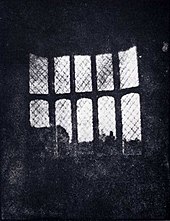
    A latticed window inLacock Abbey, England, photographed by William Fox Talbot in 1835. Shown here in positive form, this may be the oldest extant photographic negative made in a camera.

    Meanwhile, in Brazil, Hercules Florence had already created his own process in 1832, naming it Photographie, and an English inventor, William Fox Talbot, had created another method of making a reasonably light-fast silver process image but had kept his work secret. After reading about Daguerre’s invention in January 1839, Talbot published his method and set about improving on it. At first, like other pre-daguerreotype processes, Talbot’s paper-based photography typically required hours-long exposures in the camera, but in 1840 he created the calotype process, with exposures comparable to the daguerreotype. In both its original and calotype forms, Talbot’s process, unlike Daguerre’s, created a translucent negative which could be used to print multiple positive copies, the basis of most chemical photography up to the present day. Daguerreotypes could only be replicated by rephotographing them with a camera.[21] Talbot’s famous tiny paper negative of the Oriel window in Lacock Abbey, one of a number of camera photographs he made in the summer of 1835, may be the oldest camera negative in existence.[22][23]

    John Herschel made many contributions to the new field. He invented the cyanotype process, later familiar as the “blueprint”. He was the first to use the terms “photography”, “negative” and “positive”. He had discovered in 1819 that sodium thiosulphate was a solvent of silver halides, and in 1839 he informed Talbot (and, indirectly, Daguerre) that it could be used to “fix” silver-halide-based photographs and make them completely light-fast. He made the first glass negative in late 1839.

    In the March 1851 issue of The Chemist, Frederick Scott Archer published his wet plate collodion process. It became the most widely used photographic medium until the gelatin dry plate, introduced in the 1870s, eventually replaced it. There are three subsets to the collodion process; the Ambrotype (a positive image on glass), the Ferrotype or Tintype (a positive image on metal) and the glass negative, which was used to make positive prints on albumen or salted paper.

    Many advances in photographic glass plates and printing were made during the rest of the 19th century. In 1884, George Eastman invented an early type of film to replace photographic plates, leading to the technology used by film cameras today.

    In 1891, Gabriel Lippmann introduced a process for making natural-color photographs based on the optical phenomenon of the interference of light waves. His scientifically elegant and important but ultimately impractical invention earned him the Nobel Prize for Physics in 1908.

  • Postcard Views

    Task:

    1. Gather a selection of postcards (6-12) that you’ve either bought yourself or received from other people. If you don’t have any, then try to borrow some from other people,or see what you can find on an internet search. Write a brief evaluation (around 300 words) of the merits of the images you find. Importantly, consider whether, as Fay Godwin remarked, these images bear any relation to your own experience of the places depicted in the postcards.

    “I am wary of picturesque pictures. I get satiated with looking at postcards in local newsagents and at the picture books that are on sale, many of which don’t bear any relation to my own experience of the place… The problem for me about these picturesque pictures, which proliferate all over the place, is that they are a very soft warm blanket of sentiment, which covers everybody’s idea about the countryside… It idealises the country in a very unreal way.” (Fay Godwin)

    It is now quite some time since I received or sent postcards – most things these days are done by Facebook posts. I looked for postcards in East Anglia seaside towns like Aldeburgh but most were art postcards, no photographs. Even in Cambridge it is difficult to get ‘straight’ postcards. Most are tinted or artist drawings. I feel the traditional postcard is probably going out of fashion with technological change. On the Internet search for ‘postcards’ shows many sites where you can send off your own photos and get them produced as cards – this seems to be the growing trend. The other trend of for vintage postcards and art postcards.

    In the end I resorted to a simple search for Google images of some places I am familiar with on the Norfolk and Suffolk coast.

    Hunstanton postcards

    I find these very tame and boring – the place itself is breezy with salt spray in your face, sounds of seagulls that eat your fish and chips chips, a very poignant out-of-season wrapped up feel on its fun fare and Seaworld, crashing waves against the sea defences and amazing light. It is one of the few places on the East Anglia coast that face West where you can see a sunset, and is also a place famous for seeing a sky full of geese flying to roost or migrating. But nothing of this was in the postcards. They mostly just showed:

    These images are not really ‘picturesque’ in Gilpin’s sense, more just promotion of seaside holidays. The pictures of castles are generally full frontal, with very little photographic artistry. Maybe imitating snapshots that holiday-makers themselves might take.

    Below are a selection of my own mixed ‘picturesque’ and social documentary images taken in early January out of season. I find these out of season images capture more of the spirit of the place – the light and long shadows, the way people enjoy themselves even when it is cold.

    Some other out of season images of Snettisham just down the coast. These are not picturesque – many are purposely underexposed – but do echo my memories of the place. This is possibly because of my memories of taking them – the act of taking images alters perception and memory itself.

    This slideshow requires JavaScript.

    Aldeburgh in Suffolk

    This resort is better portrayed with rather more imagination – maybe because tourists there are rather more upmarket and it is a centre for art shops for the London weekend getaways with money – but still rather tame. Many of the street scenes use a very wide angle lens and leave out the traffic and parked cars – the streets are rarely that quiet.

    Cyclists walking in front of shop

    Fish and chip shop (very famous this one)

    Street view

    Some of what I consider to be the more interesting cards include:

    a  composite with different shaped and sized images of some of the major landmarks

    set of panoramas of different views from the seafront looking towards the town

    narrow panorama of the seafront houses

    narrow panorama of the tower

     the pier

    distant town view from the far beach.

    These cards do capture something of the light, the colour of the Dutch/Norfolk style houses as they look in the sunshine, the dramatic cloud forms (although the blue is too saturated) and the movement in the waves. These are more ‘picturesque’. What they fail to capture is the energy of the place and the people – all the children walking along the top of the sea wall, the different fashions people wear, the scrabble for parking in town (though plenty outside along the shoreline). They also fail to capture the drama of the windy cold days with people still enjoying a bracing walk on the shingle beach. And there is absolutely no social commentary – the parties of the rich with drunken and exclusive guests spilling out onto the streets from their holiday cottages.

    Below are some of my own more ‘picturesque images’ – I also have not so far dared to take pictures of drunken aristocracy. These for me capture more of the feel of the place – though many were taken with an old i-Phone and are not completely sharp.

    2. Write a brief response (around 200 words) to Graham Clarke’s comments above. Do you think it’s possible not to be a ‘tourist’ or ‘outsider’ as the maker of landscape images?

    “…the landscape photograph implies the act of looking as a privileged observer so that, in one sense, the photographer of landscapes is always the tourist, and invariably the outsider. Francis Frith’s images of Egypt, for example, for all their concern with foreign lands, retain the perspective of an Englishman looking out over the land. Above all, landscape photography insists on the land as spectacle and involves an element of pleasure.”

    Graham Clark (1997 p73)

    In its conventional sense as a noun, the land is inanimate space though it may have life in it – so the photographer is inevitably apart as an observer in the way they are not necessarily with documentary or street photography where the subjects of the photograph may participate in determining the meaning .If one takes ‘landscape’ as a verb and not a noun – an act of slicing parcels of space and thereby giving them some meaning – then also the photographer is always in some sense an observer and hence ‘outside’.

    But an observer is not necessarily superficial, privileged, a disinterested tourist or portraying land as spectacle for pleasure. Much depends on the intention of the photographer, their understanding of the complexities of the space they are ‘landscaping’ and the intended audience or market for the images. People may photograph the environment in which they live, or serve as a voice for other people living in the landscape – they are then less of an  outsider. Many photographers have also acted as advocates for preservation or restoration of landscapes devastated by commercial or other human exploitation – those images are far from pleasurable. Technically it is possible to select the content and composition, include even parts of the photographer’s body in the image, to increase the feeling of immersion and involvement. If the intended audience or market for the images is looking not for pleasure or commercial attraction, but to be informed of issues in the landscape/landscaping and the forces that shape it then the photographer often does in-depth research akin to documentary to select the images and meanings to communicate.


  • Psychogeography and Edgelands

    Initial reactions to ‘Wire’ and ‘Power’ – I found the descriptions evocative and also reminiscent of forbidden forays of my own early teenage life with my best friend or my dog into old bombed sites and semi-urban lanes on the outskirts of Manchester – with their potential threats of meeting with men in wait for teenage girls, gang knife fights between rival football teams and the odd murder.

    Many of the descriptions also resonate with areas along my daily walk in Cambridge that I have chosen for ‘Transitions’. And the book is definitely one source of inspiration to which I shall return many times as I progress with that project.

    But I agree with Marion Shoard:

    This book could perhaps have had more investigative rigour. The edgelands now need something beyond a merely subjective celebration of their identity. Far more than our towns and countryside, they are being subjected to ceaseless change. Wild space is being prettified at the expense of its character and creatures. Industrial ruins are being cleared away.

    We could be in the process of losing this landscape just as we are discovering its charms. Should we be trying to conserve it, as we conserve the best of rural environments? Or would any attempt to regulate this space destroy the wildness that makes it special?

    It is time for us to consider what relationship we want to see in the long term between our activity in the edgelands, their epic infrastructure, their unique wildlife and industrial archaeology and their peculiar place in our imagination. 

    Marion Shoard Guardian Review

    Robert Macfarlane Guardian review

  • Diane Burko

    Diane Burko’s work in painting, photography, and time-based media considers the marks that human conversations make on the landscape. A Professor Emerita of the Community College of Philadelphia with additional teaching experience at Princeton University, Burko has received multiple grants from the NEA, the Pennsylvania Arts Council, the Leeway Foundation and the Independence Foundation.

    After focusing for several decades on monumental geological formations and waterways through landscape painting, Burko has shifted in the past 20 years to analyze the impact of industrial and colonial activity on those same landscapes. Burko’s practice seeks to visually emulsify interconnected subjects– extraction, deforestation, extinction, environmental justice, indigenous genocide, ecological degradation, climate collapse– so viewers might feel their connection viscerally through the beauty of her work. While her work deals with impending climate catastrophe, rather than lingering in dystopia, it celebrates the sublimity of the landscape by honoring the intricate geological and political webs that shape the identity of a place.

    Burko has exhibited extensively nationally and internationally, including shows at London’s Royal Academy of Art, Minneapolis Art Institute, National Academy of Sciences, Phillips Collection, Tang Museum, Wesleyan University Center for the Arts. She has been awarded residencies in Giverny, Bellagio, the Arctic Circle, and the Amazon Rainforest. In 2021, her solo exhibition Seeing Climate Change at the American University Museum was cited in the New York Times as one of the best shows of 2021.

    Throughout her practice, Burko especially cherishes her collaborations with researchers in the sciences. She learns the most from “bearing witness” to the land.

    https://www.dianeburko.com/about
  • Time-based audio-visual presentations

    Like books, slideshows have a very ‘linear’ narrative, even more so than the photobook. The creator is in control of the order in which viewers see images and therefore has greater control over the meanings generated.

    Victorian ‘magic lantern’ shows –  idea of projecting a photographic image onto a surface for a temporary duration rather than creating a hard copy to be exhibited

    1960s, 70s and 80s  slideshow screenings at amateur international competitive events. Specialist equipment was developed, whereby two slide projectors would be automated (in terms of duration and opacity of each slide) whilst also playing a stereo soundtrack, all controlled by a domestic cassette tape.

    Automated displays of photographs as for example web galleries are now very common. Slideshow galleries on WordPress and SmugMug, the Slideshow module in Lightroom and iPhoto, as well as Windows consumer software, make it easy to compile this type of automated slideshow quickly and easily. But these are limited – the main control being over the images themselves: which images are show in which order, manipulation of each image to vary the effect of eg colour, viewpoint and crop, sequencing to vary these effects in a meaningful way, and the content and style of any titles and text to reinforce or challenge the meaning in the image. Some software like lightroom Slideshow module allows narration, sound and/or music and mixing of photos with video.

    More considered audio-visual presentations can be both works of art in themselves, and/or more effective as a means of promoting still images. Here the creator takes more control of the relative timing of viewing of each image – some take longer and some less time. There are also different types of transition. Effects can be superimposed to change the image – zooming and panning, changing colour and focus as each image is viewed, multiple images shown at the same time.

    Software used include:

    • Adobe Photoshop
    • Adobe Premiere
    • Adobe Animate
    • Adobe After Effects

    This means that substantial numbers of images can be combined – some similar and some contrasting to enhance a narrative.

    The boundary between video and still photography is becoming increasingly blurred. As high definition video is becoming a standard feature of both consumer and professional DSLRs, and shooting video is becoming more intuitive to digital photographers, it is likely that clients will start to expect photographers to offer video as well as still images.

    YouTube and Vimeo are two places where video content and slideshows saved in a video format (.mov or .mp4) can be self-published.

    Examples

    • Urbex: Beauty in Decay
    • Chris Leslie: slideshows of ‘Disappearing Glasgow’ with photos, background music and interviews. I find these very evocative as a social documentary portrait. These are in a linked series on vimeo – start with  https://vimeo.com/29799259
    • Xavier Ribas  ‘Concrete Geographies’.  Photos of concrete blocks in Barcelona. See his website: http://www.xavierribas.com. This has inside views and links to vimeos of other books like Sanctuary – no text, one photo per spread. Sometimes a cross-over image. But the onscreen resolution is not good enough to really see the images.
    • Alessandro Rota A Neocolonialist’s diary.  Small paisley pattern cover. Coloured photos of sheets in Lusaka. Dark night streets. Lights. See his website . And vimeo of the book. https://vimeo.com/28099164
    • Foto8 Magazine has many powerful photo-only documentary stories with music.

    More video-based:

    • Magnum in Motion and the subscription-based Mediastorm have powerful documentaries that mix video (often slow-motion and photo-like) and animated or still photos with narrative voice over.
    • 1 in 8 Million (New York Times) has a video gallery with video/photo mixes linked to videos with personal stories of varied New Yorkers.
    • Duckrabbit does training as well as producing documentaries blending moving as well as still images.

    Less effective I thought were:

    For links to my own work so far see: Create a slideshow. But this needs more work – when I have less work and risk of RSI.

    Audio-visual pieces – some points to consider

    (adapted from Course Guide)

    Some of the design tips for photobooks, most notably rhythm and sequencing, are equally relevant here.

    • Rationale: What is the purpose of the slideshow? What is the main concept? Who is it for? Why do you want to present your work in a slideshow? Is a slideshow the most appropriate treatment of the work? If there’s a lot of content within the frame, will the viewer have enough time to ‘read’ the image at the given pixel dimensions?
    • Selection and Editing: Edit your work strictly.  Do all the images sit comfortably next to each other. Do any seem out of place? Can this be resolved, or should they be omitted? How long will your slideshow be? If it’s intended solely for on-line use, then it will probably need to be shorter than a piece that will be shown on a loop in a gallery.
    • Sequencing: Sequencing is paramount: consider how certain images relate to each other (graphically as well as in terms of the ‘connotations’ of an image, or the juxtaposition of images within the sequence).
    • Text: Will you use text? What will you say? Will the text complement and reinforce the images, or challenge the viewer through contrast or contradiction?What typeface and style will you use?
    • Sound: Consider the relationship between the sound and your images? Have you got relevant audio and/or textual material to accompany the images? If not, what could you look for?  Adobe Audition and Sony’s Acid Music are quite easy to use giving music loops to combine and layer to compose your own simple music tracks. Websites such as http://freemusicarchive.org  offer copyright-free audio tracks for non-commercial use.
  • Land Art

    ‘Land art’  is a conceptually-based approach approach to making art that emerged in the 1970s. The nature of earth and land art requires the media of film and photography to document outcomes and incorporates aspects of performance art and sculpture.

    Land Art: The focus is not on describing the place itself, but representing the artist’s experience of visiting or travelling to or through it.

    • Hamish Fulton
    • Richard Long
    • Christo wrapping’ works
    • Jeanne-Claude wrapping’ works

    Earth art: involves direct intervention with, and often use of, the raw materials of a landscape (e.g. rocks, plants, mud), and is generally made or presented in situ. In Malcolm Andrews’ words:

    “The work of the Earth Artists cannot easily be identified with this or that particular object which the hands of the artist have made, but more with the relationship between that object (sometimes a mere rearrangement of on-site stones, for instance, or a line drawn on the desert floor) and the otherwise untouched site. The ‘landscape art’ in this case is that relationship.” (Andrews, 1999, p. 204 q Alexander 2013 p71)

    Robert Smithson (1938–73), celebrated for his Spiral Jetty (1970) which is almost 0.5km in length and extends into the Great Salt Lake in Utah.

    In relation to photography this raises the possibilities of manipulating the scene – going beyond simply tidying up strands of grass or intruding branches to constructing images to photograph – along the lines of Mohammad Barouissa’s constructed scenarios of conflict based on research and then staged. One could envisage something similar for eg environmental issues, or simply aesthetic effect.

    A further element used by some land artists, and also painters like Kurt Jackson, are words added to images – might be handwritten or typed in an appropriate font and overlaid in Photoshop. Or simply titling and putting alongside the image as a meta-narrative. This could complement or give ironic contrast to the image.

    Project 2.5: Text in art

  • Mapping and Other Technologies

    A ‘map’ isn’t necessarily something used to navigate through unfamiliar territory; it’s also a visual ordering of features and information…a means of making sense of our physical surroundings in new ways. Alexander 2013 p67

    Liz Nicol the Rubber Band Project (1997)

    Ian Brown’s series Walking the Land (2007)

    Other artists and photographers who layer numerous different photographs include Idris Khan, Jon Spencer and Isidro Ramirez.

    Creative possibilities  have been opened up by digital technologies like:

    •  Google Earth (2005): allows users to make a journey to literally anywhere in the world from the comfort of their computer, scrolling around sites of interest from the vantage point of Google’s satellite images.
    • Google Street View (2007): is limited in terms of its global coverage, but provides a more intimate, street-level view of our landscape.

    ‘Stay-at-home street photographers’ who have used these images – trawling through endless Street View images, framing and selecting these digital views as their own photographs – as a form of ‘appropriation’ art include:

     Project 2.4: Is appropriation appropriate?