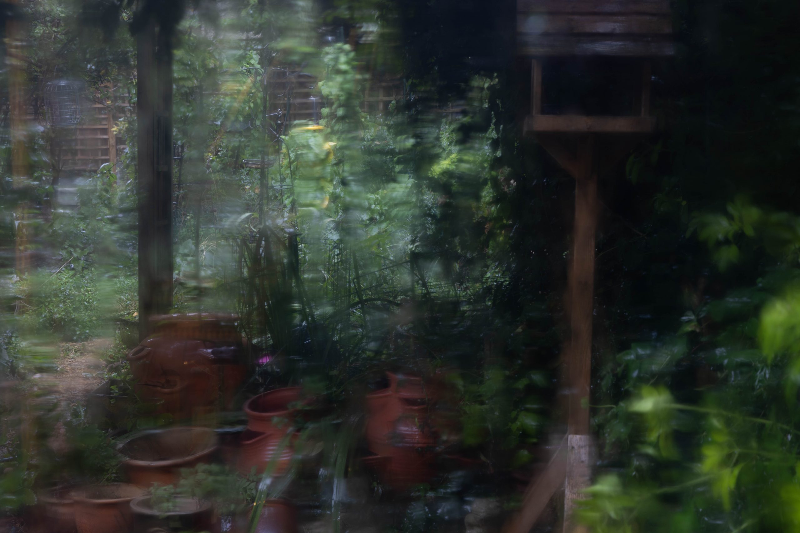
I would like to collaborate with people interested in collectively developing a series of alternative ‘essence of autumn’ images that are less stereotypical and more creative and meaningful for the 21st century than the ones we normally see.
In Europe this month is now technically in autumn. But in UK there is abnormally warm weather over much of the country. What I see in my garden and walks by the river ranges from remnants of bright green to dull fading greens of dying grass, grey whites and browns of dried seed heads and white purple-veined convolvulus flowers spreading in dark green hedge shadows. The occasional yellow flowerhead, faded red poppy and blue cornflower. There are only occasional splashes of the traditional autumn oranges and reds of turning leaves that I assume will at some point in the near future burst to fill the conventionally picturesque autumn scene, Though actually what I see are mostly terminally shrivelled rusty browns of diseased horse chestnut trees. I am anticipating later the melancholy end-of-year dark browns and purples of decaying wet leaves, punctuated with white grey mushrooms and fungus.
I apologise for the late night lyricism. But I have many questions, for example:
What is colour anyway, given that we all perceive things rather differently? What does the camera capture when we talk of colour? How ‘accurate’ can photography be? and, given the variations in individual perception, what do we mean by ‘accurate’ amyway?
What are the geographical differences in ’objective colours of autumn’? Are autumn colours different in urban areas and cities than in rural areas? In other regions of the Northern hemisphere? In the Southern hemisphere Spring?
How is ‘objective’ colour linked to our subjective emotional associations? How do different colours convey different moods associated with autumn? How does this vary between cultures?
How does climate change and what we actually see this year affect our conception of ‘autumn colours’?
These are only my initial late night thoughts. Other people may have very different conceptions and questions to shape the discussion. On a practical manageability level in the timeframe, photographs could be existing photographs, new images through the window of the street or garden, a walk around where you live or further afield, objects brought home, something more abstract etc etc etc etc.
I am particularly interested in the nature of light at different times, ways in which light changes and the process of digital capture to either record light accurately or camera adjustments to ‘make a better image’. And how this changes with different colours and techniques.
My strongest work in Assignment 2.2 Shutterscapes were the Aldeburgh Carnival photos with the focus on ‘English quirkiness’ and colour style inspired by Martin Parr. I was not able to do new photographs because continuing COVID uncertainties meant the 2020 and 2021 Carnival and other events were cancelled.
Shutterscapes II: Carnival Days brings the earlier 2017 photographs together as two reportage Photo Essays re-processed and re-framed to best represent different aspects of the carnival, sometimes humorous and sometimes intense. These images are now poignantly nostalgic, looking back at a time of freedom before ‘carnival was cancelled’, a time when mask-wearing in public was a quaint oriental habit and social distancing was anti-social. From a time when the future of the pandemic is still uncertain.
Experimenting with square and also other alternative formats is a very useful exercise I found, even if for some images I go back to the original – and maybe clarify some of the focus and contrast to achieve a new meaning or emphasis.
The work for this module is all part of an anticipated long term connection with Aldeburgh. Early 2022 I intend to send my work on the Carnival to the Carnival committee and see if they give any feedback on what is now something of a historic/nostalgic set of pictures. Once it is again COVID-safe to visit – possibly not until late 2021 because of the crowds once things open up again – I plan to discuss my work with some of the bookshops.
For high resolution of selected images see galleries on my SMUGUG Portfolio site:
As well as the gallery and sales on Shutterstock from Assignment 2.2 Shutterscapes, I submitted first and final images to Cambridge Camera Club to see it they were suitable for the exhibition. But people thought that although they were good for documentary – life, confusion and coloured chaos being the essence of carnival – they were too busy for Exhibition photographs.
The first image of the women with dogs they thought too confusing – the humorous chaos of being pulled in different directions by dogs and shouting being the point of the photo as documentary.
The final image of the woman with the charity bucket they thought was problematic because the streamers were in front of the woman’s face. It would have been difficult to take a photograph without the streamers without disturbing the scene through moving in closer and/or asking her to pose.
Lead Photo selected because of its dynamic colour and chaotic activity. I cropped the origtinal image in to remove the red person on the right and put the pink woman’s mouth and face on the thirds line so that the eye goes straight to that. With an implied shout line to the women on the right – via the annoyed looking woman in the middle.
Context shot og the crowds and stalls. The confused looking ‘man on holiday’ further emphasising the story of noise and chaos.
Sequential shot – one of the first floats. Selected for brilliant colour.
Sequential shot – selected because of clashing colours, but also disability inclusion that is an important feature of Aldeburgh and the carnival.
Portrait shot of expectant onlookers.
Portrait shot. Selected because of the lively expression on the qwoman’s face. I also liked the hand with the mobile phone behind – different ways of communicating.
Portrait shot of colourful toy seller. And the woman behind filming on her phone.
Portrait shot of colourful whistle seller. And the people behind.
Sequential shot – one of many of the band. Chosen again to show attempts at diversity – though this man was the only non-white member of the band.
Context shot. Chosen because I like the contrast between the caring policeman and the wandering child. Then the crowds of people lining the road behind.
Sequential shot. Girl pointing to something interesting happening after all the waiting.
Sequential shot. Carnival Queen.
Sequential shot following up on the waiting wheel chair participants earlier.
Sequential shot I like the different expressions on the girl’s face, and those of the dressed up gorilla and chimpanzee.
sequential shot chosen for more clashing colour.
Sequential shot. Colourful procession.
Sequential shot near the end of the procession. Ending with colour red.
After the procession paeople stand around and chat. Again colour clashes. I like the expression on the green man at the back.
Ending shot after the procession – one of the main aims of carnval is to raise money for local charities.
Final shot the carnival photographer reviews his images.
2: Carnival People: Aldeburgh 2017
As I was going through editing the colour images I thought I would see how they might look in black and white. I was quite surprised how different things looked. Very busy images were often simplified, and the focus was very much on peoples’ expressions and emotions rather than being drowned in colour.
I am also interested in black and white because it makes people look more anonymous. The images are not like the portraits they take on their phones. So potentially less ethically sensitive?
Carnival squared – the square crops have a much closer and intense focus. They make me think even more carefully what to leave in and what to leave out. My preconceptions were disrupted by the different format and I often noticed new things that I did not see before.
I think there is potentially an interesting Photobook. Inspired by Shirley Baker’s work on the North of England and Bruce Gilden’s bold flash street photography of New York. But looking at the draft below again after a break, I think the photographs are too small on the page, and I need to think a lot more about layout with much less frame, and varying the layout as in Assignment 5.2.1 Bridge.
Menu
2.2.1: Aldeburgh revisiteda very varied archive of old iPhone 5, iPad Pro and DSLR images processed in Light Room, inspired by the style of Marti Parr.
2.2.2: MINE, Penwith Cornwall: DSLR images converted to Monochrome in Lightroom and inspired by the moody and contrasty styles of Daido Moriyama and Brassai.
2.2.4: Dark Peak : low resolution images taken on an old Canon G3 compact inspired by the black and landscape work of Fay Godwin and Paul Hill as well as very early photography techniques.
Assignment 2.2 asked me to establish a self-directed project that would allow me to explore and develop skills identified in my personal statement, revisiting previous project and/or new work.
One of the key areas identified in my aims for this course was further development of my photography skills, particularly digital software editing skills in Lightroom and NikFX. I focused on existing photography series from East Anglia and Northern England, selected to present a range of different challenges and styles.
The project brief explicitly required me to focus on skills development rather than content and meaning. My aim was to start to significantly improve my digital photography editing skills and develop a number of alternative visual communication workflows in different photographic styles in different software. More specifically to:
significantly improve my proficiency in different modules of Lightroom : develop module, book module, slideshow module and print module to see what can be achieved through using Lightroom alone.
explore potential role/s in my digital workflow of of DxOFX (NikFX) filters that I had not tried before, and compare what these can do compared to the quicker processes directly in Lightroom.
I selected a number of images I found interesting and/or potentially marketable but of varying quality and aesthetic from existing photo series dating back as far as 2011. My other set of criteria was their suitability in posing a variety of technical challenges to experiment with effects in the different software. Some of the images are older and less ‘professional’ low resolution jpg images shot with an iPhone or old compact camera. Others are newer and better considered RAW images shot on a DSLR. The aim was to explore a range of interesting and relevant technical treatments in different software as a more creative way of discovering ‘happy accidents’ as visual communication rather than focusing only on more conventional ‘technically professional photography’.
Although I was not asked to focus on content or meaning, my discussion of the images and the ways in which I develop them draw on discussions of beauty/sublime, the picturesque and ‘tourist gaze’ in landscape and documentary photography and considers ways in which different styles of digital processing can alter the meanings of the photographic image. In each series I explore a range of possible aesthetic and colour and/or monochrome technique before identifying those that best communicate the ‘spirit of place’, different ways in which human activity has ‘landscaped’ the ‘natural’ environment and my own ‘landscaping’ of what I see.
Stock Photography: audience and marketing
A further key aim of this assignment was also to start to look at ways of promoting my work, starting with Shutterstock stock image market. Advice from experienced stock photographers is to have a larger number of different types of image – editorial, commercial and also abstract. Rather than – as in higher end photography – to focus on a distinctive style and niche. So an issue in selection of series and images was how far I thought they might be suitable as stock photography rather than their documentary interest.
My original submission to my tutor included images from locations in Norfolk and Suffolk that were underrepresented on Shutterstock, covering a large number of images to get lots of experience in addressing different processing challenges. But, following advice from my tutor I narrowed down the images presented here to those in the series on the left. The other image collections submitted to Shutterstock as a result of this Assignment can be found on:
Some of my own preferred images were actually sold on Shutterstock. But many of the sales appeared to be based on location searches, sometimes several together. Technical quality was not always the highest. Nor did I myself always like the images – I had taken them as part of documentary memories of a place and posted them because I thought they might have a market, rather than trying to represent my ‘voice’. This raises some questions about ways in which I might need to separate commercial photographic work from my own personal projects, though stock photography for a range of outlets is certainly a possibility if I take this work seriously. Other stock sites offer better terms for the best photos and I would probably have more success if I monitor the effectiveness of different content and keywords, and do more regular uploads to keep my images more prominent in searches. I could also do more market research on demand, and promote of my images on different platforms. I would however need to consider the relationship between that and possibility of sales from my own websites. Also whether or not I actually want to spend time on commercial work rather than earn my income from my professional consultancy career. To focus all my creative time on my own projects.
Further development
In further development of my own personal projects, many of the low resolution, grainy images that are not technically acceptable as landscape photographs could be developed as photography-based prints in photoscreen, photolithography, cyanotype and/or sola plate. Building on my development of images of the Bridge in Assignment 2.1 and 5.2.
In terms of developing the images that I feel represent my ‘voice’ and that interest me as personal projects, concept and narrative are key. As well as further developing my technical capture and processing skills, including not only Lightroom and NikFX but also Photoshop and other software like Topaz Lab. In the original assignment sent to my tutor I had drafted photobooks of photographs from National Trust properties in East Anglia and Cornwall that I had intended for further development in VCAP Assignments 4 and/or 5. But these had to be postponed because of travel restrictions during the COVID-19 and consequent difficulties developing content with local communities and required permission from National Trust. They will be followed up as part of Sustaining Your Practice or after completion of my degree.
2.2.1 Aldeburgh Revisited
Aldeburgh is a Suffolk seaside town that we visit frequently for short camping holidays in the summer and days out in the winter. It has a thriving tourist art market with well-known artists like Maggi Hambling as well as local artists.
I have a very large archive of photographs of very variable quality. In this project I focus on colour, using three series of images:
Aldeburgh Morning Light: very low resolution images taken to test my first iPhone.
Aldeburgh Carnival 2017 taken on my iPad Pro originally taken as background reference for sketchbooks of Aldeburgh in Illustration 2.
Carnival Processions: high resolution RAW images taken on my DSLR
Focusing on colour styles, I explore how I can enhance the colour in the style of photographers like Martin Parr using Lightroom and Viveza, and how poor quality images can be developed as interesting atmospheric images in ColorFX and/or Photoshop. I was also interested in whether or not I could make low resolution images, as well as my DSLR images, technically acceptable as Stock Photography for Shutterstock.
Other images I like for their colour, expressiveness and/or documentary quality.
Aldeburgh Morning Light
iPhone photographs processed in Color FX. Unfortunately the experimentation underlying the final images was deleted during a WordPress and pc disk upgrade. None of these images were of high enough resolution for Stock Images. But could form the basis for Photoscreen or solarplate prints and/or designs for linocut.
Aldeburgh Carnival
Slideshow of iPad Pro photographs processed in Lightroom. Several of these were accepted by Shutterstock, and also sold, following processing.
Aldeburgh Carnival Procession
DSLR photographs processed in Lightroom for Martin Parr-style saturated colour.
These are further developed as a Photo Essay and web gallery in Assignment 5.1 Shutterscape Reflections:
Another documentary project I did a lot of work on in previous OCA illustration and printmaking modules, was the tin mining industry in Penwith.
Dating back to Roman times at least, tin mining has historically been one of the main sources of employment – as romanticised in the Poldark series. The mines have all closed over the last decade because of trends in the international markets for tin, causing a lot of poverty and unemployment in the mining communities. A number of local and international artists have worked with mining communities, giving presentations of their work at Tate St Ives. Many of the mines are currently run as tourist attractions – capitalising on t6he Poldark effect. I have so far visited three of the mines: Geevor, a private min and Levant and Botallack owned by National Trust. Although currently closed, there are discussions on how the substantial deposits of lithium can be exploited without significant environmental pollution – rather than exporting that problem to other countries to fulfil the rapidly rising demand for lithium batteries.
I have a lot of documentary notes from various talks about the industry. Some of the photos of Geevor I used as the basis for linocuts in Printmaking 1. And there is significant potential for doing printmaking in different print media for cards and other outputs for the tourist market. The tour guiders are also very friendly and there is potential to develop Photobooks eg as the basis on which I could apply for a National Trust photographer permit to do commercial work on other properties in the UK. I should also ask for permission from the (friendly) community/privately-owned Geevor mine.
In this assignment I reviewed my photographic images, selecting some of the most dramatic in Black and White to provide some sort of overview narrative. I processed these in Black and White and exported them as a Slideshow from Lightroom. The presentation on the left had to be converted to low resolution in order to fit the file size limits on WordPress.
Due to COVID-19 restrictions I was not able to revisit Cornwall to work further on this area until September 2021, and this is now one of the locations selected for SYP.
2.2.3 In Search of Sublime, Lake District
I revisit photographs from a short stay in Troutbeck in the Lake District taken in 2014 for a Landscape Photography personal development assignment (not submitted for assessment). I wanted to see how processing these with Dx0FX Viveza could bring these to a more professional standard, comparing this with Lightroom.
I myself really like the enigmatic reflected sunsets, abstract shapes, almost apocalyptic cloud images, wind or rain with drops on the lens and black and dramatic black and white images of the many vapour trails. For me these represent my experience of Troutbeck much more than the ‘prettier’ pastoral images. But these would need to be brought together as a narrative, or shot with more technical skill probably on a better camera than my existing DSLR.
Further anticipated documentary work was again impossible because of COVID-19. I develop this image series further together with new images from Derwentwater in 2019 and further planned visits in 2022 in SYP.
Clouds
Rain and wind
Sun
2.2.4: Dark Peak
A series of images from a walk in 2011 around Crowden in the Peak District. Taken on an old Canon G3 compact. camera series of photographs, these images were very low resolution, grainy and with jpg artefacts. The images themselves were reminiscent of some of the landscape work of Fay Godwin and Paul Hill, and I liked the stark loneliness of ‘grey grit’ landscape and skeletal trees.
This first set of images was a set of experiments in monochrome conversion to see what could be done in SilverFX to produce enhance the ghostly loneliness of the landscape and sense of vulnerability of the trees. I find the results quite atmospheric, with interesting illustrative possibilities if further developed and combined with some sort of narrative. None of these images were of high enough resolution to submit to Shutterstock. But could be used for photography-based printmaking.
The Path
Lightroom Landscape BW1b with readjusted colour balance on sky to bring back gloom and reduced clarity and contrast in bottom right corner to lead the eye in to lightened sharpened gate at the end of the path.
4000×3000 pixels on Canon Powershot G9. ISO 200 1/800 sec@f/4.0. I like the green colour after the rain. But jpg artefacting because of camera an d jpg format.
Colour image processed in Dfine to removes artefacts. Black and White classic conversion in Analogue FX pro gives a vintage feel and artefacting a bit more acceptable. Just dull emptiness.
Lightroom Landscape Black and White Conversion. Uses Dfine to remove some of the jpgartefacts, then SilverFX high structureBW with lighten and sharpen points on the horizon line to accentuate man and gate, and reduce structure and darken in forground to bring the eye in. Removing contrast in sky. No vignette. This retains the dull emptiness. But blurry artefacts still there.
Lightroom add grain in foreground. Edit in SFX wet rocks filter. Sharpens and increases contrast for more impact. The texture of the grain is similar to the texture of the heather on the hills.
Lightroom Landscape Black and White Conversion. Spred blacks. Gradtauted filters to slightly darklen and increase contrast on bottom left and top of the image. Clarity adjustment filter on the rock to draw eye up the river. Add grain to mask remaining jpg artefacts.
Lightroom Landscape Black and White Conversion. Spred blacks. Gradtauted filters to slightly darklen and increase contrast on bottom left and top of the image. Clarity adjustment filter on the rock to draw eye up the river. Add grain to mask remaining jpg artefacts.
Lightroom Landscape Black and White Conversions
Ther interest here are the rock veins and the tree silhouettes. Lightroom Landscape Black and White Conversions. Silver FX focus on the rocks to increase contrast and sharpness of texture. Increase sharpness and contrast on the tree ridge and rocks bottom right. Darken bottom left and sky area.
Ther interest here are the rock veins and the tree silhouettes. Lightroom Landscape Black and White Conversions. Silver FX focus on the rocks to increase contrast and sharpness of texture. Increase sharpness and contrast on the tree ridge and rocks bottom right. Darken bottom left and sky area.
Ther interest here are the rock veins and the tree silhouettes. Lightroom Landscape Black and White Conversions. Silver FX focus on the rocks to increase contrast and sharpness of texture. Increase sharpness and contrast on the tree ridge and rocks bottom right. Darken bottom left and sky area.
Ther interest here are the rock veins and the tree silhouettes. Lightroom Landscape Black and White Conversions. Silver FX focus on the rocks to increase contrast and sharpness of texture. Increase sharpness and contrast on the tree ridge and rocks bottom right. Darken bottom left and sky area. Adding noise and grain did not work with this image.
Water, rocks and flowers
Lightroom Landscape Black and White Conversions
The interest here is in the moevement of the water, and ther flow over the rocks. Edit in Silver FX high contrast High structure and control points on water and rocks to increase contrast and structure and lithen. Then control points on bottom corener to darken and reduce structure so the eye is not diectracted.
Remove some of the artefacts with Photoshop noise reduction – works better for this image than Dfine. But image quality remains a problem.
The interest here is in the contrasting textures of the rocks and the grasses and lichens. No real focul point, but allow the eye to explore. Edited in Suilver FX Pro with control points dotted over the image to increase or decrease contrast, structure and brightness to increase the variation and interest. Jpg artefacts are not really a problem because of the short focal length and amount of detail.
Lightroom Landscape Black and White Conversions
Trees and Sky
Experience with Shutterstock by August 2021
My experience so far has been broadly positive – good resources database on areas like intellectual and privacy rights, technical tutorials and quick and helpful response to some queries I had. I have learned a lot technically. and the experience has taught me a lot so far. Most of my 220 images were accepted when submitted first time (having consulted all their documentation first). The main reasons for rejection have been because of issues like titling, editorial vs commercial categorisation or keywording. Only 3 have so far been terminally rejected on jpg quality issues, but even these I think I plan to re-submit as more artistic creations using NikFX and/or use as images for photography-based printmaking.
Sales have been less successful. Shutterstock is generally considered by You Tube contributors to give highest income because of volume of sales rather than percentage of price. But in order to make substantial income you need to have around 2-3,000 images and constantly have a drip of new images going on. By the end of this module I had had 19 downloads, at different prices from 0.10C to $2.07, earning a grand total of USD5.80. The latest being August 2021, so sales still being made. Unfortunately because of changes to the Shutterstock member platform, I cannot link all these here.
Aldeburgh Lockdown Escape is a body of work based on a two week holiday in Aldeburgh, Suffolk during the COVID-19 pandemic in December 2020. This was a time when the very first vaccinations were being started and people were relaxing their behaviour in anticipation of a removal of restrictions over Christmas. And before the horrendous second wave in January and February 20201.
I had originally intended to do a street documentary of Lockdown. But in the event there was too much traffic pollution and too little social distancing for me to be comfortable going out except for one daily blow along the edge of the sea, and that only on days when it was not raining. At the same time the austere grey cottage interior had very interesting reflections and angles, and the reflected light through condensation on cold morning windows and the see-through cotton blinds were ‘sublime’. I worked on two completely new interlinked projects:
‘Reflections in Grey’ is a black and white Photobook of ‘a journey’ round our holiday escape two-room cottage, with snippets of found text from my diary, books I was reading and local news. In a claustrophobic small square format it juxtaposes images of the rooms with ‘slices of textured light’, texts I was reading and newspaper clippings as an internal narrative about coping with Lockdown and also increasing external urgency of pollution and climate change.
‘Lockdown Landscapes’ two Photo Essays taken on the few days when I went out, selected to tell somewhat different narratives in colour and monochrome.
For high resolution images and slideshows see the galleries on my SMUGMUG Portfolio website::
My photographic work on Aldeburgh here is part of a much bigger and ongoing body of work ‘Aldeburgh Great Escapes’ that will be further developed in Sustaining Your Practice, together with a moving image version of ‘Reflections in Grey’ and sketchbook, printmaking and iPad illustration work.
1: Reflections in Grey: Photobook
‘Reflections in Grey’ aims to ultimately be a series of rather rambling but hopefully interesting reflections on ‘politics of the sublime’ and the ‘new normal’ post-COVID-19. This is a completely new body of work – black and white photography of ‘a journey’ round our holiday escape two-room cottage under lockdown in December 2020. I had originally intended to do a street documentary of Lockdown. But in the event there was too much traffic pollution and too little social distancing for me to be comfortable going out except for one daily blow along the edge of the sea, and that only on days when it was not raining. At the same time the austere grey cottage interior had very interesting reflections and angles, and the reflected light through condensation on cold morning windows and the see-through cotton blinds were ‘sublime’.
Reflections in Grey builds on the feedback and experience of producing Assignment 3, A Week in Teetotal Street and Assignment 4.2 Light in the Shadows of T’ien Shan and Assignment 5.2.1 Bridge. Like Teetotal Street I use a claustrophobic square format and combining personal and contextual narrative in layering and juxtaposition of images with diary extracts, texts of books I was reading and newspaper clippings. Like Light in the Shadows of T’ien Shan I work in black and white photography with attention to cropping and framing on the page. But Reflections in Grey is a much more intimate work that takes photographic abstraction, study of light and textures and experimentation with tone, focus and viewpoint much further.
My creative process involved taking many photographs each day, keeping a journal (see below left), collecting clippings from local papers and taking video footage of the changing light, house sounds and traffic noise outside. As the holiday progressed these became more strategic in capturing emerging themes and ideas relating to my diary and also the reading of:
DE MAISTRE, X. 2004. A Journey around My Room, London, Alma Books Ltd.
MORLEY, S. (ed.) 2010. The Sublime, London: Whitechapel Gallery.
SOUSANIS, N. 2015. Unflattening, Cambridge Mass and London, Harvard University Press.
My first version was a rough brainstorm selecting images and matching with texts in InDesign and shown below on the right.
The book so far – still small square format – is shown on the right. This current version revisited the image selection, sketchbook and found texts and re-ordered the narrative to have more of a thematic approach and flow. I cut a lot out, and focused on either minimum text or in some cases a David Carson approach to legibility there the overall texture of the image and text combination is more important for meaning that the legibility of the text itself.
For high resolution images and slideshow of the book, see the galleries on my SMUGMUG Portfolio website:
This is still very much a work in progress. It is unlikely that I will get the Photobook from Blurb before I finalise my assessment submission. I then want to get audience feedback – preferably face to face discussions rather than on-line so that I can ask probing questions I have and discuss differing viewpoints without wasting peoples’ valuable time. But on the whole I think this book has potential as a concept, with implications wider than the immediate time and place of Aldeburgh in Lockdown.
2: Aldeburgh Lockdown Landscapes
Lockdown Landscapes I
20 images selected for the dramatic sea, stark light/shadow/shape contrast and feeling of loneliness and desertion.
5.2 Taking Things Forward: Aldeburgh Escapes 2021 onwards
The work for this module is part of longer term and wider body of work in a range of media around ‘Escapes on the Edge’.
In addition to the photographs here and in the Shutterscapes series, I already have a lot of photographs, sketches and video clips of Aldeburgh from previous OCA courses that I started to review, cull and bring together as a multi-media A3 sketchbook with collage and annotations. Including work in different styles from other local artists. But this needs more work before presentation. I have only very recently gained access to my art studio after clearing space for our daughter to live separately for COVID social distancing.
For SYP I plan to do more documentary as well as personal work on Aldeburgh:
diversity in tourism – Aldeburgh is a disability-friendly place and the numbers of older people and people with disabilities is noticeable. There are also an increasing number of people from ethnic minorities. But I would need some time to do this sensitively as I feel uncomfortable/unethical being too intrusive as a photographer.
environmental issues – pollution, effects of climate change and rising sea levels on erosion of the town and the thorny issue of nuclear energy and development of Sizewell C. Although this may well bring jobs for some, it will alter the local environment and tourist industry beyond all recognition.
‘imaginings’ and folk and political narratives suggested by textures around the town developed as a short book of ‘Moot Tales’ and/or as short animations.
Aldeburgh Lockdown Escape is a body of work based on a two week holiday in Aldeburgh, Suffolk during the COVID-19 pandemic in December 2020. This was a time when the very first vaccinations were being started and people were relaxing their behaviour in anticipation of a removal of restrictions over Christmas. And before the horrendous second wave in January and February 20201.
I had originally intended to do a street documentary of Lockdown. But in the event there was too much traffic pollution and too little social distancing for me to be comfortable going out except for one daily blow along the edge of the sea, and that only on days when it was not raining. At the same time the austere grey cottage interior had very interesting reflections and angles, and the reflected light through condensation on cold morning windows and the see-through cotton blinds were ‘sublime’. I worked on two completely new interlinked projects:
‘Reflections in Grey’ is a black and white Photobook of ‘a journey’ round our holiday escape two-room cottage, with snippets of found text from my diary, books I was reading and local news. In a claustrophobic small square format it juxtaposes images of the rooms with ‘slices of textured light’, texts I was reading and newspaper clippings as an internal narrative about coping with Lockdown and also increasing external urgency of pollution and climate change.
‘Lockdown Landscapes’ two Photo Essays taken on the few days when I went out, selected to tell somewhat different narratives in colour and monochrome.
For high resolution images and slideshows see the galleries on my SMUGMUG Portfolio website::
My photographic work on Aldeburgh here is part of a much bigger and ongoing body of work ‘Aldeburgh Great Escapes’ that will be further developed in Sustaining Your Practice, together with a moving image version of ‘Reflections in Grey’ and sketchbook, printmaking and iPad illustration work.
1: Reflections in Grey: Photobook
‘Reflections in Grey’ aims to ultimately be a series of rather rambling but hopefully interesting reflections on ‘politics of the sublime’ and the ‘new normal’ post-COVID-19. This is a completely new body of work – black and white photography of ‘a journey’ round our holiday escape two-room cottage under lockdown in December 2020. I had originally intended to do a street documentary of Lockdown. But in the event there was too much traffic pollution and too little social distancing for me to be comfortable going out except for one daily blow along the edge of the sea, and that only on days when it was not raining. At the same time the austere grey cottage interior had very interesting reflections and angles, and the reflected light through condensation on cold morning windows and the see-through cotton blinds were ‘sublime’.
Reflections in Grey builds on the feedback and experience of producing Assignment 3, A Week in Teetotal Street and Assignment 4.2 Light in the Shadows of T’ien Shan and Assignment 5.2.1 Bridge. Like Teetotal Street I use a claustrophobic square format and combining personal and contextual narrative in layering and juxtaposition of images with diary extracts, texts of books I was reading and newspaper clippings. Like Light in the Shadows of T’ien Shan I work in black and white photography with attention to cropping and framing on the page. But Reflections in Grey is a much more intimate work that takes photographic abstraction, study of light and textures and experimentation with tone, focus and viewpoint much further.
My creative process involved taking many photographs each day, keeping a journal (see below left), collecting clippings from local papers and taking video footage of the changing light, house sounds and traffic noise outside. As the holiday progressed these became more strategic in capturing emerging themes and ideas relating to my diary and also the reading of:
DE MAISTRE, X. 2004. A Journey around My Room, London, Alma Books Ltd.
MORLEY, S. (ed.) 2010. The Sublime, London: Whitechapel Gallery.
SOUSANIS, N. 2015. Unflattening, Cambridge Mass and London, Harvard University Press.
My first version was a rough brainstorm selecting images and matching with texts in InDesign and shown below on the right.
The book so far – still small square format – is shown on the right. This current version revisited the image selection, sketchbook and found texts and re-ordered the narrative to have more of a thematic approach and flow. I cut a lot out, and focused on either minimum text or in some cases a David Carson approach to legibility there the overall texture of the image and text combination is more important for meaning that the legibility of the text itself.
For high resolution images and slideshow of the book, see the galleries on my SMUGMUG Portfolio website:
This is still very much a work in progress. It is unlikely that I will get the Photobook from Blurb before I finalise my assessment submission. I then want to get audience feedback – preferably face to face discussions rather than on-line so that I can ask probing questions I have and discuss differing viewpoints without wasting peoples’ valuable time. But on the whole I think this book has potential as a concept, with implications wider than the immediate time and place of Aldeburgh in Lockdown.
2: Aldeburgh Lockdown Landscapes
Lockdown Landscapes I
20 images selected for the dramatic sea, stark light/shadow/shape contrast and feeling of loneliness and desertion.
5.2 Taking Things Forward: Aldeburgh Escapes 2021 onwards
The work for this module is part of longer term and wider body of work in a range of media around ‘Escapes on the Edge’.
In addition to the photographs here and in the Shutterscapes series, I already have a lot of photographs, sketches and video clips of Aldeburgh from previous OCA courses that I started to review, cull and bring together as a multi-media A3 sketchbook with collage and annotations. Including work in different styles from other local artists. But this needs more work before presentation. I have only very recently gained access to my art studio after clearing space for our daughter to live separately for COVID social distancing.
For SYP I plan to do more documentary as well as personal work on Aldeburgh:
diversity in tourism – Aldeburgh is a disability-friendly place and the numbers of older people and people with disabilities is noticeable. There are also an increasing number of people from ethnic minorities. But I would need some time to do this sensitively as I feel uncomfortable/unethical being too intrusive as a photographer.
environmental issues – pollution, effects of climate change and rising sea levels on erosion of the town and the thorny issue of nuclear energy and development of Sizewell C. Although this may well bring jobs for some, it will alter the local environment and tourist industry beyond all recognition.
‘imaginings’ and folk and political narratives suggested by textures around the town developed as a short book of ‘Moot Tales’ and/or as short animations.
The River Cam is part of a longer term body of environmental and social documentary work in different media about ‘Cam Edgelands’ that is central to my practice going forward. The river is just down the road from my house and an area where in normal times I walk nearly everyday for exercise.
The A14 road bridge is one of a number of bridges across the river. On one side the bridge underpass dissects two areas of land that are used by travellers and migrant workers living on a Traveller site relegated to the margins of Cambridge. There is a well-established traveller community that has been there for very many years. Living on one side of the bridge, they use fields on the other side to keep their horses, using the underpass as a transit between the two. Before Brexit they were joined by migrant workers – particularly men – from Eastern Europe. It is unclear how much of the graffiti, litter and broken glass is created by either of these communities, and how much by other walkers passing under the bridge. Graffiti is certainly not confined to this bridge, but is evident in a range of styles also under the other bridges along the river.
The river itself is part of the University rowing Bumps course, and used by town rowers and also leisure boats.
The other side of the bridge is mostly farmland with a footpath linking the somewhat affluent villages of Horningsea to Fen Ditton.
It is a haunting, almost spiritual place. Large majestic concrete pillars with enigmatic graffiti create dramatic shafts of light in the early morning and sunset or dark shapes in the winter fog. Between shuddering bursts of traffic overhead, the water reflects and echoes the drips from the roof. The ever-changing artworks, puddle-life, scatterings of litter and sparkling broken glass tell stories, real and imagined.
I have nearly 2000 photographs of this bridge dating back to 2009, taken with cameras of varying technical quality and with varying technical skill on my part. But, together with my thousands of other images of other bridges and ‘edgeland’ features on this regular walk, the Bridge will continue to be an important ongoing part of my creative practice. There is also a potentially important local audience and market for physical images: photographic prints and art prints in different printmaking media, photobooks and sketchbooks eg as part of submission to Cambridge Open Studios, and more socially-interested Cambridge residents and tourists. As well as on-line presentation, interest from Cambridge Camera Club and other creative networks in Cambridge.
Thematically in this module, part of my motivation to focus on the Bridge in Assignment 5 is because it shows a body of work around peri-urban ‘sublime and grunge’ and concerns about poverty, alienation and pollution in the UK where I live. To balance work on these concerns in contexts like Kyrgyzstan where I am an outsider and where attention to the less than beautiful aspects could be misinterpreted as ‘rich world complacency and racist prejudice’ .
My ability to produce new photographic work of the Bridge has been continually disrupted over the period of this module. Firstly between March 2020 and May 2021 I was not able to go down the narrow river towpath to the Bridge because of Covid-19. The towpath was continually crowded in both Lockdown and more open times as one of the main places that local people went for exercise with very many runners and cyclists accompanying rowers, with very little social distancing and a lot of aerosols being expelled for long distance in plumes that are very alarming in cold weather. From May 2021 the area under the bridge was closed for repairs, and then towpath was closed for all of July/August for final works on a new cycle bridge across the river. The Covid pandemic also meant that it was very difficult to do the sort of documentary research I had hoped.
My focus in this module has therefore been on :
Printmaking: Continuing experiments with photography-based print media: revisiting photoscreen and new images in solar plate.
Photographic creativity: Web galleries that explore alternative perspectives on the bridge, and the way in which different narratives can be created through different selecting and formatting of the images and how narratives and moods can be enhance by different digital processing styles.
Photobook Design: looking at different potential narratives and layout for Photobooks, continuing my earlier interest in juxtapositions and framing.
Slideshow of Page Spreads from Draft Photobook
For high resolution images and galleries of all the material presented here please see:
Photoscreen gives a grainy, documentary feel because of the duotone dot process that is similar to newspaper printing. Though different effects can be achieved through the way the initial image is processed and degree of detail, particularly in the highlights and shadows, the shape and density of the dots, then exposure and inking processes.
For more detail and discussion of the development of the printmaking images and different effects of photo screen see:
Solar plate gives a much dreamier feel. A double exposure solar plate starts with a fine mezzotint stochastic screen. This enables much finer detail. Again the effect depends very much on processing of the initial image – the pylon image on the left is very dreamy with more grain. The ‘underworld’ image on the right is much more contrasty, retaining details in the highlights and shadows.
In order to get an overview of the ‘spirit of place’, I started with a free brainstorming of what I thought were potentially the most interesting images and angles that I could use – with some processing in Lightroom and/or Topas AI and/or DxOFX and/or Photoshop to improve technical quality.
This led to an initial ragbag of images that did not have coherence in themselves, but sparked ideas on at least five very different narrative approaches with focus on:
‘Colour grunge’ traces of human activity: graffiti, wire netting, ‘horse has bolted’, dark reflections. With an overall dark mood of the mess that people leave when they live on the margins.
‘sublime light’ with geometric angles, colours and finding beauty in the everyday.
‘human stories untold’
bleak mist and murk
stark dark black and white.
I then decided to use the Creative prompts to explore a series of alternative narratives that would further extend my understanding of potential themes and styles. Before making decisions on themes and styles to combine in an overall narrative – possibly adding further images to fill any important thematic gaps in what I do not already have.
Alternative Narratives: Web Galleries
Aims
My next stage was to use the Creative Prompts to see whether and how they might help me to identify different themes, how the images might best be processed and ‘pushed’ to communicate these differences. To help me think more clearly what I want to say, and how I might say it.
!! Still to do – all these to be combined into one hyperlinked annotated pdf in InDesign with references to sources of inspiration and notes on different variants that were tried.
What I learned
As with single images, this process really helps to tease out different themes and start to indicate potential linkages. It also very much helped then to indicate different processing/style options to differentiate the themes and work out where images best ‘fit’ in terms of narrative.
1 Define it: Tony was here
Photo Essay 1 ‘Define It’ focuses on the things that immediately interested me about the Bridge: ‘grunge traces of humans’, graffiti, wire netting, ‘horse has bolted’, dark reflections. With an overall dark mood of the apparent mess that people leave in Edgelands. I started by eliminating from the initial brainstorming selection all images that did not conform to this theme and ‘grunge’ aesthetic. Then I reordered them in a rough narrative: starting on the traveller side of the bridge: ‘horse has bolted’ opening shot, bridge context shot, then Power Queen, graffiti, netting and wire, reflections and algae. Then some images of mangled bikes like Still Life on the other side. Finally some ‘dark reflections.
2: Make it bold: narrative in black and white
3: Let’s Look at the Real Thing: Angling
These need to be more natural looking – remove the saturated colour. Got mixed up in all the virtual copies.
4: Introduce time, motion and sound
5: What is the key moment/ 12 Combine seemingly arbitrary content
I decided to interprete this as a series of ‘decisive moment’ images that capture thinsg happening or chance juxtapositions.
The use of black and white means that the focus is on the action, rather than being distracted by colour.
I did not have many of these images – a gap that I would like to fill.
6: Create a variation
The series of misty winter images was the most obvious outlier. But I wanted to include these because they are so atmospheric. Showing also the way in which people continue to use the river in different ways in the cold – and polluted – weather.
7: Play, fantasy, dreams
Sections of texture, graffiti and algae growing in stagnant puddles suggest faces, figures and stories.
8 arbitrary
Arbitrary marks of water and chemicles.
9 erase distinctions between original and copy
Possibly some context shots of the edgelands around the bridge, and wildlife, particularly herons. I like this reflection shot where the reflection is what one sees first.
10: Consider again your motivation – golden light bridge
My fascination with the bridge is not only the social diversity and ‘grunge factor’, but also the beautiful light and shadows in the early summer evening.
11: Make it obvious: traces and litter
12: Make it ambiguous: Reflections
Feedback from Cambridge Camera Club on the Reflection series suggested that I crop in more closely for more complete abstraction. Something like the following.
Feedback from Cambridge Camera Club on the Reflection series suggested that I crop in more closely for more complete abstraction. Something like the following.
13: Remind Yourself: people I meet
Finally one of the real motivations is because the people I meet – even if fleetingly – under the bridge are people from very different backgrounds to my own. People who use the space for a wide range of activities. And who I would like to get to know better.
14 Bounce around at speed
Focus on traffic – much of it international – and all the movement, pollution and noise of heavy lorries at speed above that makes the bridge rattle. Contrasting with the apparent idyllic peace below.
Here I experimented with different crops – square to squash the contrast between moving lorries and under the bridge. Versus lazy long images that also show the space in which lorries are moving at speed. Then colour blur versus black and white.
15 We’ve got a problem Houston
Here I focus on conclusions about being an outsider. The barriers I face to actually really understanding peoples’ lives and what is happening under the bridge.
Audience Feedback: Cambridge Camera Club
I submitted selected images to Cambridge Camera Club from the Reflection series suggested that I crop in more closely for more complete abstraction. Something like the following.
Photobook development
I then start to bring the different themes together – making a decision early on to develop two quite different photobooks. One in colour and one in black and white.
In Lightroom I started by taking 3 images that I thought best represented each of the relevant creative collections, avoiding duplicates. Resulting in 18-26 images in one colour and one black and white set, again avoiding duplicates unless they were central. Then I took each of the two selections into the Lightroom book module to see how these images could be sequenced internally to create narratives and spreads. Adding a few new images or subtracting a few that really did not fit , with 20 images in each narrative.
Bridge Edgelands: moody black white and grey
Bridge Edgelands is quite a bleakly dreamy, abstracted book dealing with the wider ‘edgeland context’ – people walking, running, rowing and fishing in the fog, and pylon and netting reflections in puddles. As well as concrete pillars and the grit and grunge of netting and litter under the bridge. To this – depending on what happens after the diary – I may add some wildlife images of herons hiding in the reeds and icicles and water striations under the bridge.
The actual pdf export did not export the double page spreads. This produced some interesting accidental juxtapositions eg splitting the spread of the netting. I will look again at this and see whether some of these accidents should be retained.
‘Tony was here’: colour grunge
‘Tony Was Here’ is more of a social documentary narrative. The A14 road bridge dissects two areas of land that are used by travellers and migrant workers living on a Traveller site relegated to the margins of Cambridge. There is a well-established traveller community that has been there for very many years. Living on one side of the bridge, they use fields on the other side to keep their horses, using the underpass as a transit between the two. Before Brexit they were joined by migrant workers – particularly men – from Eastern Europe. It is unclear how much of the graffiti, litter and broken glass is created by either of these communities, and how much by other walkers passing under the bridge. Graffiti is certainly not confined to this bridge, but is evident in a range of styles also under the other bridges along the river.
This series focuses on an unknown event by people unknown where somehow the horses break free. The way the graffiti changes over time. And the inscription of someone called Tony (I know someone who walks along the river called Tony, but haven’t seen him for a long time).
!!!! need more history here when I can meet and talk to people again over the summer. Not sure I will ever be able to find the answers. But it will be interesting to see how things have changed.
BRIDGE: final current version
This final version (see slide gallery at the beginning of this post) drew on feedback on the web galleries from my daughter (Emma) for whom I have initially produced the book, and feedback on individual images from Cambridge Camera Club. At the time of writing this post I have sent it for printing to Blurb as a large landscape photobook – echoing the majestic size of the Bridge and my aim to take this aesthetic and some of the questions it poses to the coffee table. Aiming initially for a local and Cambridge tourist market and direct marketing to bookshops and through Cambridge Open Studios.
I was very selective in choosing photographs that showed different aspects of the bridge. Inspired by the photography narratives of Alec Soth, I selected them and organised them as a flow of interconnections with mini-narratives like that of the hole in the horse fence and also in terms of aesthetic flow between colour and monochrome. I decided to keep text to an absolute minimum, and am still not sure whether to add page numbers. I also use layout to break up the narrative into recognisable blocks – like the pages of photos of people. And the framing of the ‘Power Sex’ double page graffiti spread – like a painting on a wall.
I tested publication of the book in large landscape format on Premium Lustre paper as a birthday present for daughter Emma – also one of my critical and frank artist reviewers.
For me this book works well. I was quite pleased with the image quality and physical feel of the book with this this size and paper. Though still a work in progress – some of the texture images could be further worked on to give greater contrast between ‘real’ and reflected elements. Once I have had audience feedback I may also revisit the narrative.
But as I completed it just before sending for assessment, I am probably too close to it to see things so clearly. I may not get the Blurb book until after sending my work for assessment, and much will depend on how the images stand up to larger page sizes and how the actual book feels in my hands when I get it. Probably some of the images can be further processed to emphasise particular textures. When I can go along the river again I would like more and better images of people taken with clearer narrative in mind – and where the blur on movement was not so accidental. Thinking through more the social narrative I want to communicate.
Taking things further: SYP and River Edgelands
COVID restrictions lasted longer than anticipated, when I was able to go along the river the Bridge itself was closed off underneath for repairs. And the long anticipated cycle bridge was delayed until end of August, with the whole footpath closed from mid July.
The Bridge is a place with many possibilities for further work, with a good potential local market and tourist market for socially engaged artwork. If I create feedback networks to identify more what is in demand.
As part of Sustaining Your Practice, as well as development of images in different printmaking and other physical media, and refining my photography and photobook ideas here, further work envisaged in the Bridge includes:
sketchbook diaries using creative writing prompts on eg 5 senses – possibly to create text to include or to help me make visual decisions.
I also plan to do some moving image work with audio recorded on location – traffic noise, people shouting and echoes, birds, splashes of rowers etc. Possibly adding also some Messian-style electronic digital music.
As part of SYP and in the longer terms the Bridge (one of several bridges across the Cam) will also form part of a larger and ongoing body of work around the changing river Edgelands. This will include other locations along the river, documenting changes after Brexit and exodus of Eastern European migrant workers from the Traveller site, effects of Lockdown on the way people use the river and the many changes that are likely following the final opening of the Cycle Bridge linking both sides of the river coupled with further intensive economic development connected to the new railway station.
BENCH is a selection of photos taken along the River Cam where I walk nearly every day. It is a beautiful place where I have walked for nearly 40 years. I started taking photos regularly – at least once a week – from when I started the course in November 2014 through to just before May 21st 2017 – the day of opening of a new rail station that is likely to significantly alter the area. Increasing the litter – but maybe more attention will be given to clearing it up for possible tourists from London.
The images constitute one of a number of possible series from the thousands of photos I took over the period. I have many others of the seasonal changes in the landscape, including tree management, animals and birds, impact of sporting events and particularly of the life around the three bridges over the Cam – sites of graffiti, reflections and various activities. I will work on these further planned as a series of books around human impacts on the urban ‘idyll’ fringe. For more of these images see my website: http://www.zemniimages.com .
Initially a book called ‘Flowers’ came to mind because suddenly at the beginning of Spring the numbers of crisp and chocolate wrappers shining in the grass escalated as people came to feed the ducks and swans. I started to track the litter – how long did it stay, how long did it last. And how did its content change with the seasons. But casually thrown litter carried by wind was less interesting than the more concentrated litter, and other signs of activity, around the benches.
Originally I had planned to cover all 10 benches up to Baits Bite Lock, but reduced this to 7 to the key bend of Grassy Corner as the sites of most interesting activity. So I started to look much more intensively at these and chart what happened to particular objects, when new ones appeared and so on. Though there are gaps when I was away for travel for my work.
This project draws heavily on reading for this course, in particular Edgelands, Justyn Partyka with his sharp images of crows on barbed wire in East Anglia and Paul Hill‘s work, including White Peak Dark Peak and images of rotting rabbits. Also New Topographics and Late Photography I considered converting the images to Black and White, but decided to maintain the colour of the collaged patterns of bottles and cans. The project also draws particularly on my work on Grassy Corner in Assignment 3 From Spaces to Places and my experimentation with Photobooks and tutor comments in Assignment 5 Perspectives on Kyrgyzstan.
An assessment of the individual images and page spreads is given below.
The course as a whole significantly expanded my ideas of what ‘landscape photography is’ (See Course Review). I still remain attracted to the beauty of the river at those few times when there are few people. I feel resigned rather than welcoming of the increasing crowds and lack of space. But doing this project has made me much more observant of human activity – rather than just trying to ignore it, and to bring ideas I had on social/environmental documentary to the heart of my landscape photography.
I plan (once I have a revised version and possibly one or two of the three ‘Bridges’ books) to approach Waterstones and/or Heffers in Cambridge to see if they might be interested – they do stock local books on Cambridge. This one (or the series) might have a local/tourist market if it is engaging enough for an ‘alternative’ readership (their main in-store clientele). The books they currently have on Cambridge are pretty mundane.
The space that is Grassy Corner has mainly become a special place along the Cam towpath because of the University rowing. This image was done with a narrow focus to clearly mark out the bench from the background.It is also used for drinking in the summer – the gate is shut with barbed wire and leads nowhere.Spring is a time when many people start to use the river again – seeing the ducks and feeding the swans. Walking after winter. On March 22nd 2015 I photographed all the litter left by this sudden burst of activity – like flowers suddenly in bloom.I like the idea of a snail also using the space as its own place – it was still there a month later. Hybernating? But the image is not really sharp enough. I need to increase the focus depth.The gateposts are also a prime spot whyere pieces of dropped clothing – hats, gloves, babies clothes – are placed for other walkers to see in case they have lost them. But this glove appears to point accusingly up the path to the caravan park as the source of all evil around the bench.The growth in population has also led to increased fishing. Both official through the Angler’s Association. And unofficial by local travellers and seasonal migrant workers from the Grassy Corner Traveller Site and other temporary accommodation on the farms.
Assessment
This is the first print version mock-up. I needed to see things first in print as a book at this size to clarify things – as with the other books in Assignment 5. All will be discussed with potential readers, then revised and published on-line – for myself and people I work with if not for anyone else.
The book itself was produced in Lightroom, following on from my exploration of book options that I looked at in Assignment 5, taking on board my tutor’s suggestions to reduce images. For ease and speed of first printing I continued to use Blurb – with 40% discount. But in future I plan to look more at using InDesign (issue being how to calculate the depth of the spine), and also other printers – currently things are too expensive.
Some general issues
I chose a small square format because I wanted to be able to emphasis the abstract dynamics of some of the images. I did consider a large coffee table book – as a contrast to the normal glossy landscape books. But this would have been very expensive, and the images would need significant work to make them good enough for the high resolution at this size. Something I need to improve in future – maybe get a better camera, or use a tripod though this has practicality issues as the most interesting images were inevitably accidental discoveries on my regular a relaxing walk around work, not specific expeditions. I do though have a tendency to use too narrow a depth of field and need to really learn more how to make those decisions. Sometimes there is just not much light and I don’t like to use flash or reduce image quality.
I need to think more how to increase the contrasts between the different benches. I wanted to limit myself to 3 and maximum 4 spreads per bench, and I think this was correct. At the moment the narrative/layout sequence follows too much of a pattern. This may involve changing some of the images for others that I have, or different cropping and combination on the page.
I also need to sharpen the text. I prefer to just have one short set of text on the second page, retaining all the white space, rather than splitting it as in Bench 1. The text needs to explain enough of the images, but not overdo it to leave the images to speak for themselves. As I am very close to the images, I need to have some detailed feedback from readers to see how they interprete them.
I was trying to present the images of litter as still life, and downplay contrast between the more obviously ‘beautiful’ images and those of human activity. But I need to see how to increase the edginess of some of the images and spreads eg the black dress. And the newspapers.
Some of the images still need editing work in Photoshop and/or Nik Effects now I have actually seen them in print – to either increase contrast between in and out of focus areas, or select sharper images. For some of them the depth of field is to shallow – to really focus on specific parts of the image and need better cropping. Sharpness and effect was not always apparent on screen before seeing the actual size of reproduction, and in relation to other images on the page. The page divide in some of the spreads also needs adjusting.
The cover: My name on the front cover needs to be clear and I should increase diagonals on the image. The back cover I like as one of the very few images with a person in it (apart from Bench 1 and the vague rowers at Grassy Corner). But I would like to find one with the person walking away.
Sections:
I was not sure whether or not to put page numbers??
I also need to sharpen up the end text – re-reading Edgelands, Paul Hill’s work and Justyn Partyka’s photobooks.
But I needed to see it first in print. And get some feedback.
On the whole I think this section is quite successful.
But I want to combine the text to put it all on the first page. And make some reference the changes that will take place over the next few months either here or in the endpiece.
Image 1 is a bit washed out and I would like to substitute an image with no people in.
Image 3 I could increase the sense of forbidden darkness in this image through some selective sharpening and colour adjustments – the focal point is the path at the back, led by the trail of cigarettes and blue bag. But I think increasing the contrast in the foreground – without sharpening or changing the background – would give greater depth. Contrasting with the uncut fence barrier in the lefthand image.
Bench 2: Fields
Bench 2: Field 1Bench 2: Field 2Bench 2: Field 3Bench 2: Field 4Bench 2: Field 5Bench 2: Field 6Bench 2: Field 7Bench 2: Field 8
I like this section but the font and colour of the dates on the dishcloth series need some attention. Maybe some allusion to the first sight of ‘wild things’ in the text.
Bench 3 ‘Rithy City’
Bench 3: Rithy City 1Bench 3: Rithy City 2Bench 3: Rithy City 3Bench 3: Rithy City 4Bench 3: Rithy City 5Bench 3: Rithy City 6Bench 3: Rithy City 7Bench 3: Rithy City 8
Here the ‘wild thing’ is really lurking. But the big image 7 in the centre of the spread needs recropping or changing (I have others) so the focal point is not in the page join, and the differences in focus are effective rather than distracting. Image 8 needs much more thought to how it will look on a spread. It was difficult to show that this is obviously the stash left by a rough sleeper for future use or collection.
I need to think more about image 5. Probably do a full page spread, but include more of the image to make the hat off centre and not on the fold. I have a number of different options. I also have more on the details of the sponsor of this bench, with images of the plate that might be more interesting than just the scuffed arm.
Bench 5: Bend
5: Bend 15: Bend 25: Bend 35: Bend Black Dress 45: Bend Black Dress5: Bend Black Dress5: Bend Black Dress 75: Bend Black Dress 75: Bend 85: Bend : Back cover 9
I like the black dress series, but have more I could choose from to increase contrast of textures and decay now I have seen what things might look like. Again I need to think more about the text font and colour. Maybe even have a central gap with text on either side of the central image. I think Image 3 and 8 could be combined into a 2 image spread. I have other images that might go with the plastic can holder of other litter in the brambles.
In the main spread I could follow the pattern of putting dates. Though mostly winter because summer things are more hidden behind the weeds. That might be something to include as contrast.
I like the set of square images as a layout, but need to make sure they are all in focus and increase the range of items.
I like the edginess of the final image of the coat by the ‘unknown girl’. Bench 7: Grassy Corner
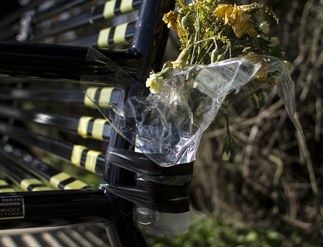
Bench 7: 1 – Grassy Corner The space that is Grassy Corner has mainly become a special place along the Cam towpath because of the University rowing. This image was done with a narrow focus to clearly mark out the bench from the background. And lead the eye also back to the litter – traces of local users and University.Bench 7: Grassy Corner 2Bench 7: 3 – Grassy Corner Flowers are left each Spring.Bench 7: 4:- Grassy Corner There has been a bench here for very many years. But the current new bench was put here in memory of Reebecca Jane Chamberlain who was a keen rower, killed in a car crash in 2012 at the age of 21.Bench 7: 5: – Grassy Corner But at the other end of the bench the flowers had gone. Maybe they faded early and had been removed – but why not also take the plastic bottles.Bench 7: Grassy Corner 6Bench 7: Grassy Corner 7Bench 7: Grassy Corner 8Bench 7: 9 – Grassy Corner It is also used for drinking in the summer – the gate is shut with barbed wire and leads nowhere.Bench 7: 10 Grassy Corner
I want to change the sequence here, putting the signs and snail first.
The spread with the bench needs to leave out the middle image. The idea is to contrast the two ends of the bench with their different bunches. I have quite a few alternative images here that could be lined up as a spread. I think the final spread is OK as the end – this heap was the same day as the flowers. Somehow I need to indicate that as contrast.
Evolution of the project
BRIEF:
The assignment should address the notion that the landscape is an evolving, dynamic system. You may wish to confirm, question or subvert this assertion.
Produce a series of images that responds to the idea of ‘transitions’ within the landscape. Record the changes that a part of the landscape undergoes over an extended period of time. You may want to revisit a very specific view, or you may choose to explore a particular part of the landscape more intuitively.
You may wish to photograph at very specific intervals (monthly, weekly or even daily) or your routine may develop by other means. The quantity of work you submit will depend on your particular strategy.
The work must include a reflective summary (300 words) on how your project developed and how or whether it has affected your ideas around landscape
E1.5 Visualising Transitions
I intend to do this assignment on the River Cam where I walk every day. This has many resonances with ‘Edgelands’. This stretch of river has changed a lot over the past 30 years since I first walked along it in the mid 1970s.
Firstly with the building of the A14 road bridge, that has changed the whole feel of the place from a wild walk to something in-between with noise pollution, but also added interest of graffiti under the bridge. About 5-6 years ago the towpath was ‘improved’ to the surface to enable the cyclists accompanying the University rowers to ride faster. This has significantly increased the numbers of people using it. To the extent that afternoons and weekends during term time rowers and their cyclists completely dominate the whole space, and local people tend to only go at limited times in the morning and sunset.
There has also been considerable population growth, both from a traveller’s site that has now become a permanent site housing also migrant labourers from Eastern Europe working on nearby farms. The area is just behind the Cambridge Science Park which is one of the fastest growing high tech industrial parks in Europe. So there are also many well-paid more affluent joggers and walkers. In addition to the rowers, there is also an angling club that takes over the weekends over the summer. And some of the travellers sometimes fish (probably illegally) for their supper. As a consequence of all this amounts of litter have increased dramatically.
At the same time the river is still a very conventionally picturesque and beautiful place, with sunsets, reflections and swans. There is also a lock and a weir. The river is managed by Conservators of the Cam, and there are periodic campaigns by local people to protect the wildlife. There is also a series of benches, many of which have been donated as memorials to people on their favourite spots. There are very dramatic changes through the day, and also the year with different weather. Usually there is beauty somewhere, I still need to look for sublime.
I plan to start this with Exercise 2.5, making text a key element of the work. From this I will select a number of different views and do a map with associated concept maps, echoing some of the titles in Edgelands. Probably:
– rail bridge
– meadows
– the bend
– pylons
– benches
– wooden bridge
– road bridge
– boats
– stumps
– Bait’s Bite weir and lock
I will aim to photograph them over a whole day one Sunday and one weekday a month starting on January 1st 2015 or the weekend immediately after. The aim will be to show different ways of viewing each of the spots. I want to experiment with different lenses, shutter speeds, sometimes using flash – probably one of the days I will do the whole walk with set technical constraints eg using only one lens, put the camera on a fixed manual focus, to see how different a series can be depending on technique. I also want to look at post processing with some panoramas, photomontages and collections and also some superimposed images like Ian Brown.
The aim will be partly to explore my own feelings about my environment – why do I find some things in the landscape beautiful and not others? why do I prefer the quiet times – can I find things to enjoy also when it is busy? It will also be a study of the interrelationship between people and the landscape – including conflicts between users and the rubbish and litter…
For some earlier images – focusing particularly on beauty and picturesque see
My thoughts on this project have now become more focused after inspiration from the New Topography movement and psychogeography, textual approaches and a rereading of Edgelands. Coupled with observation of the site and too much travel to start seriously on the project in January 2015 as planned.
I think as a coherent body of work within the timeframe available to me it would make sense to limit my study to just the area around the A14 road bridge – its graffiti, pylons, farm and the view beyond. This offers more than enough material and variation in mood to make a poignant portrayal of the contradictions, melancholy beauty and dereliction of an Edgeland site. Showing its shifting populations, different uses and class conflicts. I am also planning to include some text. I feel there is a potential for quite an interesting book here.
I will aim to photograph at different times of day and in different light and weather at least twice a month – having already started in August. Building on earlier work.
But I need to think through a lot more what I am trying to convey, or discover, with these images. Are they primarily aesthetic/deadpan? or social landscape and commentary? Do I want to present them as a series montage of images per month to show the differences between the months, like the set of images of different stages of ‘Going North’ or a series of montages of different subjects with one image a month? Or a slideshow or set of large prints? Do I just keep shooting what I feel attracted to or now start to be more focused? Or some combination of both?
It might be extremely interesting to really experiment with different techniques and interpretations of the same thing. Looking very carefully at composition, focus and ideas of ‘the gaze’ to show radical transitions in the interpretation by the viewer the more one looks. Eg very bland, minimalist ‘boring’ through to fascinating and beautiful all in the same view. Including variatiins over time.
I am also interested in the layering of images and memory. Maybe compare HDR with normal shots. Very long exposures on the water etc. to really explore a wide range of possible interpretations. See where it leads. And then select.
——————————————-
The river Cam is a beautiful place where I have walked for nearly 40 years. But it is in many ways a barometer of changing social divisions and trends between traveller and council estate residents, and affluent middle class and university outsiders. It is also a place of increasingly intensified public use, particularly during the COVD pandemic when it was difficult to walk at all because of the many unsocially-distanced new joggers along the narrow tow path. There is also now a new ‘modern’ cycle bridge parallel to the railway bridge linking Chesterton to Fen Ditton as part of a new ‘Chisholm Trail’ cycle route. This will reduce some of the pressure and the cycle route will be interesting to explore. But the character of the area is rapidly changing.
This body of work continues landscape drawing, painting and printmaking work since 2009, particularly two earlier photobook projects:
The project here continues my interest in ‘life seen from benches’, focusing particularly on the old railway bridge and new cycle bridge seen from Bench 1. The aim is to complement the existing photobooks, widening my vision and deepening my understanding of documentary of the place through developing new skills:
Bench Diaries: diaries from the 7 benches sketching, iPhone documentary and writing from life
Building Bridges: using existing and new photographs of the railway and cycle bridges sequenced and composited in Premiere and After Effects, including sound.
Insights and any photographs from the project here will then contribute to finalising the ‘Bench’ and ‘Bridge’ Photobooks after completion of this degree in the light of contributions and feedback from local people as well as other audiences.
Project re-starting Spring and Summer 2022 after long COVID and construction-related restrictions.
Bench Diaries: Life Sketchbooks
This project will start in Spring 2022 with a sketchbook diary of pencil and ink and wash sketches of life and landscapes from each bench along the towpath. Linked to Illustration Sketchbooks Assignment 5.
Sketchbook pages will experiment with different ways of representing time through processes of building up multiple images, erasure and sequencing.
Building Bridges: experimental iPhone video
This project will focus on Bench 1 next to the railway bridge and new cycle bridge with existing photos since 2009 and new still images and video, linked to Moving Image Assignment 4 projects. This will explore layering, blending and compositing to document processes over time.
Bench: Photobook 2022
There is significant potential for local sales of Photobooks, printmaking and art locally, in Cambridge shops and Cambridge Open Studios and other events.
Revised photobook informed by the 2022 sketchbooks and video revisiting photo series since 2009 together with new photographs. Some of the sketches might also be included and/or promotional video footage uploaded to social media.
In Search of the Wild: Edgeland Writings and/or large Photoscreen Posters with text
This is a longer term project as a book and/or series of large wall posters.
Juxtaposing manipulated ‘edgy’ photographic images and/or screenprints from the river Cam, manipulating and juxtaposing images with challenging captions, poems or short text I aim to create contradictory meanings about our relationship with the natural peri-urban environment. Underlying the interpretations will also be questions of the ‘female gaze’ – what difference might my gender make to the questions and responses.
The aim will be to stimulate thinking about the future, not just highlight the present and past. I envisage this as an ongoing body of work beyond 2023, developed with a local audience in Chesterton and members of the Cambridge Camera Club focusing on what we might want as ‘Building Back Better’.
My original idea involved 6 well-known ‘English’ poems but could be my own writing in a similar vein:
‘I wandered lonely as a cloud’ Wordsworth (focused on litter imaginings of flowers and animals)
‘On a lane in Spring’ John Clare (looking at water pollution)
‘Tyger Tyger’William Blake (mystery of the one wild patch where deer are said to roam – though I have only seen one and I think they are now gone)
‘Xanadu‘ Samuel Taylor Coleridge (uses photos of the underneath of the A14 road bridge as another imaginary place of mystery and imagination – I have many pictures of stories told in pealing paint and gathering mould in puddles)
This sceptred Isle William Shakespeare (looks at ideas of identity and invasion/intrusion using photographs of cans left by Polish beer parties, exclusion of travellers and migrant labour from a designated traveller site contrasted with power graffiti left by University rowers).
‘Jerusalem’ William Blake (uses pictures of pylons and power lines across the landscape)
Task
Within a series of up to 12 photographs, explore a landscape, or a small part of a landscape, which you believe to have some kind of significance. This may be a landscape with which you have a personal relationship, or it may be somewhere that is more widely known. You may wish to begin your research with your findings from the local history exercise (3.5).
The objective of this assignment is to engage with the question of how a ‘space’ becomes a ‘place’. Your project should put into practice the idea that a ‘place’ is a constructed, subjective term that, for whatever reason (political, industrial, mythological, environmental), is imposed upon, or becomes associated with, a particular ‘space’. This may be a very specific location, or it may be a more generic type of space.
You’re free to approach this project with whatever strategy you feel is appropriate to your subject matter. Introduce your work with a supporting text (around 500 words), as in previous assignments.
This slideshow requires JavaScript.
In this Assignment I look at the way in which a particular place along the River Cam – Grassy Corner has become distinguished from other places along this space – other equally picturesque but unmarked twists and turns, other benches, other places used by runners, rowers and fishers. This is a confluence of specific geography on both sides of the river, interests of different classes of Cambridge society and different river users.
Potentially there is nothing particularly spectacular about Grassy Corner – just one of many twists in the River Cam. It is not even the most picturesque.
Though, like most places along the River Cam it can be extremely beautiful when photographed in particular light and weather conditions.
I first became interested in Grassy Corner as one of a series of locations of benches along the River Cam where I walk every day and which I had selected as a possible subject (among other possible subjects along the river) for the final Assignment on Transitions. But the more I observed Grassy Corner itself, and the more I researched around it as part of the local history project, the more interesting it became for the way in which this rather ordinary-looking place has become meaningful and marked in different ways by different groups of people using the space.
It is unclear how long this particular spot along the river has been marked as a ‘place’ – it is a narrow bend between the on the River Cam between the Plough Reach in Fen Ditton and Chesterton Fen. Parts of Chesterton itself were settled during Roman Times and there are many iron age and Anglo-saxon remains in the area. The River Cam was an important riverway – from medieval times Stourbridge Common a little further upstream hosted Stourbridge Fair – the largest market in Europe. There was a pub over the river from the 16th Century and ferry over the river.
But like most of the landmarks in and around Cambridge, it was Cambridge University that made Grassy Corner more important. From at least the 19th Century – 1827 – it became a key site for viewing the Cambridge University May and Lent bumps student rowing races. In the 1890s a well-known Cambridge photographer -Thomas Stearn, who pioneered the use of modern photographic techniques, photographed the river and boat races from Fen Ditton’s river banks and had a photographic studio at Grassy Corner – in 1995 this was rebuilt and restored to its 1892 state. A photograph he took of the race looking across the river from Grassy Corner can be found at:
Compare this with my photo above of the pollarded willows – the very same willow trees but more closely pollarded?
Today Grassy Corner is very clearly a ‘place’. This remains largely linked to the University – and also now town – rowing clubs and their races. This has led to a whole row of very prominent signs – change left signs for rowers and Keep Left signs for the Cyclists so they don’t collide with each other while following the rowers. These signs can be seen from a very great distance, and somewhat spoil the ‘picturesque’ views, unless very carefully cropped out or hidden by shadows at sunset.
There are also many concrete posts around the bench. Their purpose is unclear – possibly some were posts for barges along the towpath. Other markers along the towpath are to mark staged in the races themselves. They are currently painted bright magenta – the colours of the winning boats (men only???) I am told. But Caius college won the 2015 bumps and their colours are blue and the magenta colour has not been changed now for years.
There has been a bench here for very many years – certainly since I moved here in 1984. But the current new metal bench was put here in memory of Rebecca Jane Chamberlain. For me the bench started to seem special when I found daffodils attached to the bench in April. One set had faded, others that had been in the plastic bottles attached to the other end of the bench had already gone. Someone must visit very regularly. I found this really poignant. In my research for this assignment I found number of articles about her death can still be found on the Internet: http://www.dailymail.co.uk/news/article-2134038/Cambridge-University-student-21-killed-car-crash-way-rowing-training-camp.html Rebecca was a keen rower, killed in a car crash in April 2012 at the age of 21. Finding this out now makes this bench particularly special – though other benches also have commemorative plaques that I will look up in future.
The bench is also a sitting place for walkers and runners -one had carefully placed their can. Others have lost keys. Others use the bench as an exercise place to stretch their muscles – leaving dirty, muddy marks behind. The gateposts are a prime spot where pieces of dropped clothing – hats, gloves, babies clothes – are placed for other walkers to see in case they have lost them.
The bench is located also at the end of a path leading to Grassy Corner Caravan Park – a traveller site that has now become a prime location for development with the expansion of the Cambridge Science Park and forthcoming new station on the Kings Lynn to London main line. This was purchased and refurbished in 2013: http://www.cambridge-news.co.uk/11m-project-buy-refurbish-Fen-Road-travellers-site/story-22364004-detail/story.html . In the summer there are also many migrant labourers from Eastern Europe who come to work on the local farms. There are frequent rumours of crime, vandalism and fights between the different communities. The bench – located by the river safely at the end of the path and far from anyone else – is used as a party place at night – bottles and cans are scattered behind the bench and do not appear to even be cleared. The glove on the post appears to point accusingly up the path to the caravan park as the source of all evil around the bench.
The space that is Grassy Corner has therefore become ‘a place’ through the ways in which different groups of people use and mark it off from other spaces. As a photographer I have learned a lot through thinking about what and how to photograph it in order to highlight specific features:
the picturesque through careful cropping out, timing, lighting and weather choices
class differences and proprietary marking by the University of this like many other spaces
memory of the dead and place for contemplation
the ugly through closely focusing on litter and cloudy streams
The space that is Grassy Corner is all these things at the same time – many places co-existing in one space that the process of ‘landscaping’ has helped me to explore, unravel and communicate.
Other images of Grassy Corner
The corner itself is nowhere special.
Nowhere special.
Nowhere special – the whole towpath is beautiful. Why Grassy Corner particularly?
I have better images of mist through the trees further up the river. But this shows some of the charm of the place.
Sunset – the way I make the space a place. But this is an old image and I need to repeat with a tripod.
This image shows the type of ubiquitous litter of peoples’ activities in the ‘marked’ place.
This was an earlier image would have been better if it was all sharp – not just focusing on the litter. I also only have it in jpg for some reason.
I like the echo of the two purples as nature and University making their mark.
I like the idea of a snail also using the space as its own place – it was still there a month later. Hybernating? But the image is not really sharp enough. I need to increase the focus depth.
Other images of things left.
Here I was trying to include both the memorial and the litter. But I would need a very big depth of field and the angle was very difficult. Going back later with a tripod the litter had gone.
I like the puddles and the atmosphere they give to the place – my memory of taking the image.
I like the place on dull grey days – it does have a more ancient feel in that sort of weather.
At certain times of day there are lots of people going past. But I decided not to fiocus on people using the place – more on their traces.
I like the idea of this gate going nowhere. I could make a good Black and White image of this.
Nature has also made it a place.
For links to large format files of all the images see:
This body of work is based on ‘outsider’ photographs taken in Baizakh village at the foothills of the T’ien Shan Mountains (Mountains of Heaven) in Naryn Province, Kyrgyzstan in May 2016.
They were taken in spare time over a 6 day period fitted around consultancy work to facilitate a participatory workshop with women and a few men from different rural areas of Kyrgyzstan on empowerment and gender. Although they do not constitute an in-depth ‘photo-documentary’, I saw more than most tourists would see and my contextual information on peoples’ perspectives from the workshop is more in-depth than most outsiders would have.
In 2016 I had quickly developed a selection of the most technically proficient photographs as two Blurb photobooks – monochrome and colour without text – exported directly from Lightroom Book module. This was part of personal development work for the OCA Landscape photography course (never submitted for assessment). But I had always intended to revisit and re-edit them later once I had improved my digital software and book design skills, adding text from people in Kyrgyzstan, and particularly from Baizakh.
In this body of work I treat the photographs as the beginning of my reflections as part of a dialogue with potential audiences in Kyrgyzstan, UK and elsewhere on what they represent as documentary on Kyrgyzstan, and also creative philosophies of life.
The projects are however still very much part of a work in progress. Throughout 2020 and into 2021 the Covid-19 pandemic swept through rural communities in Kyrgyzstan in waves. And many of the people I knew got sick – Asel was very sick with long Covid – and not only once. In October 2020 through to elections in January 2021 the political situation was very precarious. As of assessment submission in September 2021 all of my on-line consultancy work with Kyrgyzstan to which some of the audience feedback was linked was still postponed or cancelled due to these events.
In this audience-focused project I got useful feedback on the colour photographs from people in Bishkek, and on-line feedback from Cambridge Camera Club, OCA Forums, family and other networks in UK. But for books in particular face-to-face discussions are likely to be more incisive because they are more immediate and informal and it is easier to ask all the questions I myself have. Particularly when people are giving feedback on a voluntary basis rather than as part of a business process for a commissioned brief.
I revisit the original photographs and re-select them on the basis of content rather than just technical quality, re-processing them in the light of my work on digital photography software in Project 2.2 Shutterscapes. I am particularly interested in:
‘Documentary creativity’ and how photography as a medium that starts with ‘reality’ rather than imagination affects my creative process, using the creative prompts from Project 1.3. Discussing with different audiences how different treatments might be interpreted in different ways. Including potential role of Photoshop in my workflow, to creatively enhance what can be relatively easily and quickly achieved in Lightroom and/or DxOFX and/or automate creative effects for speed and consistency for large series images for Book Design or Moving Image work.
Approaches to photobook design in terms of visual communication of images, their sequencing and layout and use of text for different audiences from the same set of photographs. Inspired particularly by the work of Martin Parr, Daido Moriyama and monochrome photography from Lithuania and other ex-Soviet countries.
Ways of integrating text from audiences in Kyrgyzstan, participants at the workshops I facilitated and on-line sources. I experiment with different Photobook layouts and design, with and without text, using InDesign and Photoshop, building on skills developed in Book Design 1 and Assignment 3 TeeTotal Street. Inspired particularly by the work of Dave Carson and Dan Eldon.
Different ways of engaging with different audiences – differences in what they contribute and differences in their reactions on feedback. In the context of COVID-19 pandemic I focus on exploring and developing a range of on-line social networks reaching different potential audiences for my work. But over the summer of 2020 I am able to also engage face-to-face with audiences in UK.
Links to high resolution files on SMUGMUG and full blog posts
Some conclusions and further questions
Audience engagement: conclusions about market realism
I look at how my creative process, particularly documentary work, can be significantly improved through working with other people to help me to develop alternative narrative threads and visual approaches, building on some of my professional qualitative research skills. My body of work will includes ways of engaging different audiences to improve my work in terms of:
refining the ‘messages’ by getting a range of local views and information on social and environmental issues through conversations and interviews and engagement with relevant local social networking sites.
feedback on the effectiveness of the ‘communication aesthetics’ from local, national and also international overseas audiences to improve my technical and visual communication skills through ZemniImages Facebook page crosspasted to other social networks.
finding different marketing, promotion and advocacy outlets for the different dimensions of the body of work.
I was aiming in this work to explore ways of working with different audiences, in:
Kyrgyzstan: Bishkek capital city and other centres of Kyrgyz culture with people working in development agencies, photographers, artists and people in their families.
Kyrgyzstan: people in rural areas involved in my consultancy work. These people generally do not have an income to buy books, but I was interested in their feedback and also making images available on-line.
UK: visual commications and photographic networks including OCA forums and Cambridge Camera Club.
International: other people who subscribe to my ZemniImages Facebook page. These include people involved in development agencies in different parts of the world as well as socially-interested tourists.
I am particularly interested in how my creative process can also be of use and benefit to the people giving feedback, not only in terms of what I am trying to say but also putting audiences in contact with each other to discuss issues and create their own work.
In this audience-focused project I got useful feedback on the colour photographs from people in Bishkek, and on-line feedback from Cambridge Camera Club, OCA Forums, family and other networks in UK. I was particularly encouraged by unexpectedly enthusiastic responses from people in Kyrgyzstan who saw many things in the resulting photographs that I myself had not seen. And felt that it made them look differently at the everyday things around them.
However particularly for books or extended narratives, face-to-face discussions are likely to be more incisive because they are more immediate and it is easier to ask all the questions I myself have. Particularly when people are giving feedback on a voluntary basis rather than as part of a business process for a commissioned brief.
Making the World a Better Place: conclusions for activist creativity
The project continues my interest in different subjective and objective ‘outsider’ approaches to documentary, focusing on environmental challenges, social challenges of marginalisation and rural poverty. In terms of documentary I am interested in:
Photographer and subject: the photographer as voyeur ‘shooting’ images of issues and themes that are not necessarily the same as the subjects of the photo.
Is the image showing how things are, or how the photographer want things to be? or how the audience wants to see them? Selective editing and erasure (eg cars and rubbish bins)
Different focus and viewpoint – is the photographer directing the image or leaving interpretation open?
Present, past and future – places change over time – even over a few seconds – short term, long term, historical perspective and layers – the past is always present but maybe the message is for the future.
Exploration and deepening understanding of tensions and contradiction of reality over time
But I am aiming for different types of outputs that fulfil different purposes for different audiences linked to a broad ethical commitment. I am aiming to provoke questioning from the viewer rather than imposing one single message. Highlighting potential contradictions and tensions between ideals and realities, rather than overuse of shock and horror. To inspire exploration to discover more about the world around us. Rather than ‘compassion fatigue’ that makes us want to retreat from reality. And where possible finding beauty in the everyday things, as well as the natural and human-made environment around us.
What was really interesting from the audience feedback was that many people were more interested in the creative images:
‘photographic grunge’ – UK audience
dramatic colour and dynamic abstraction (Kyrgyzstan Bishkek and UK)
images that made them slow down and notice things around them (Kyrgyzstan Bishkek).
I think that this has important implications for my ‘creative activi
Taking things forward
The projects are however still very much part of a work in progress. Throughout 2020 and into 2021 the Covid-19 pandemic swept through rural communities in Kyrgyzstan in waves. And many of the people I knew got sick – Asel was very sick with long Covid – and not only once. In October 2020 through to elections in January 2021 the political situation was very precarious. As of assessment submission in September 2021 all of my on-line consultancy work with Kyrgyzstan to which some of the audience feedback was linked was still postponed or cancelled due to these events.
Taking things forward: possible Graphic Design MA proposal. I plan to revisit all the Baizakh projects towards the end of 2022 together with other photo series I have of journeys in Kyrgyzstan. This would be part of a bigger retrospective body of work on ‘Journeys as Beginnings’ (as contrasted with Eldon’s Journeys as Destinations) using my travel photo series and video from Africa and Asia as springboards and initiation of contemporary on-line and audience research. Published in a combination of books, moving image and interactive experiences. This could be the basis for a Grahic Design MA proposal and/or done as a series of personal projects with potential audiences.
Continues exploration of photographic styles, meaning and communication from Assignment 2.2, further developing my creative process workflow as it related to photographic media.
Monochrome and photographic experiments with Lightroom, AnalogFX and Photoshop, with using creative prompts.
Also draws on styles from printmaking like screenprint, cyanotype and solar plate.
Photographer and subject: the photographer as voyeur ‘shooting’ images of issues and themes that are not necessarily the same as the subjects of the photo.
Is the image showing how things are, or how the photographer want things to be? or how the audience wants to see them? Selective editing and erasure (eg cars and rubbish bins)
Different focus and viewpoint – is the photographer directing the image or leaving interpretation open?
Present, past and future – places change over time – even over a few seconds – short term, long term, historical perspective and layers – the past is always present but maybe the message is for the future.
Exploration and deepening understanding of tensions and contradiction of reality over time
1 define it 2 make it bold 3 let’s look at the real thing 4 introduce time motion and sound 5 what is the key moment? 6 create a variation 7 connect play, fantasies and daydreams 8 combine seemingly arbitrary content 9 erase the distinctions between the original and the copy 10 consider again your motivation 11 make it obvious 12 make it ambiguous 13 remind yourself 14 bounce around at speed 15 ‘we’ve got a problem, Houston’
Creativity 1: Fire in the Sky
Fire in the Sky 1 original CRW file. But this is a very dull version of what I saw. The colour of the sky was the main feature, but was very much more vivid. The quiet end of day buildings at the bottom had reflected colour, not the dull dark objects they are here.
1.3 Fire in the Sky Let’s look at the real thing. Here I looked again at the farm and brought the colours back in.
1.4 Fire in the Sky Motion and Sound: Here I used the liquify filter in Photoshop twice, blended in Vivid Light to introduce a feeling of emotional turmoil and apocalyptic upheaval of the mountains and wind. I think this concept has potential that I could explore further for more powerful images. Using Difference Blend Mode was also interesting.
1.10 Fire in the Sky Consider Again Your Motivation Here I rethought the concept a bit. This is a more melancholy and thoughtful image. I adjusted the control points in SFRX from 1.1 to make the buildings look more etherial and vulnerable between the sunset and the encroaching grass and weed flowers. I would like to make these more distressed.
1 define it
2 make it bold
3 let’s look at the real thing
4 introduce time motion and sound
5 what is the key moment?
6 create a variation
7 connect play, fantasies and daydreams
8 combine seemingly arbitrary content
9 erase the distinctions between the original and the copy
10 consider again your motivation
11 make it obvious
12 make it ambiguous
13 remind yourself
14 bounce around at speed
15 ‘we’ve got a problem, Houston’
I wanted to get a feeling of fire and abstracted dynamism. I flattened and duplicated 1.5 and used Exclusion Blending to get a bigger range of colours.
1 define it
2 make it bold
3 let’s look at the real thing
4 introduce time motion and sound
5 what is the key moment?
6 create a variation
7 connect play, fantasies and daydreams
8 combine seemingly arbitrary content
9 erase the distinctions between the original and the copy
10 consider again your motivation
11 make it obvious
12 make it ambiguous
13 remind yourself
14 bounce around at speed
15 ‘we’ve got a problem, Houston’
1.9 Fire in the Sky Erase Distinctions between the original and the copy. This looks nostalgic and otherworldly. SFX.
1.13 Fire in the Sky: remind yourself. This version was pdoeced with selective desaturated colour in SFX with vignetting. This now loooks like a faded memory. With grain and white vignette.
Sepia filter in SFX
1.12 Fire in the Sky 12: Make it ambiguous Fire in the Sky make it ambiguous. Using Analgo Pro on 3 the image takes on a nostaligc feel old film feel where the time of day is unclear.
1.8 Fire in the Sky Combine Seemingly Arbitrary Content. In Analog FX Vintage Film Effects I added a random orange colour streak and film strip frame. This was arbitrary in the sense that it was a selection of the most contrasting elements from a random selection. But I find the result very evocative – many older photos from Kyrgyzstan have these dull colours, particularly when printed on cheap paper.
I wanted a dreamy, other-worldly image. I used Wet Plate 9 filter in Analog Pro. As this was a ‘adydream’ albeit a bit of a nightmare, I retained the desaturated colour. I chose film streaks that looked like figures going across the screen.
The key moment of the scene is the fiery sunset. I intensified this through duplicating 1.1 in Photoshop and using Vivid Light blend mode.
In SFX on a high contrast version of the image, I used control points to colourise and increase contrast to intenfify the colours in the sky and bring in the vivid light on the buildings and yellow flowers in the foreground. This has more of the intensity of feeling of the original scene as I actually saw it.
11 make it obvious
15 ‘we’ve got a problem, Houston’
Creativity 2: After the Event
‘After the Event’ – more photos from Baizakh Village in Naryn Province May 2016 exploring creative effects in DxO analogueFX and/or SilverFX. These picture of bottles in what was a beautiful landscape – particularly mountains that are outside the frame, follow early monochrome traditions of ‘late photography’ of bombs and war by Richard Fenton.
Bottles 1 original colour
Bottles 2 Landscape in Colour Analog FX colour wetplate with saturated colour on control points. I wanted to contrast the saturated bottles against a faded, tired landscape.
After the Event 1 Through using this sepia effect, I wanted to simulate monochrome ‘late photography’ of photographers like Richard Fenton’s photographs of bombs in the landscape. SFX AntiquePlate 1. The action seems to have been in the empty middle. But the eye is drawn to the shrarpness and contrast on the lefthand bottle, then the right hand bottle and all the debris on the ground. The eye goes between these and the soft focus misty landscape in the distance. The slight dark vignette makes it into a ‘picture’ and keeps the eye in the frame.
After the Event 2. SFX Antique Plate 1. This version of the sepia effect, is more ‘antique’ through its tonal banding, soft edge focus and faded white vignette. I retained some of the black and white on the bottles and this keeps the eyes coming back to them, skipping the middle ground and finding less interest in the soft focus landscape background.
After the Event 3. Black and white simulation of ‘late photography’ of photographers like Richard Fenton’s photographs of bombs in the landscape. AnalogFX Black and White 3. The focusing is less sharp and structured across the whole image so the eye wanders around the frame looking for some meaning. The action seems to have been in the empty middle. But the effects are the bottles. The eye goes between these and the soft focus landscape in the distance. The simple thin lightbox frame makes it into a ‘picture’.
After the Event 4. SFX Film Noir 1. I wanted to simulate monochrome ‘late photography’ of photographers like Richard Fenton’s photographs of bombs in the landscape. This Film Noir filter increases contrast, add some grain and a black vignette and a bigger frame. The action seems to be even more in the empty middle. But the light on the bottles highlighted by contrast with the vignette keeps the the eye going back. The didtant landscape seems like a far unattainable misty light on the horizon. The thicker and heavier frame keeps the eye firmly inside the more obvious picture.
After the Event 5 SFX Film Noir 2. I wanted to simulate monochrome ‘late photography’ of photographers like Richard Fenton’s photographs of bombs in the landscape. Film Noir 2 filter blows out the highlights and flattends the blacks. It is now the contrasting black tree line with blown out sky and disappeared landscape framed in black that attract the eye first. Then the blown out featureless area in the middle – even more like remains of a bomb blast. Then the eye notices the bottles with their sharper light and detail. Going down and getting trapped by the frame to go back and forth between the empyt middle and the bottles. There is not enough detail in the rest of the image to detract from this relationship.
After the Event 6.AFX Film Noir 3 has the detail in the dark areas, and darker overall, less grain and no frame. Here the eye enters the image from the bottom left, attracted by the contrast in the left bottle then the detail in the right bottle. Then up to the glistning highlights in the middle at almost the same time as looking at the foft detail in the landscape. The absence of frame means the eye continues to be attracted by the landscape and blank sky. Giving a more optistic upward movement away from the darkness at the bottom.
After the Event 7 Pinhole effect with slective colorisation. Here I selectively colour the landscape. This makes the contrast and movement between the bottles and the landscape more obvious. The earth aroung the bottles and the middle portion look like sticky tar, increasing their ‘human industrial imprint’. The eye skips over the low contrast uninteresting middle in rather schizophrenic conflict for attention between landscape and bottles. Giving a somewhat confused feeling – maybe the aim of the original image.
After the Event 8. AnalogFX multilens filter with thin black frame. This fractured effect I find quite interesting in vertically suffling the frames. This makes the eye look quite hard, seeking similarities, differences and thereby some meaning within and between each frame.
After the Event 9. SFX Cool Tone Ilfordpan400 film with narrow frame. I wanted to simulate monochrome ‘late photography’ of photographers like Richard Fenton’s photographs of bombs in the landscape. This toning increases the industrial tarry impression – like a peri-urban watsland that could be anywhere.
Creativity 3: Washbasin with Rag
Original cropped. straightened and coloured in Lightroom.
Wash Basin with Rag 2 Silver FX Film Noir 1. Focusing on light – and raising questions about what might be round the corner on the right.
Wash Basin with Rag 3 Silver FX Film Noir 2. More dramatic focusing on light – and raising questions about what might be round the corner on the right.
Wash Basin with Rag Ligbhtroom crop
Wash Basin with Rag 4. Closer crop and saturation in LIghtroom, then toned sepia in SilverFX, with control point colorisation to get the brilliant turqoise and texturing.
Wash Basin with Rag 5. Closer crop and saturation in LIghtroom, then AnalogFX green old film effect, with control point colorisation to get the brilliant turqoise and texturing. This has a much more grungy feel.
Wash Basin with Rag 6. AnalogPro multiple exposure with mnountains, framed as a ‘picture’.
Wash Basin with Rag 7. AnalogPro multiple exposure with mnountains, framed as a ‘picture’. Blended in photoshop with SFX Film Noir. To juxtapose the beauty and simplicity of life in Baizakh. And make the scene more colourful and optimistic. Which is what I saw.
Feedback so far
Feedback from colleagues and their friends in Bishkek, OCA student forums and Cambridge Camera Club.
So far this is quite encouraging on the more creative art, as well as black and white styles, particularly from Kyrgyzstan and Cambridge Camera Club.