Project Type: Themes

  • Penwith 3: MINE

    2.2.2 MINE, Penwith, Cornwall

    Another documentary project I did a lot of work on before COVID, intending to use for this module was on the tin mining industry in Penwith. Dating back to Roman times at least, tin mining has historically been one of the main sources of employment – as romanticised in the Poldark series. The mines have all closed over the last decade because of trends in the international markets for tin, causing a lot of poverty and unemployment in the mining communities. A number of local and international artists have worked with mining communities, giving presentations of their work at Tate St Ives. Many of the mines are currently run as tourist attractions – capitalising on t6he Poldark effect. I have so far visited three of the mines: Geevor, a private min and Levant and Botallack owned by National Trust. Although currently closed, there are discussions on how the substantial deposits of lithium can be exploited without significant environmental pollution – rather than exporting that problem to other countries to fulfil the rapidly rising demand for lithium batteries.

    In terms of my own work, I took many photographs that are presented here. And have a lot of documentary notes from various talks about the industry. Some of the photos of Geevor I used as the basis for linocuts in Printmaking 1. And there is significant potential for doing printmaking in different print media for cards and other outputs for the tourist market. The tour guiders are also very friendly and there is potential to develop Photobooks eg as the basis on which I could apply for a National Trust photographer permit to do commercial work on other properties in the UK. I should also ask for permission from the (friendly) community/privately-owned Geevor mine.

    Project Plans for further development

    We have booked a week in a holiday cottage in St Just for last week of September. I am planning to use this to do some psycho-geographic walks in St Just itself, as well as along the mining coast path. This will enable me to create a more interesting documentary photobook without needing permission from National Trust. I am hoping to revisit again in 2022 to also get some interviews and feedback from local people.

    The images would be very effective as linocut and/or drypoint cards and I plan to also try that.

    But possibly this would be an exploratory project for future possibilities, aiming to produce mostly a portfolio of striking documentary black and white prints for my own website. Together with my insights on psycho-geography walking. There are also other local artists working with mining communities on work about the area, I would also want to link with them and make sure I was doing something complementary rather than duplicating. And something that would contribute to the local area.

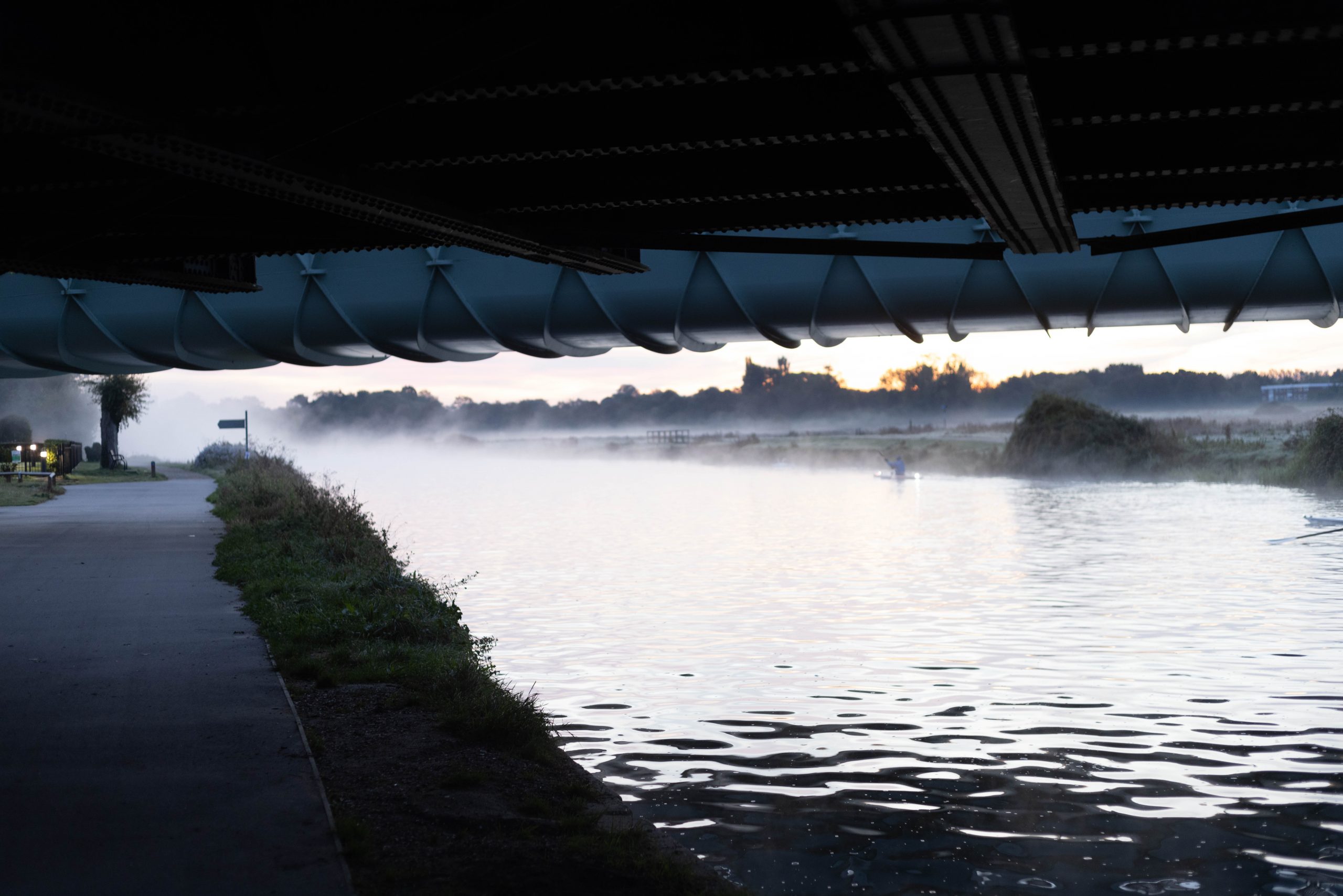
  • Windows to the Present 3: New Bridge Sunrise

    Windows to the Present 3: New Bridge Sunrise

    “While the intent of photographing a sunset maybe to capture something ephemeral or to assert an individual subjective point of view – the result is quite the opposite – through the technology of our common camera we experience the power of millions of synoptic views, all shared the same way, at the same moment. To claim individual authorship while photographing a sunset is to disengage from this collective practise and therefore negate a large part of why capturing a sunset is so irresistible in the first place.”

    Penelope Umbrico in ALEXANDER, 2015: 61

    1: Sunset to Sunrise:
    Lives Spliced in Time

    Sunrise: First Frosts

    Abstraction

  • Windows to the Present 2: Beast of Bramblefields

    My original idea: What colour is autumn?

    I would like to collaborate with people interested in collectively developing a series of alternative ‘essence of autumn’ images that are less stereotypical and more creative and meaningful for the 21st century than the ones we normally see.

    In Europe this month is now technically in autumn. But in UK there is abnormally warm weather over much of the country. What I see in my garden and walks by the river ranges from remnants of bright green to dull fading greens of dying grass, grey whites and browns of dried seed heads and white purple-veined convolvulus flowers spreading in dark green hedge shadows. The occasional yellow flowerhead, faded red poppy and blue cornflower. There are only occasional splashes of the traditional autumn oranges and reds of turning leaves that I assume will at some point in the near future burst to fill the conventionally picturesque autumn scene, Though actually what I see are mostly terminally shrivelled rusty browns of diseased horse chestnut trees.  I am anticipating later the melancholy end-of-year dark browns and purples of decaying wet leaves, punctuated with white grey mushrooms and fungus.

    I apologise for the late night lyricism. But I have many questions, for example:

    • What is colour anyway, given that we all perceive things rather differently? What does the camera capture when we talk of colour? How ‘accurate’ can photography be? and, given the variations in individual perception, what do we mean by ‘accurate’ amyway?
    •  What are the geographical differences in ’objective colours of autumn’? Are autumn colours different in urban areas and cities than in rural areas? In other regions of the Northern hemisphere? In the Southern hemisphere Spring?
    • How is ‘objective’ colour linked to our subjective emotional associations? How do different colours convey different moods associated with autumn? How does this vary between cultures? 
    • How does climate change and what we actually see this year affect our conception of ‘autumn colours’?

    These are only my initial late night thoughts. Other people may have very different conceptions and questions to shape the discussion. On a practical manageability level in the timeframe, photographs could be existing photographs, new images through the window of the street or garden, a walk around where you live or further afield, objects brought home, something more abstract etc etc etc etc.

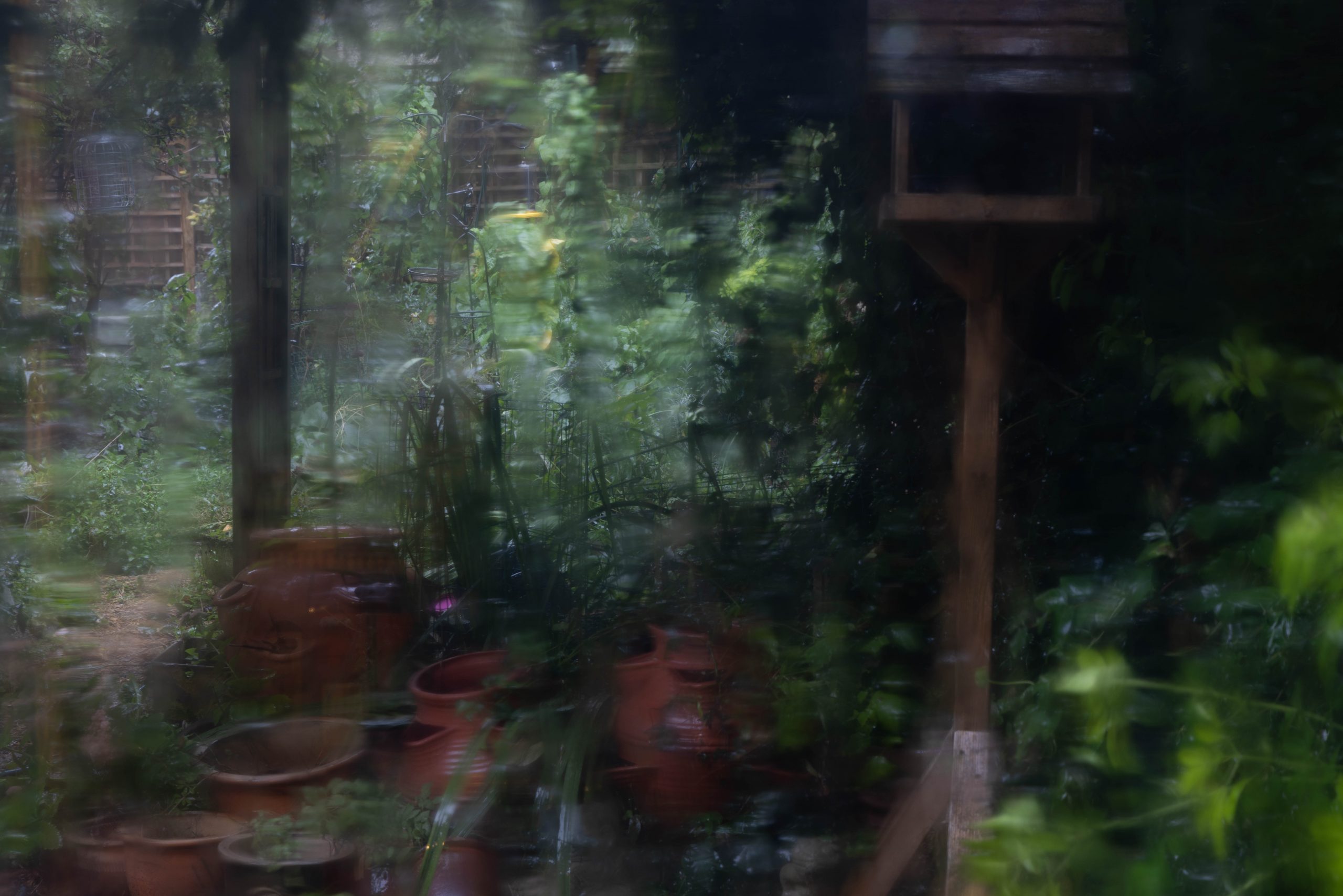
  • Windows to the Present 1: Home Views

    Windows to the Present 1: Home Views

    I am particularly interested in the nature of light at different times, ways in which light changes and the process of digital capture to either record light accurately or camera adjustments to ‘make a better image’. And how this changes with different colours and techniques.

    Inspiration:

    Ori Gersht

    Uta Barth

    Rain

    Long exposure on tripod

    Sundance

    Manual Exposure and focus

    Reclaim the Night

  • Bridge Underworlds 2017

    The River Cam is part of a longer term body of environmental and social documentary work in different media about ‘Cam Edgelands’ that is central to my practice going forward. The river is just down the road from my house and an area where in normal times I walk nearly everyday for exercise.

    The A14 road bridge is one of a number of bridges across the river. On one side the bridge underpass dissects two areas of land that are used by travellers and migrant workers living on a Traveller site relegated to the margins of Cambridge. There is a well-established traveller community that has been there for very many years. Living on one side of the bridge, they use fields on the other side to keep their horses, using the underpass as a transit between the two. Before Brexit they were joined by migrant workers – particularly men – from Eastern Europe. It is unclear how much of the graffiti, litter and broken glass is created by either of these communities, and how much by other walkers passing under the bridge. Graffiti is certainly not confined to this bridge, but is evident in a range of styles also under the other bridges along the river.

    The river itself is part of the University rowing Bumps course, and used by town rowers and also leisure boats.    

    The other side of the bridge is mostly farmland with a footpath linking the somewhat affluent villages of Horningsea to Fen Ditton.

    It is a haunting, almost spiritual place.  Large majestic concrete pillars with enigmatic graffiti create dramatic shafts of light in the early morning and sunset or dark shapes in the winter fog. Between shuddering bursts of traffic overhead, the water reflects and echoes the drips from the roof. The ever-changing artworks, puddle-life, scatterings of litter and sparkling broken glass tell stories, real and imagined.     

    I have nearly 2000 photographs of this bridge dating back to 2009, taken with cameras of varying technical quality and with varying technical skill on my part. But, together with my thousands of other images of other bridges and ‘edgeland’ features on this regular walk, the Bridge will continue to be an important ongoing part of my creative practice. There is also a potentially important local audience and market for physical images: photographic prints and art prints in different printmaking media, photobooks and sketchbooks eg as part of submission to Cambridge Open Studios, and more socially-interested Cambridge residents and tourists. As well as on-line presentation, interest from Cambridge Camera Club and other creative networks in Cambridge.

    Thematically in this module, part of my motivation to focus on the Bridge in Assignment 5 is because it shows a body of work around peri-urban ‘sublime and grunge’ and concerns about poverty, alienation and pollution in the UK where I live. To balance work on these concerns in contexts like Kyrgyzstan where I am an outsider and where attention to the less than beautiful aspects could be misinterpreted as ‘rich world complacency and racist prejudice’ .

    My ability to produce new photographic work of the Bridge has been continually disrupted over the period of this module. Firstly between March 2020 and May 2021 I was not able to go down the narrow river towpath to the Bridge because of Covid-19. The towpath was continually crowded in both Lockdown and more open times as one of the main places that local people went for exercise with very many runners and cyclists accompanying rowers, with very little social distancing and a lot of aerosols being expelled for long distance in plumes that are very alarming in cold weather. From May 2021 the area under the bridge was closed for repairs, and then towpath was closed for all of July/August for final works on a new cycle bridge across the river. The Covid pandemic also meant that it was very difficult to do the sort of documentary research I had hoped.

    My focus in this module has therefore been on :

    • Printmaking: Continuing experiments with photography-based print media: revisiting photoscreen and new images in solar plate.
    • Photographic creativity: Web galleries that explore alternative perspectives on the bridge, and the way in which different narratives can be created through different selecting and formatting of the images and how narratives and moods can be enhance by different digital processing styles.
    • Photobook Design: looking at different potential narratives and layout for Photobooks, continuing my earlier interest in juxtapositions and framing.

    Slideshow of Page Spreads from Draft Photobook

    For high resolution images and galleries of all the material presented here please see:

    ‘Bridge Edgelands’

    on my SMUGMUG portfolio site:

    Photography-based printmaking

    Printmaking: Photoscreen

    Photoscreen gives a grainy, documentary feel because of the duotone dot process that is similar to newspaper printing. Though different effects can be achieved through the way the initial image is processed and degree of detail, particularly in the highlights and shadows, the shape and density of the dots, then exposure and inking processes.

    For more detail and discussion of the development of the printmaking images and different effects of photo screen see:

    https://illustration.zemniimages.info/portfolio/assignment-2-1-edit-bridge-printscapes
    Printmaking: Solarplate – new images

    Solar plate gives a much dreamier feel. A double exposure solar plate starts with a fine mezzotint stochastic screen. This enables much finer detail. Again the effect depends very much on processing of the initial image – the pylon image on the left is very dreamy with more grain. The ‘underworld’ image on the right is much more contrasty, retaining details in the highlights and shadows.

    Photographic Creativity

    Five interactive web galleries have been uploaded with introductory text to my professional SMUGMUG portfolio site as part of my audience presentation and promotion.
    See: https://www.zemniimages.com/Lost-Reflections-Projects-2021/Bridge-Edgelands-Cambridge-UK
    For links to the individual galleries click on the titles below.

    Bridge Edgelands: project evolution

    In order to get an overview of the ‘spirit of place’, I started with a free brainstorming of what I thought were potentially the most interesting images and angles that I could use – with some processing in Lightroom and/or Topas AI and/or DxOFX and/or Photoshop to improve technical quality.

    This led to an initial ragbag of images that did not have coherence in themselves, but sparked ideas on at least five very different narrative approaches with focus on:

    1. ‘Colour grunge’ traces of human activity: graffiti, wire netting, ‘horse has bolted’, dark reflections. With an overall dark mood of the mess that people leave when they live on the margins.
    2. ‘sublime light’ with geometric angles, colours and finding beauty in the everyday.
    3. ‘human stories untold’
    4. bleak mist and murk
    5. stark dark black and white.

    I then decided to use the Creative prompts to explore a series of alternative narratives that would further extend my understanding of potential themes and styles. Before making decisions on themes and styles to combine in an overall narrative – possibly adding further images to fill any important thematic gaps in what I do not already have.

    Alternative Narratives: Web Galleries

    Aims

    My next stage was to use the Creative Prompts to see whether and how they might help me to identify different themes, how the images might best be processed and ‘pushed’ to communicate these differences. To help me think more clearly what I want to say, and how I might say it.

    !! Still to do – all these to be combined into one hyperlinked annotated pdf in InDesign with references to sources of inspiration and notes on different variants that were tried.

    What I learned

    As with single images, this process really helps to tease out different themes and start to indicate potential linkages. It also very much helped then to indicate different processing/style options to differentiate the themes and work out where images best ‘fit’ in terms of narrative.

    1 Define it: Tony was here

    Photo Essay 1 ‘Define It’ focuses on the things that immediately interested me about the Bridge: ‘grunge traces of humans’, graffiti, wire netting, ‘horse has bolted’, dark reflections. With an overall dark mood of the apparent mess that people leave in Edgelands. I started by eliminating from the initial brainstorming selection all images that did not conform to this theme and ‘grunge’ aesthetic. Then I reordered them in a rough narrative: starting on the traveller side of the bridge: ‘horse has bolted’ opening shot, bridge context shot, then Power Queen, graffiti, netting and wire, reflections and algae. Then some images of mangled bikes like Still Life on the other side. Finally some ‘dark reflections.

    2: Make it bold: narrative in black and white
    3: Let’s Look at the Real Thing: Angling

    These need to be more natural looking – remove the saturated colour. Got mixed up in all the virtual copies.

    4: Introduce time, motion and sound
    5: What is the key moment/ 12 Combine seemingly arbitrary content

    I decided to interprete this as a series of ‘decisive moment’ images that capture thinsg happening or chance juxtapositions.

    The use of black and white means that the focus is on the action, rather than being distracted by colour.

    I did not have many of these images – a gap that I would like to fill.

    6: Create a variation

    The series of misty winter images was the most obvious outlier. But I wanted to include these because they are so atmospheric. Showing also the way in which people continue to use the river in different ways in the cold – and polluted – weather.

    7: Play, fantasy, dreams

    Sections of texture, graffiti and algae growing in stagnant puddles suggest faces, figures and stories.

    8 arbitrary

    Arbitrary marks of water and chemicles.

    9 erase distinctions between original and copy

    Possibly some context shots of the edgelands around the bridge, and wildlife, particularly herons. I like this reflection shot where the reflection is what one sees first.

    10: Consider again your motivation – golden light bridge

    My fascination with the bridge is not only the social diversity and ‘grunge factor’, but also the beautiful light and shadows in the early summer evening.

    11: Make it obvious: traces and litter
    12: Make it ambiguous: Reflections

    Feedback from Cambridge Camera Club on the Reflection series suggested that I crop in more closely for more complete abstraction. Something like the following.

    Feedback from Cambridge Camera Club on the Reflection series suggested that I crop in more closely for more complete abstraction. Something like the following.

    13: Remind Yourself: people I meet

    Finally one of the real motivations is because the people I meet – even if fleetingly – under the bridge are people from very different backgrounds to my own. People who use the space for a wide range of activities. And who I would like to get to know better.

    14 Bounce around at speed

    Focus on traffic – much of it international – and all the movement, pollution and noise of heavy lorries at speed above that makes the bridge rattle. Contrasting with the apparent idyllic peace below.

    Here I experimented with different crops – square to squash the contrast between moving lorries and under the bridge. Versus lazy long images that also show the space in which lorries are moving at speed. Then colour blur versus black and white.

    15 We’ve got a problem Houston

    Here I focus on conclusions about being an outsider. The barriers I face to actually really understanding peoples’ lives and what is happening under the bridge.

    Audience Feedback: Cambridge Camera Club

    I submitted selected images to Cambridge Camera Club from the Reflection series suggested that I crop in more closely for more complete abstraction. Something like the following.

    Photobook development

    I then start to bring the different themes together – making a decision early on to develop two quite different photobooks. One in colour and one in black and white.

    In Lightroom I started by taking 3 images that I thought best represented each of the relevant creative collections, avoiding duplicates. Resulting in 18-26 images in one colour and one black and white set, again avoiding duplicates unless they were central. Then I took each of the two selections into the Lightroom book module to see how these images could be sequenced internally to create narratives and spreads. Adding a few new images or subtracting a few that really did not fit , with 20 images in each narrative.

    Bridge Edgelands: moody black white and grey

    Bridge Edgelands is quite a bleakly dreamy, abstracted book dealing with the wider ‘edgeland context’ – people walking, running, rowing and fishing in the fog, and pylon and netting reflections in puddles. As well as concrete pillars and the grit and grunge of netting and litter under the bridge. To this – depending on what happens after the diary – I may add some wildlife images of herons hiding in the reeds and icicles and water striations under the bridge.

    The actual pdf export did not export the double page spreads. This produced some interesting accidental juxtapositions eg splitting the spread of the netting. I will look again at this and see whether some of these accidents should be retained.

    ‘Tony was here’: colour grunge

    ‘Tony Was Here’ is more of a social documentary narrative. The A14 road bridge dissects two areas of land that are used by travellers and migrant workers living on a Traveller site relegated to the margins of Cambridge. There is a well-established traveller community that has been there for very many years. Living on one side of the bridge, they use fields on the other side to keep their horses, using the underpass as a transit between the two. Before Brexit they were joined by migrant workers – particularly men – from Eastern Europe. It is unclear how much of the graffiti, litter and broken glass is created by either of these communities, and how much by other walkers passing under the bridge. Graffiti is certainly not confined to this bridge, but is evident in a range of styles also under the other bridges along the river.

    This series focuses on an unknown event by people unknown where somehow the horses break free. The way the graffiti changes over time. And the inscription of someone called Tony (I know someone who walks along the river called Tony, but haven’t seen him for a long time).

    !!!! need more history here when I can meet and talk to people again over the summer. Not sure I will ever be able to find the answers. But it will be interesting to see how things have changed.

    BRIDGE: final current version

    This final version (see slide gallery at the beginning of this post) drew on feedback on the web galleries from my daughter (Emma) for whom I have initially produced the book, and feedback on individual images from Cambridge Camera Club. At the time of writing this post I have sent it for printing to Blurb as a large landscape photobook – echoing the majestic size of the Bridge and my aim to take this aesthetic and some of the questions it poses to the coffee table. Aiming initially for a local and Cambridge tourist market and direct marketing to bookshops and through Cambridge Open Studios.

    I was very selective in choosing photographs that showed different aspects of the bridge. Inspired by the photography narratives of Alec Soth, I selected them and organised them as a flow of interconnections with mini-narratives like that of the hole in the horse fence and also in terms of aesthetic flow between colour and monochrome. I decided to keep text to an absolute minimum, and am still not sure whether to add page numbers. I also use layout to break up the narrative into recognisable blocks – like the pages of photos of people. And the framing of the ‘Power Sex’ double page graffiti spread – like a painting on a wall.

    I tested publication of the book in large landscape format on Premium Lustre paper as a birthday present for daughter Emma – also one of my critical and frank artist reviewers.

    Link to Blurb book (opens in new tab)

    Link to SMUGMUG Photobook slideshow and high resolution images (opens in new tab)

    Assessment

    For me this book works well. I was quite pleased with the image quality and physical feel of the book with this this size and paper. Though still a work in progress – some of the texture images could be further worked on to give greater contrast between ‘real’ and reflected elements. Once I have had audience feedback I may also revisit the narrative.

    But as I completed it just before sending for assessment, I am probably too close to it to see things so clearly. I may not get the Blurb book until after sending my work for assessment, and much will depend on how the images stand up to larger page sizes and how the actual book feels in my hands when I get it. Probably some of the images can be further processed to emphasise particular textures. When I can go along the river again I would like more and better images of people taken with clearer narrative in mind – and where the blur on movement was not so accidental. Thinking through more the social narrative I want to communicate.

    Taking things further: SYP and River Edgelands

    COVID restrictions lasted longer than anticipated, when I was able to go along the river the Bridge itself was closed off underneath for repairs. And the long anticipated cycle bridge was delayed until end of August, with the whole footpath closed from mid July.

    The Bridge is a place with many possibilities for further work, with a good potential local market and tourist market for socially engaged artwork. If I create feedback networks to identify more what is in demand.

    As part of Sustaining Your Practice, as well as development of images in different printmaking and other physical media, and refining my photography and photobook ideas here, further work envisaged in the Bridge includes:

    • sketchbook diaries using creative writing prompts on eg 5 senses – possibly to create text to include or to help me make visual decisions.
    • I also plan to do some moving image work with audio recorded on location – traffic noise, people shouting and echoes, birds, splashes of rowers etc. Possibly adding also some Messian-style electronic digital music.

    As part of SYP and in the longer terms the Bridge (one of several bridges across the Cam) will also form part of a larger and ongoing body of work around the changing river Edgelands. This will include other locations along the river, documenting changes after Brexit and exodus of Eastern European migrant workers from the Traveller site, effects of Lockdown on the way people use the river and the many changes that are likely following the final opening of the Cycle Bridge linking both sides of the river coupled with further intensive economic development connected to the new railway station.

  • Assignment 1: Beauty and the Sublime

    Assignment 1: Beauty and the Sublime

    My interpretation of the brief
    In my reading for this part of the course I had become particularly interested in ideas of the sublime and Morley’s discussion of  five different ways in which the word is now broadly used:
    • the unpresentable
    • transcendence
    • terror
    • the uncanny and
    • altered states of consciousness.
    I  am particularly interested in Japanese photography like that of Sugimoto with his references to transcendence and altered states of consciousness. Also Moriyama’s stark black/white images of streaks of light like scratches on a black surface and the potential for portraying terror and the uncanny. I find Rothko’s abstract paintings evoke a deep feeling of meditation and unreality. I also enjoy the drama of Turner and Martin’s vortex landscape paintings with their contrasts of colour and light. I wanted to use a motorhome holiday in the Lake District to get the images for this assignment. Although I had a rather vague idea of how I might produce sublime images like those of Sugimoto, Moriyama or Rothko, I did not start out with a clear idea of exactly what I would do because I knew much would depend on the weather. I wanted rather to see what came up, and maybe develop some new directions of my own. I started by doing a search for images of the Lake District by other photographers and compiled a page of links that I could refer to. Most of the images on Google or Flickr are sunny images of views from the tops of fells, often over-saturated with a lot of processing or filters – picturesque rather than beautiful. Some images like those of Brian Kerr, however I found beautiful with misty lakes and skeletal trees. Like another world. Ideas for ‘beautiful’ but nothing bleak or towering enough to be sublime in the way I wanted to portray things. For large size versions of the images discussed below, click here

    The sublime: black and white

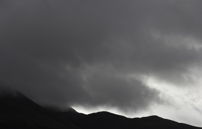
    I had initially intended to go walking – armed with Wainright’s Walks and walking boots. And we had planned to stay on Derwentwater, But on the way up to the Lakes my partner (the only driver) twisted his back and all the Derwentwater campsites were full. So in the end we stayed at Troutbeck and  I was constrained to the area just around our Camper Van for three days. However the view from just around the van had more than enough to inspire me. The first day the campsite staff apologised for the weather – but the swirling fog and clouds over the mountains with shafts of light through the occasional cracks was much more ‘sublime’ than sunshine. Sublime_clouds_-1 In the image top and below I was trying to get a minimalist Rothko feel of veils over the unknown. Staring through the viewfinder at cropped slices of the scene gave a feeling of disorientation. Sublime_clouds_-3 The occasional crow added a sense of menace and foreboding to an almost volcanic scene. Sublime_clouds_-15 Then the clouds started to disperse over cracks of light. Sublime_clouds_-17 Then looking in the other direction there was the sun coming through over a round tumulus still wreathed in volcanic clouds. Sublime_clouds_-20 Although shot in colour these almost monotone images looked better in black and white, though I might experiment more with different tones. I also want to process them more with Nikon Silver FX to get more localised contrasts. But on the whole I feel these images – due to a happy accident of the weather – do convey a movement through different concepts of the sublime – altered states of consciousness, the uncanny, foreboding,  to transcendence.

    The sublime to beautiful: colour

    Sunset_-3 A constant element in the sky were the streaks of plane smoke like comets. Echoing Sugimoto’s interest in the beauty of technology. Plane trails have always fascinated me – where are all these people going? But then also the fear of growing global warming. Above was evening. Below are similar trails at dawn. But here they are subtle marks on the pink sky. Now moving more towards the beautiful – promise of a sunny day. I like the classical curves of the tree and hill, like a wave on a Cretan or Roman vase. I left the big expanse of sky at the top to draw the eye into the universe beyond. SunDawn-2

     Beauty

    Despite the cliche, the Lake District is also really beautiful when the sun comes out. Some of this feeling of beauty is instilled by romantic nostalgia of some time past that never really existed. But some, I think is hardwired pleasure at colours, sunshine and longing for peace and quiet to rest. The grass is brilliant green after all the rain – here it is the colour that is beautiful. In this ‘picturesque’ rather conventional image I follow compositional rules of division of thirds, the sheep looking at the viewer on the left is on an intersection, then lots of diagonals and leading lines. ISO 400, f22, 1/80 sec I wanted a deep depth of field here, and the sheep were not moving much. I would have liked more texture in the middle ground grass, but I guess that was just not possible without different lighting. SunnyDay_-19 This patch of seedheads (knapweed? not sure??) was special in the way the sun shone through the silken hairs fluttering in a gentle breeze. Here the beauty is in the feeling of lightness and joy, some ancient contented idyll that must be hard-wired in the brain. It was almost possible not to hear the cars on the road behind. ISO200 f/22 1/80 second. Probably here I should have increased the shutter speed so that more of the seedheads were sharp – they were moving in the breeze. But I did not want the background to blur out too much. SunnyDay_-9 Then the sunsets are really stunning – even without filters or changing whitebalance. I think this reaction to sunsets is hard-wired in us as the body relaxes ready to rest over night. As well as pleasure in colours and contrast. But this sunset would have benefited from a tripod to give a bigger depth of field and greater sharpness in the middle ground. This was also one of the few images that did not have lens flare. Sunset_-8 Even the same crow looks quite friendly. Shot at ISO 125, 1/160 , f5.6. A tripod here would not have helped because the bird would have become more blurred. Sunset_-12

    Assessment

    I was quite pleased with the sublime images. But I want to work more on them in post-processing to see if I can push the tones further in certain places to increase their impact. They were shot in aperture mode and aperture and shutter speed were somewhat reactive as the scene kept changing. It might have been interesting to have used a tripod and longer exposures to capture some of the movement. Some were at 400 ISO, with hindsight that could have been reduced to increase the quality of the images. The ‘beautiful’ images are much more conventional. Here I need to think much more about different approaches. But I was hampered by our lack of mobility – and the fact that we only had one sunny day. The other cloudy days were also much less dramatic than the first. Some interesting images, but not enough light for conventional beauty or enough drama/contrast for sublime. Subverting these concepts too much might make them meaningless. But maybe I should have just looked harder with a more open mind. ———————————————————-

    This project focuses on photobooks, landscape photography styles and relationship between text and image, linking and contrasting issues, styles and narratives with those of my project on the Cambridge Fens.

    Most images of the Lake District on stock agencies like Shutterstock are over-saturated sunny photographs of traditional ‘Green and Pleasant Land’ quintessentially ‘English’ images of the Lake District.

    But the Lake District is an area of intense economic, social and environmental challenges. Brexit has brought some new discussions and opportunities particularly in relation to environmental issues. But has also intensified challenges of sheep farming etc.

    As with the Fens I have local family contacts with whom I can discuss my work and get audience feedback and extend my networks. Further work on all the below will be done during an extended 3-4 week visit to the Lake District in October 2022. Locations and themes yet to be decided.

    Made with Padlet

    Waiting for Daffodils

    This work revisits earlier photographs I had taken of Troutbeck on a short camping holiday in October 2014 for OCA Landscape Photography Assignment 1 Beauty and the Sublime together with selected images of Derwentwater below and other images from Ullswater in October 2019. It will also include new photographs from an extended holiday in October 2022, locations and themes yet to be decided.

    Some of these images were sent and accepted by Shutterstock. Click here to view Shutterstock Gallery

    This first series of images with contrasting captions and/or text take a tongue in cheek look at the images of the Lake District from Celia Feines, Daniel Defoe, the Romantics and the tourist industry (including landscape photographers). Either as a Photobook if I get enough new images in 2022, or a series of photocards and a photo gallery. Serves as background thinking to text in the books below.

    A further series of images as card, or a landscape photography book could target the East Asian tourist market. Around beauty and the sublime.

    Derwentwater: Flood

    Draft photobook of flooding on Derwentwater in 2019. Both the drama and how people responded on the campsite where we were staying.

    Biblical as well as climate change references.

    Text or no text to be decided depending on feedback.

    Threlkeld: Lakeland Futures

    Draft only – I have more information and text. And want to get feedback and ideas from people in Threlkeld and the museum staff. Including what happened during Covid and post-Brexit plans.

    This book will focus on the idea of the Lakes as a theme park. Juxtaposing the very graphic history of the mining industry with the tourist experience.

    One of the key attractions in Threlkeld is the steam train ride – going past rusty machinery to the anti-climactic ‘nothingness’ of the slate tips.

    Tourists when we were there in 2019 were mostly from the US.